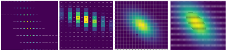
## Multi-Panel Data Visualization: Heatmaps and Density Plots
### Overview
The image displays four distinct panels arranged horizontally, each presenting a different form of data visualization. The overall aesthetic uses a consistent color scheme, primarily a deep purple background with data points or gradients ranging from blue/teal to bright yellow. The panels appear to progress from discrete, sparse data representations to continuous, dense distributions. No legible text labels, axis titles, or legends are present in the image at a readable resolution.
### Components/Axes
The image is segmented into four vertical panels of equal size.
1. **Panel 1 (Far Left): Sparse Matrix/Heatmap**
* **Structure:** A grid of discrete points or short horizontal dashes.
* **Data Pattern:** Points are arranged in distinct horizontal rows. The rows are not uniformly filled; they contain sparse clusters of colored points against the dark purple background.
* **Color Scale:** Points vary in color from dark blue/teal to bright yellow, suggesting a value scale.
* **Text:** No legible text is visible.
2. **Panel 2 (Center-Left): Numerical Grid/Table**
* **Structure:** A dense grid of cells, each containing a numerical value.
* **Data Pattern:** The numbers are arranged in a regular matrix. The cells are color-coded, with the background color of each cell corresponding to its numerical value, following the same blue-to-yellow color scale.
* **Text (Transcription with Uncertainty):** The numbers are too blurry for definitive transcription. Based on visual approximation, the grid appears to be roughly 10 columns by 10 rows. The values seem to range from low numbers (e.g., `0.00`, `0.01`) in dark blue cells to higher numbers (e.g., `0.85`, `0.90`) in bright yellow cells. A central cluster of cells shows the highest values (bright yellow).
* **Note:** The exact numerical content cannot be reliably extracted due to image resolution.
3. **Panel 3 (Center-Right): 2D Density Plot (Coarse Grid)**
* **Structure:** A continuous 2D field overlaid with a visible, relatively coarse grid of white lines.
* **Data Pattern:** A smooth, elliptical gradient. The highest intensity (bright yellow) is concentrated in an off-center region, fading through green and teal to the dark purple background at the edges.
* **Text:** No text is present.
4. **Panel 4 (Far Right): 2D Density Plot (Fine Grid)**
* **Structure:** A continuous 2D field overlaid with a very fine, dense grid of white lines, creating a textured appearance.
* **Data Pattern:** A smooth, elliptical gradient similar to Panel 3, but the distribution appears slightly more spread out or diffuse. The peak intensity (yellow) is in a similar off-center location.
* **Text:** No text is present.
### Detailed Analysis
* **Color Consistency:** All four panels use an identical perceptual color map: dark purple (low value) -> blue -> teal -> green -> yellow (high value). This suggests they are visualizing related or the same underlying data metric.
* **Progression of Representation:**
* Panel 1 shows discrete, possibly sampled data points.
* Panel 2 shows binned or aggregated data in a tabular format.
* Panels 3 and 4 show continuous, interpolated density estimates of the data distribution.
* **Spatial Grounding:** The region of highest value (yellow) is consistently located in the center-right portion of each panel's plotting area. In Panel 2, this corresponds to the cluster of high-value cells in the central columns. In Panels 3 and 4, it corresponds to the bright yellow core of the gradient.
### Key Observations
1. **Illegible Text:** The primary limitation is the inability to read specific numerical values in Panel 2 or any potential labels. The analysis is based solely on visual pattern and color recognition.
2. **Consistent Data Peak:** All panels agree on the location of the data's maximum value, reinforcing the reliability of the spatial pattern despite the different visualization methods.
3. **Grid Evolution:** The transition from the sparse points in Panel 1, to the coarse grid in Panel 2, to the fine continuous grids in Panels 3 and 4 illustrates a common data processing pipeline: from raw samples to binned statistics to smoothed density estimation.
4. **Anomaly/Outlier:** No obvious outliers are visible. The distributions in Panels 3 and 4 are smooth and unimodal.
### Interpretation
This composite image likely demonstrates different stages of visualizing a two-dimensional dataset or probability distribution. It serves as a technical comparison of visualization techniques.
* **What it demonstrates:** The figure shows how the same underlying data can be represented with varying levels of granularity and abstraction. Panel 1 might represent raw observations or a sparse matrix. Panel 2 shows a binned summary (like a 2D histogram). Panels 3 and 4 are kernel density estimates or similar continuous models, with Panel 4 using a finer evaluation grid than Panel 3.
* **Relationship between elements:** The panels are directly comparable. The high-value region's consistent position across all four confirms they depict the same phenomenon. The progression highlights the trade-off between showing discrete data fidelity (Panel 1) and perceiving continuous trends (Panels 3 & 4).
* **Underlying Message:** The visualization argues for the effectiveness of continuous density plots (Panels 3 & 4) in revealing the overall shape and central tendency of a data distribution, which might be less apparent in the discrete representations (Panels 1 & 2). The choice between the coarse and fine grid in the density plots (3 vs. 4) involves a trade-off between computational cost/perceived smoothness and visual texture.