## Heatmaps: Density Visualizations
### Overview
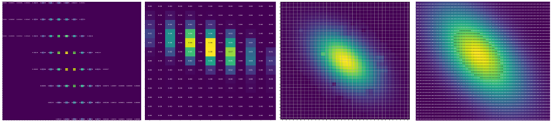
The image contains four heatmaps, each displaying a different density distribution. The color scheme ranges from dark purple (low density) to bright yellow (high density). The first heatmap shows discrete points along horizontal lines. The second heatmap shows a distribution along a diagonal. The third and fourth heatmaps show a continuous, elliptical distribution.
### Components/Axes
**Heatmap 1:**
* **Axes:** No explicit axes are labeled. The heatmap displays five horizontal rows of data points.
* **Color Scale:** Dark purple indicates low density, transitioning to yellow for high density.
* **Data Points:** Each row contains multiple data points, with varying densities.
**Heatmap 2:**
* **Axes:** No explicit axes are labeled. The heatmap is a 10x10 grid.
* **Color Scale:** Dark purple indicates low density, transitioning to yellow for high density.
* **Data Values:** The heatmap contains numerical values, likely representing density, at each grid location.
**Heatmap 3:**
* **Axes:** No explicit axes are labeled. The heatmap is a grid.
* **Color Scale:** Dark purple indicates low density, transitioning to yellow for high density.
* **Distribution:** The density is concentrated in an elliptical shape, with the highest density at the center.
**Heatmap 4:**
* **Axes:** No explicit axes are labeled. The heatmap is a grid.
* **Color Scale:** Dark purple indicates low density, transitioning to yellow for high density.
* **Distribution:** The density is concentrated in an elliptical shape, with the highest density at the center. The grid lines are more prominent than in Heatmap 3.
### Detailed Analysis or ### Content Details
**Heatmap 1:**
* **Row 1:** Data points are sparse and have low density.
* **Row 2:** Data points are more concentrated, with a higher density region in the center.
* **Row 3:** Data points are even more concentrated, with a high-density region in the center.
* **Row 4:** Data points are similar to Row 3.
* **Row 5:** Data points are similar to Row 2.
**Heatmap 2:**
* The heatmap shows a diagonal distribution of density.
* The highest density (yellow) is concentrated along the diagonal from approximately (2,8) to (8,2).
* The values in the grid are as follows (approximate):
| | 0 | 1 | 2 | 3 | 4 | 5 | 6 | 7 | 8 | 9 |
| :---- | :---- | :---- | :---- | :---- | :---- | :---- | :---- | :---- | :---- | :---- |
| **0** | 0.00 | 0.00 | 0.00 | 0.00 | 0.00 | 0.00 | 0.00 | 0.00 | 0.00 | 0.00 |
| **1** | 0.00 | 0.00 | 0.00 | 0.00 | 0.00 | 0.00 | 0.00 | 0.00 | 0.00 | 0.00 |
| **2** | 0.00 | 0.00 | 0.00 | 0.00 | 0.00 | 0.00 | 0.00 | 0.00 | 0.00 | 0.00 |
| **3** | 0.00 | 0.00 | 0.00 | 0.00 | 0.00 | 0.00 | 0.00 | 0.00 | 0.00 | 0.00 |
| **4** | 0.00 | 0.00 | 0.00 | 0.00 | 0.00 | 0.00 | 0.00 | 0.00 | 0.00 | 0.00 |
| **5** | 0.00 | 0.00 | 0.00 | 0.00 | 0.00 | 0.00 | 0.00 | 0.00 | 0.00 | 0.00 |
| **6** | 0.00 | 0.00 | 0.00 | 0.00 | 0.00 | 0.00 | 0.00 | 0.00 | 0.00 | 0.00 |
| **7** | 0.00 | 0.00 | 0.00 | 0.00 | 0.00 | 0.00 | 0.00 | 0.00 | 0.00 | 0.00 |
| **8** | 0.00 | 0.00 | 0.00 | 0.00 | 0.00 | 0.00 | 0.00 | 0.00 | 0.00 | 0.00 |
| **9** | 0.00 | 0.00 | 0.00 | 0.00 | 0.00 | 0.00 | 0.00 | 0.00 | 0.00 | 0.00 |
**Heatmap 3:**
* The density is highest at the center of the ellipse and gradually decreases towards the edges.
* The ellipse is oriented diagonally.
**Heatmap 4:**
* Similar to Heatmap 3, the density is highest at the center of the ellipse and gradually decreases towards the edges.
* The grid lines are more visible, providing a clearer sense of the underlying structure.
### Key Observations
* Heatmap 1 shows discrete density variations along horizontal lines.
* Heatmap 2 shows a diagonal density distribution on a grid.
* Heatmaps 3 and 4 show continuous, elliptical density distributions.
* The color scale is consistent across all four heatmaps, allowing for easy comparison of density levels.
### Interpretation
The heatmaps visualize different types of density distributions. Heatmap 1 could represent the distribution of events along different categories, with each row representing a category. Heatmap 2 could represent the correlation between two variables, with the diagonal distribution indicating a positive correlation. Heatmaps 3 and 4 could represent the probability density function of a bivariate normal distribution. The differences in the distributions suggest different underlying processes or relationships between the data points.