\n
## Heatmaps: Correlation Visualizations
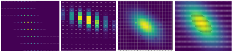
### Overview
The image presents four heatmaps arranged horizontally. Each heatmap appears to visualize a correlation matrix or a similar relationship between two sets of variables. The color intensity represents the strength of the correlation, with warmer colors (yellow) indicating stronger positive correlations and cooler colors (purple/blue) indicating weaker or negative correlations. The heatmaps differ in their resolution and the pattern of correlations they display.
### Components/Axes
All four heatmaps share a similar visual structure. They lack explicit axis labels or numerical scales. However, the arrangement of cells suggests a two-dimensional grid representing the relationships between variables. The first heatmap has a legend on the left side, with a gradient of colors from purple to yellow, corresponding to the intensity of the correlation. The other three heatmaps do not have a visible legend.
### Detailed Analysis or Content Details
**Heatmap 1 (Leftmost):**
This heatmap has a legend on the left side. The legend consists of 7 color-coded dots, ranging from dark purple to yellow. The legend does not have numerical values associated with the colors. The heatmap itself shows a series of dots arranged vertically, with varying colors. The dots appear to represent individual correlation values.
* The top row of dots is mostly light blue.
* The second row is a mix of light blue and yellow.
* The third row is mostly yellow.
* The fourth row is a mix of yellow and light blue.
* The fifth row is mostly light blue.
* The sixth row is a mix of light blue and yellow.
* The bottom row is mostly light blue.
**Heatmap 2:**
This heatmap is a grid of cells with varying colors. The strongest correlations (yellow) are concentrated in the central columns. The correlation strength decreases towards the edges of the grid.
* The central columns (approximately columns 4-7) show strong positive correlations (yellow).
* The columns to the left and right of the center show moderate correlations (green/light blue).
* The outermost columns show weak or negative correlations (purple/dark blue).
* The rows appear to have a similar pattern of correlation strength, with the center being the strongest.
**Heatmap 3:**
This heatmap displays a smooth, elliptical pattern of correlation. The strongest correlation (yellow) is located in the center of the ellipse. The correlation strength decreases as you move away from the center.
* The center of the heatmap shows a strong positive correlation (yellow).
* The correlation strength gradually decreases towards the edges of the ellipse (green/blue).
* The edges of the heatmap show weak or negative correlations (purple).
**Heatmap 4:**
This heatmap is similar to Heatmap 3, but the elliptical pattern is more elongated. The strongest correlation (yellow) is located in the center of the elongated ellipse.
* The center of the heatmap shows a strong positive correlation (yellow).
* The correlation strength gradually decreases towards the edges of the ellipse (green/blue).
* The edges of the heatmap show weak or negative correlations (purple).
### Key Observations
* Heatmap 1 provides a discrete representation of correlation values, while the other three heatmaps provide a continuous representation.
* Heatmap 2 shows a localized pattern of strong correlations in the central columns.
* Heatmaps 3 and 4 show a smooth, elliptical pattern of correlation, suggesting a spatial or temporal relationship between the variables.
* The absence of axis labels makes it difficult to interpret the specific variables being correlated.
### Interpretation
The heatmaps likely represent the correlation between different features or variables in a dataset. The varying patterns of correlation suggest different underlying relationships. Heatmap 2 might represent the correlation between different features in a dataset, where the central features are highly correlated. Heatmaps 3 and 4 might represent the correlation between variables over time or space, where the elliptical pattern suggests a cyclical or spatial relationship. The lack of axis labels and numerical scales limits the ability to draw definitive conclusions. The data suggests that the relationships between variables are complex and vary depending on the specific context. The smooth gradients in heatmaps 3 and 4 suggest a continuous relationship, while the discrete values in heatmap 1 suggest a more categorical relationship. The absence of numerical values makes it difficult to quantify the strength of the correlations.