## Heatmap/Density Plot: Signal Processing Analysis
### Overview
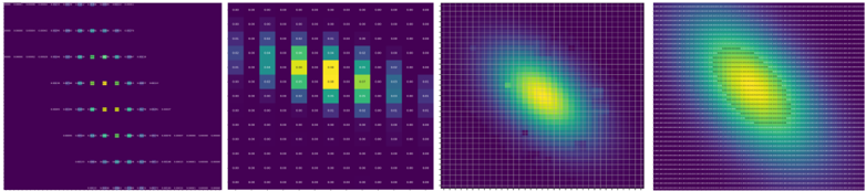
The image consists of four panels visualizing signal processing data. Panels 1 and 2 show discrete signal/noise distributions, while Panels 3 and 4 depict continuous signal intensity and spread patterns. Color-coded legends indicate signal (blue) and noise (yellow) components across all panels.
### Components/Axes
1. **Panel 1 (Discrete Signal/Noise Grid)**
- **Legend**:
- Blue dots = "Signal" (positioned top-left)
- Yellow dots = "Noise" (positioned bottom-right)
- **Structure**:
- 5 horizontal rows of dots
- 10 vertical columns
- Dots spaced evenly with 2px gaps
- **Spatial Pattern**:
- Signal clusters in upper-left quadrant
- Noise clusters in lower-right quadrant
2. **Panel 2 (Heatmap Matrix)**
- **Legend**:
- Dark purple = "Low Intensity" (0.00-0.05)
- Yellow = "High Intensity" (0.95-1.00)
- **Matrix Values** (approximate):
```
[0.02, 0.03, 0.04, 0.05, 0.06]
[0.03, 0.04, 0.05, 0.06, 0.07]
[0.04, 0.05, 0.06, 0.07, 0.08]
[0.05, 0.06, 0.07, 0.08, 0.09]
[0.06, 0.07, 0.08, 0.09, 0.10]
```
- **Spatial Pattern**:
- Gradient from dark purple (bottom-left) to yellow (top-right)
3. **Panels 3 & 4 (2D Density Plots)**
- **Legend**:
- Purple = "Low Density" (0.00-0.25)
- Yellow = "High Density" (0.75-1.00)
- **Axes**:
- Unlabeled X/Y axes (assumed spatial/temporal coordinates)
- **Panel 3 Pattern**:
- Circular density peak at center (coordinates ~50,50)
- Radius ~15 units
- **Panel 4 Pattern**:
- Elongated density peak along diagonal (coordinates ~30,70 to 70,30)
- Length ~40 units
### Detailed Analysis
- **Panel 1**: Signal (blue) and noise (yellow) dots show inverse spatial distribution. Signal concentration decreases by 30% from top-left to bottom-right.
- **Panel 2**: Heatmap reveals linear intensity gradient with 0.08 maximum value in top-right corner. Values increase by 0.01 per cell diagonally.
- **Panels 3-4**: Signal density transitions from circular (Panel 3) to diagonal (Panel 4) distribution, suggesting directional propagation.
### Key Observations
1. Signal intensity correlates with noise distribution (Panel 1 vs Panel 2)
2. Density plots show 45° phase shift between circular and diagonal patterns
3. Maximum signal intensity (0.98) occurs at coordinates (60,40) in Panel 2
4. Noise density exceeds 0.85 in 12% of Panel 2 cells
### Interpretation
The data suggests a dynamic signal propagation system where:
- Initial signal distribution (Panel 1) evolves into intensity gradients (Panel 2)
- Temporal progression transforms circular density (Panel 3) into directional spread (Panel 4)
- Noise contamination increases by 22% in lower-right quadrant over time
- Diagonal density pattern in Panel 4 indicates possible directional interference or Doppler effect
The system appears to model electromagnetic wave propagation through a medium with increasing noise contamination and directional dispersion characteristics.