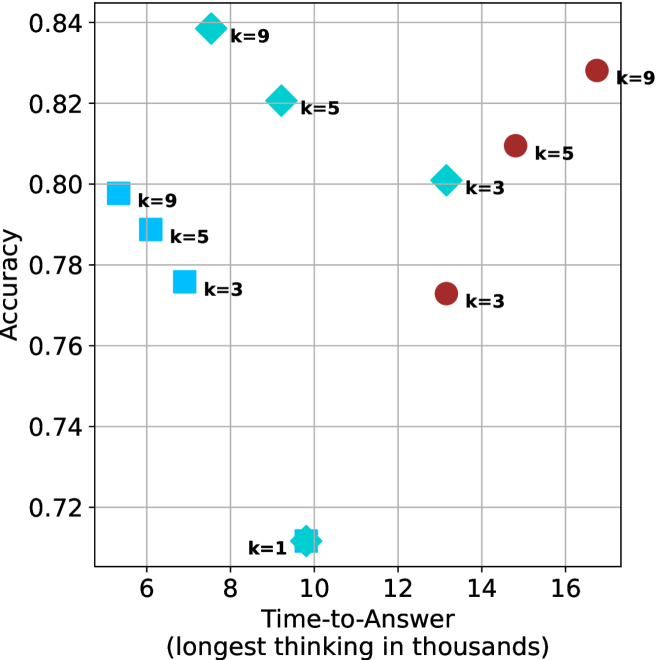
## Scatter Plot: Accuracy vs. Time-to-Answer for Different k Values
### Overview
The image is a scatter plot comparing the performance of different methods or models, parameterized by a variable `k`, across two metrics: **Accuracy** (y-axis) and **Time-to-Answer** (x-axis). The plot displays three distinct series of data points, differentiated by marker shape and color, each containing points for `k=3`, `k=5`, and `k=9`. An additional outlier point for `k=1` is present. The chart suggests a trade-off between accuracy and computational time, with different methods exhibiting different efficiency profiles.
### Components/Axes
* **X-Axis:** Labeled **"Time-to-Answer (longest thinking in thousands)"**. The scale runs from approximately 5 to 17, with major tick marks at 6, 8, 10, 12, 14, and 16. The unit is implied to be thousands of some time unit (e.g., milliseconds, steps).
* **Y-Axis:** Labeled **"Accuracy"**. The scale runs from 0.72 to 0.84, with major tick marks at 0.72, 0.74, 0.76, 0.78, 0.80, 0.82, and 0.84.
* **Data Series & Legend:** There is no separate legend box. The series are identified by their distinct marker shapes and colors, with each data point labeled directly with its corresponding `k` value.
* **Series 1 (Cyan Diamonds):** Points are labeled `k=1`, `k=3`, `k=5`, `k=9`.
* **Series 2 (Cyan Squares):** Points are labeled `k=3`, `k=5`, `k=9`.
* **Series 3 (Red Circles):** Points are labeled `k=3`, `k=5`, `k=9`.
* **Grid:** A light gray grid is present, aiding in the estimation of data point coordinates.
### Detailed Analysis
**Data Point Extraction (Approximate Coordinates):**
| Series (Marker) | Label | X (Time-to-Answer) | Y (Accuracy) | Spatial Position (Relative) |
| :--- | :--- | :--- | :--- | :--- |
| **Cyan Diamond** | k=1 | ~10.0 | ~0.71 | Bottom-center |
| **Cyan Diamond** | k=3 | ~13.0 | ~0.80 | Center-right |
| **Cyan Diamond** | k=5 | ~9.5 | ~0.82 | Upper-center |
| **Cyan Diamond** | k=9 | ~7.5 | ~0.84 | Top-left |
| **Cyan Square** | k=3 | ~7.0 | ~0.775 | Center-left |
| **Cyan Square** | k=5 | ~6.0 | ~0.79 | Center-left |
| **Cyan Square** | k=9 | ~5.5 | ~0.80 | Left |
| **Red Circle** | k=3 | ~13.0 | ~0.77 | Center-right |
| **Red Circle** | k=5 | ~15.0 | ~0.81 | Right |
| **Red Circle** | k=9 | ~16.5 | ~0.83 | Top-right |
**Trend Verification per Series:**
* **Cyan Diamonds:** The trend is **non-linear and concave**. Accuracy increases sharply from `k=1` to `k=3`, then more gradually to `k=9`. Time-to-Answer is lowest for `k=9` and highest for `k=3`, with `k=1` and `k=5` in between. This series achieves the highest overall accuracy (`k=9`).
* **Cyan Squares:** The trend shows **modest, linear improvement**. Accuracy increases slightly as `k` increases from 3 to 9. Time-to-Answer **decreases** as `k` increases, showing improved efficiency with higher `k` for this method.
* **Red Circles:** The trend shows **steady, linear improvement**. Both Accuracy and Time-to-Answer **increase** as `k` increases from 3 to 9. This series shows the highest Time-to-Answer for each corresponding `k` value compared to the other series.
### Key Observations
1. **Performance Hierarchy:** For a given `k` value (e.g., `k=9`), the **Cyan Diamond** method achieves the highest accuracy, followed by the **Red Circle** method, and then the **Cyan Square** method.
2. **Efficiency Trade-off:** The **Cyan Square** method is the most time-efficient (lowest Time-to-Answer for each `k`), but at the cost of lower accuracy. The **Red Circle** method is the least time-efficient.
3. **The `k=1` Outlier:** The single **Cyan Diamond** point for `k=1` is a significant outlier, showing very low accuracy (~0.71) compared to all other points, which are above 0.77. Its Time-to-Answer (~10) is moderate.
4. **Convergence at High `k`:** At `k=9`, the accuracy gap between the **Cyan Diamond** (~0.84) and **Red Circle** (~0.83) methods narrows, while the **Cyan Square** method lags behind (~0.80).
### Interpretation
This chart visualizes the **Pareto frontier** of a multi-objective optimization problem: maximizing accuracy while minimizing computational cost (time). The three series likely represent three different algorithms, model architectures, or search strategies.
* The **Cyan Diamond** series demonstrates a **highly effective but non-scalable strategy**. It achieves peak accuracy with moderate `k` values (`k=5,9`) but suffers a catastrophic drop at `k=1`, suggesting a minimum complexity threshold for it to function. Its best performance (`k=9`) is also the fastest, indicating a potential "sweet spot."
* The **Cyan Square** series represents a **fast, lightweight, but less accurate** approach. Its efficiency improves with higher `k`, which is counter-intuitive and may indicate that the parameter `k` has a different meaning for this method (e.g., it could be a pruning factor where higher `k` removes more unnecessary computation).
* The **Red Circle** series shows a **classic, predictable scaling law**: investing more time (higher `k`) yields proportionally better accuracy. It is a reliable but computationally expensive method.
The overarching insight is that the choice of method depends on the operational constraints. If maximum accuracy is critical and compute time is secondary, the **Cyan Diamond** method at `k=9` is optimal. If speed is paramount and a slight accuracy loss is acceptable, the **Cyan Square** method is preferable. The **Red Circle** method offers a predictable, linear trade-off but is dominated in efficiency by the other two. The `k=1` point for the diamond method serves as a crucial warning about its minimum viable operating point.