# Technical Data Extraction: Resolution Performance Chart
## 1. Image Classification and Overview
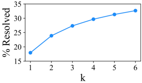
This image is a **line graph** depicting the relationship between a variable **k** and the percentage of items resolved. The chart utilizes a single data series represented by a blue line with circular markers at each data point.
## 2. Component Isolation
### A. Header/Title
* **Content:** None present.
### B. Main Chart Area (Axes and Data)
* **Y-Axis Label:** `% Resolved` (Oriented vertically, 90 degrees counter-clockwise).
* **Y-Axis Scale:** Numerical range from 15 to 35.
* **Y-Axis Markers:** 15, 20, 25, 30, 35.
* **X-Axis Label:** `k` (Centered horizontally below the axis).
* **X-Axis Scale:** Discrete integer values from 1 to 6.
* **X-Axis Markers:** 1, 2, 3, 4, 5, 6.
### C. Legend
* **Placement:** No explicit legend is provided as there is only one data series.
* **Visual Encoding:** Blue line with solid circular markers.
## 3. Trend Verification
The data series exhibits a **positive, monotonic trend with a decreasing rate of growth** (concave down).
* As the value of **k** increases, the **% Resolved** also increases.
* The steepest increase occurs between $k=1$ and $k=2$.
* The slope gradually flattens as **k** approaches 6, suggesting diminishing returns for higher values of **k**.
## 4. Data Table Reconstruction
Based on the spatial positioning of the markers relative to the axis tick marks, the following values are extracted:
| k (X-axis) | % Resolved (Y-axis) [Approximate] |
| :--- | :--- |
| 1 | 18.0 |
| 2 | 24.0 |
| 3 | 27.5 |
| 4 | 29.5 |
| 5 | 31.5 |
| 6 | 33.0 |
## 5. Technical Summary
The chart illustrates a performance metric where increasing the parameter **k** from 1 to 6 results in an improvement in the resolution rate from approximately **18%** to **33%**. The most significant gain (approx. +6%) is achieved by moving from $k=1$ to $k=2$, while subsequent increments of **k** yield smaller marginal improvements (averaging approx. +2.25% per step thereafter).