## Bar Charts: Speedup Comparison of Naive, GSE, and VSE
### Overview
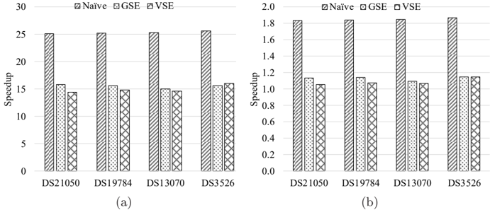
The image presents two bar charts, labeled (a) and (b), comparing the speedup achieved by three different methods: Naive, GSE, and VSE, across four datasets: DS21050, DS19784, DS13070, and DS3526. The y-axis represents "Speedup," while the x-axis represents the datasets. Chart (a) has a speedup scale from 0 to 30, while chart (b) has a speedup scale from 0 to 2.0.
### Components/Axes
* **X-axis (Both Charts):** Datasets - DS21050, DS19784, DS13070, DS3526
* **Y-axis (Chart a):** Speedup (Scale: 0 to 30)
* **Y-axis (Chart b):** Speedup (Scale: 0 to 2.0)
* **Legend (Both Charts):**
* Naive (represented by a solid pattern)
* GSE (represented by a diagonally striped pattern)
* VSE (represented by a dotted pattern)
### Detailed Analysis or Content Details
**Chart (a): Speedup 0-30**
* **DS21050:**
* Naive: Approximately 26.0
* GSE: Approximately 13.0
* VSE: Approximately 16.0
* **DS19784:**
* Naive: Approximately 24.0
* GSE: Approximately 12.0
* VSE: Approximately 15.0
* **DS13070:**
* Naive: Approximately 25.0
* GSE: Approximately 12.0
* VSE: Approximately 14.0
* **DS3526:**
* Naive: Approximately 26.0
* GSE: Approximately 12.0
* VSE: Approximately 14.0
**Chart (b): Speedup 0-2.0**
* **DS21050:**
* Naive: Approximately 1.1
* GSE: Approximately 0.9
* VSE: Approximately 1.8
* **DS19784:**
* Naive: Approximately 1.1
* GSE: Approximately 0.9
* VSE: Approximately 1.2
* **DS13070:**
* Naive: Approximately 1.1
* GSE: Approximately 0.9
* VSE: Approximately 1.2
* **DS3526:**
* Naive: Approximately 1.1
* GSE: Approximately 0.9
* VSE: Approximately 1.1
### Key Observations
* In both charts, the "Naive" method consistently shows the highest speedup values.
* The "GSE" method consistently exhibits the lowest speedup values.
* The "VSE" method generally falls between "Naive" and "GSE" in terms of speedup.
* The speedup values are relatively consistent across the four datasets for each method, particularly in chart (a).
* Chart (b) shows a much smaller scale of speedup compared to chart (a).
### Interpretation
The data suggests that the "Naive" method provides the most significant speedup across all tested datasets, followed by "VSE," and then "GSE." The two charts likely represent different aspects or scales of the speedup measurement. Chart (a) shows the raw speedup values, which are significantly higher, while chart (b) might represent a normalized or relative speedup, or a different metric altogether. The consistency of the results across datasets indicates that the performance differences between the methods are not dataset-specific. The large difference in speedup between "Naive" and the other methods suggests that the "Naive" approach is substantially more efficient for these particular tasks. The relatively low speedup of "GSE" indicates that it may be less suitable for these datasets or requires further optimization. The consistent ranking of the methods suggests a fundamental difference in their algorithmic complexity or implementation efficiency.