## Bar Chart: Disabled vs Non-Disabled
### Overview
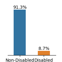
The image is a bar chart comparing the percentages of non-disabled and disabled individuals. The chart consists of two vertical bars, one representing "Non-Disabled" and the other representing "Disabled". The height of each bar corresponds to the percentage it represents, with the exact percentage value displayed above each bar.
### Components/Axes
* **X-axis:** Categorical axis with two categories: "Non-Disabled" and "Disabled".
* **Y-axis:** Implicit percentage scale, represented by the height of the bars.
* **Bar 1:** Represents "Non-Disabled" individuals. The bar is colored blue.
* **Bar 2:** Represents "Disabled" individuals. The bar is colored orange.
* **Values:** The percentage value is displayed above each bar.
### Detailed Analysis
* **Non-Disabled:** The blue bar representing "Non-Disabled" has a height corresponding to 91.3%.
* **Disabled:** The orange bar representing "Disabled" has a height corresponding to 8.7%.
### Key Observations
* The percentage of non-disabled individuals (91.3%) is significantly higher than the percentage of disabled individuals (8.7%).
### Interpretation
The bar chart visually demonstrates a significant disparity between the proportion of non-disabled and disabled individuals. The data suggests that in the population being represented, non-disabled individuals constitute a much larger percentage than disabled individuals. The exact context of this data (e.g., population demographics, survey results) is not provided, but the chart clearly highlights this difference in proportions.