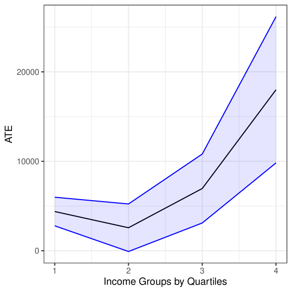
## Line Chart: ATE by Income Groups by Quartiles
### Overview
The image is a line chart displaying the Average Treatment Effect (ATE) across different income groups, divided into quartiles. The chart shows a trend of ATE increasing with higher income quartiles, with a shaded area indicating the uncertainty or variability around the ATE estimates.
### Components/Axes
* **X-axis:** "Income Groups by Quartiles" with labels 1, 2, 3, and 4.
* **Y-axis:** "ATE" (Average Treatment Effect) with scale markers at 0, 10000, and 20000.
* **Data Series:** A single data series represented by a black line, with a blue shaded area around the line indicating a confidence interval or standard error. There is no explicit legend.
### Detailed Analysis
* **Income Group 1:** ATE is approximately 4000, with a range from approximately 2000 to 6000 (based on the shaded area).
* **Income Group 2:** ATE decreases to approximately 3000, with a range from approximately 0 to 6000.
* **Income Group 3:** ATE increases to approximately 8000, with a range from approximately 3000 to 11000.
* **Income Group 4:** ATE increases significantly to approximately 18000, with a range from approximately 10000 to 24000.
**Trend Verification:**
* The black line representing the ATE starts at approximately 4000 for Income Group 1.
* The line decreases to approximately 3000 for Income Group 2.
* The line then increases to approximately 8000 for Income Group 3.
* Finally, the line increases sharply to approximately 18000 for Income Group 4.
### Key Observations
* The ATE is lowest for the second income quartile.
* There is a substantial increase in ATE from the third to the fourth income quartile.
* The shaded area, representing uncertainty, widens as income increases, suggesting greater variability in ATE estimates for higher income groups.
### Interpretation
The chart suggests that the Average Treatment Effect is positively correlated with income, particularly in the higher income quartiles. The initial decrease from the first to the second quartile could indicate a non-linear relationship or the influence of other factors. The widening uncertainty range for higher income groups may reflect greater heterogeneity or smaller sample sizes within those groups. The data demonstrates a clear trend of increasing ATE as income increases, especially when moving from the third to the fourth income quartile.