\n
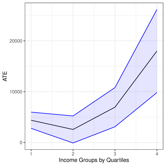
## Line Chart: Average Treatment Effect (ATE) by Income Quartile
### Overview
The image presents a line chart illustrating the relationship between income groups (divided into quartiles) and the Average Treatment Effect (ATE). A shaded region represents a confidence interval around the central line. The chart suggests a positive correlation between income quartile and ATE, with a particularly steep increase in ATE for the highest income quartile.
### Components/Axes
* **X-axis:** "Income Groups by Quartiles" - Ranges from 1 to 4, representing the four income quartiles.
* **Y-axis:** "ATE" - Ranges from 0 to 25000, representing the Average Treatment Effect. The scale is linear.
* **Line:** A solid black line representing the central tendency of the ATE for each income quartile.
* **Shaded Region:** A light blue shaded region surrounding the black line, representing the confidence interval around the ATE.
* **Grid:** A light gray grid is present in the background to aid in reading values.
### Detailed Analysis
The chart displays the ATE for each income quartile.
* **Quartile 1:** The ATE is approximately 3000.
* **Quartile 2:** The ATE decreases to approximately 1500.
* **Quartile 3:** The ATE increases significantly to approximately 9000.
* **Quartile 4:** The ATE increases dramatically to approximately 23000.
The confidence interval is wider for higher income quartiles, indicating greater uncertainty in the ATE estimate for those groups.
* **Quartile 1:** The confidence interval ranges from approximately 0 to 6000.
* **Quartile 2:** The confidence interval ranges from approximately 0 to 4000.
* **Quartile 3:** The confidence interval ranges from approximately 3000 to 15000.
* **Quartile 4:** The confidence interval ranges from approximately 10000 to 35000.
The black line shows an initial decrease in ATE from Quartile 1 to Quartile 2, followed by a substantial and accelerating increase from Quartile 2 to Quartile 4.
### Key Observations
* The ATE is not constant across income quartiles.
* There is a clear positive trend between income quartile and ATE, especially for the highest income quartile.
* The confidence intervals widen with increasing income, suggesting greater variability or uncertainty in the ATE estimates for higher income groups.
* The ATE for the highest income quartile is significantly higher than for the other quartiles.
### Interpretation
The data suggests that the treatment effect is strongly influenced by income level. Individuals in higher income quartiles experience a substantially larger average treatment effect than those in lower income quartiles. The widening confidence intervals for higher income groups could indicate that the treatment effect is more heterogeneous within those groups, or that there is less data available for those groups. The initial decrease in ATE from Quartile 1 to Quartile 2 is an interesting observation that warrants further investigation. It could be due to a variety of factors, such as selection bias or confounding variables. The steep increase in ATE for Quartile 4 suggests that the treatment is particularly effective for individuals in the highest income bracket, or that there are unique characteristics of this group that amplify the treatment effect. This could have important implications for policy decisions and resource allocation.