## Line Chart with Confidence Interval: Average Treatment Effect (ATE) by Income Quartile
### Overview
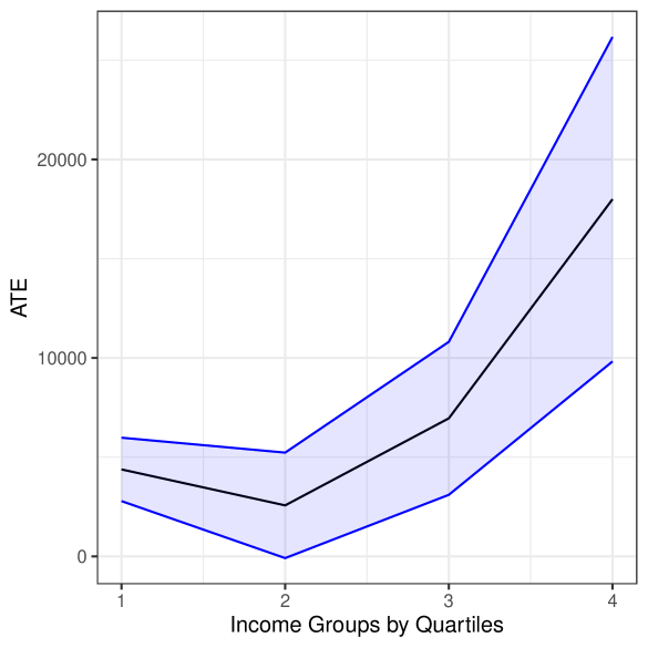
The image displays a line chart illustrating the Average Treatment Effect (ATE) across four income groups, categorized by quartiles. The chart features a central trend line (black) surrounded by a shaded confidence interval (light blue) bounded by two blue lines. The overall trend shows a slight initial decrease followed by a significant increase in ATE as income rises.
### Components/Axes
* **Y-Axis (Vertical):** Labeled "ATE". The scale runs from 0 to over 20,000, with major tick marks at 0, 10,000, and 20,000.
* **X-Axis (Horizontal):** Labeled "Income Groups by Quartiles". It has four categorical tick marks labeled "1", "2", "3", and "4", representing the income quartiles from lowest (1) to highest (4).
* **Data Series:**
* **Central Trend Line (Black):** Represents the point estimate of the ATE for each quartile.
* **Confidence Interval (Light Blue Shaded Area):** Represents the range of uncertainty around the central estimate.
* **Upper & Lower Bounds (Blue Lines):** Define the upper and lower limits of the confidence interval.
* **Legend:** No explicit legend is present within the chart area. The series are distinguished by color and line style (solid black line vs. solid blue lines with shading between them).
### Detailed Analysis
**Data Point Estimates (Central Black Line):**
* **Quartile 1 (Lowest Income):** ATE is approximately 4,500.
* **Quartile 2:** ATE decreases to its lowest point, approximately 2,500.
* **Quartile 3:** ATE increases to approximately 7,000.
* **Quartile 4 (Highest Income):** ATE shows a sharp increase to approximately 18,000.
**Confidence Interval (Blue Shaded Region):**
* **Quartile 1:** The interval spans from approximately 2,500 (lower blue line) to 6,000 (upper blue line).
* **Quartile 2:** The interval is narrowest here, spanning from approximately 0 (lower blue line) to 5,000 (upper blue line).
* **Quartile 3:** The interval widens, spanning from approximately 3,000 (lower blue line) to 11,000 (upper blue line).
* **Quartile 4:** The interval is widest, spanning from approximately 10,000 (lower blue line) to over 25,000 (upper blue line, extending beyond the top axis limit).
**Trend Verification:**
* The central black line exhibits a "check mark" or "J-shaped" trend: a shallow dip from Q1 to Q2, followed by a steep, accelerating rise from Q2 through Q4.
* The confidence interval (blue shaded area) follows the same general shape but expands dramatically at the higher end (Q3 and Q4), indicating greater uncertainty in the estimate for higher-income groups.
### Key Observations
1. **Non-Linear Relationship:** The relationship between income quartile and ATE is not linear. The effect is smallest for the second income quartile.
2. **Increasing Effect and Uncertainty:** Both the estimated ATE and the uncertainty around that estimate increase substantially for the third and especially the fourth income quartiles.
3. **Minimum Point:** The lowest estimated ATE and the narrowest confidence interval both occur at the second income quartile.
4. **Asymmetric Interval:** At Quartile 4, the upper bound of the confidence interval rises much more sharply than the lower bound, creating a highly asymmetric interval.
### Interpretation
This chart suggests that the Average Treatment Effect (ATE) of whatever intervention or phenomenon is being measured is highly dependent on income level. The effect is modest for the lowest income group, dips slightly for the lower-middle group (Q2), and then grows substantially for the upper-middle (Q3) and highest (Q4) income groups.
The widening confidence interval at higher incomes is a critical finding. It indicates that while the *average* effect is estimated to be large for high-income individuals, there is much more variability or less data to pin down this estimate precisely. This could mean the treatment works very differently for different people within the high-income bracket, or that the sample size for this group is smaller.
From a policy or research perspective, this pattern might indicate that the treatment is most effective, on average, for higher-income populations, but its impact on them is also the least certain. The dip at Q2 could be an important anomaly worth investigating—perhaps there is a subgroup for whom the treatment is less effective or even counterproductive. The overall message is one of heterogeneity: the treatment effect is not uniform across the population defined by income.