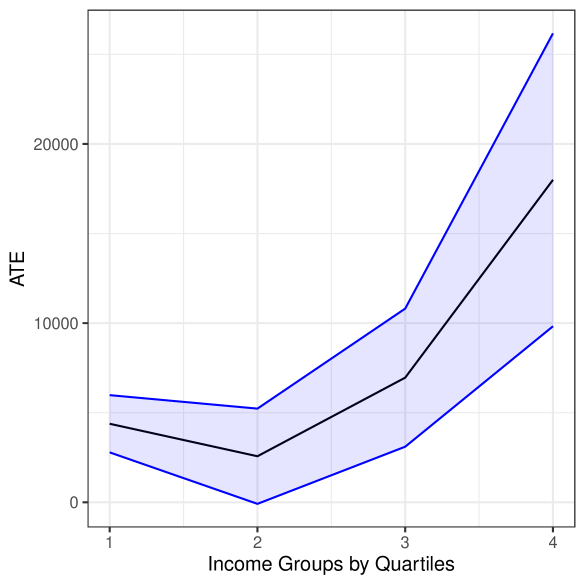
## Line Chart: Treatment Effect Across Income Quartiles
### Overview
The chart visualizes the Average Treatment Effect (ATE) across four income quartiles, comparing observed treatment effects (black line) with confidence intervals (blue shaded region). The x-axis represents income groups divided into quartiles (1–4), while the y-axis measures ATE in monetary units (up to 25,000). Two data series are present: a central black line for treatment effects and a blue shaded band representing confidence intervals.
### Components/Axes
- **X-axis**: "Income Groups by Quartiles" (labeled 1 to 4, evenly spaced)
- **Y-axis**: "ATE" (ranging from 0 to 25,000, with gridlines at 5,000 increments)
- **Legend**: Located in the top-right corner, associating:
- **Black line**: "Treatment Effect"
- **Blue shaded region**: "Confidence Interval"
- **Shading**: Blue gradient bands extend ±1,000 units around the black line in quartiles 1–3, and ±2,000 units in quartile 4.
### Detailed Analysis
1. **Treatment Effect (Black Line)**:
- **Quartile 1**: ~4,000 ATE
- **Quartile 2**: ~2,500 ATE (lowest point)
- **Quartile 3**: ~6,500 ATE
- **Quartile 4**: ~18,000 ATE (steep upward spike)
- **Trend**: U-shaped curve with a sharp increase in quartile 4.
2. **Confidence Interval (Blue Shaded Region)**:
- **Quartile 1**: 3,000–5,000
- **Quartile 2**: 1,500–4,000
- **Quartile 3**: 5,000–8,000
- **Quartile 4**: 16,000–22,000
- **Trend**: Confidence intervals widen significantly in quartile 4, suggesting higher uncertainty.
### Key Observations
- The treatment effect increases **14,000 units** from quartile 2 to quartile 4, while the confidence interval expands by **6,000 units** (16,000–22,000 vs. 1,500–4,000).
- The blue shaded region consistently envelops the black line, indicating the treatment effect lies within the confidence bounds.
- The steep rise in quartile 4 for both lines suggests a nonlinear relationship between income and treatment impact.
### Interpretation
The data demonstrates that the treatment’s effect is **strongly correlated with income**, with disproportionately higher impacts in the top quartile. The widening confidence intervals in quartile 4 may reflect:
1. **Smaller sample sizes** in higher-income groups, increasing statistical uncertainty.
2. **Heterogeneous responses** to the treatment within this group.
3. **Potential outliers** in the upper bound of the confidence interval (22,000), which could indicate measurement error or extreme cases.
The U-shaped pattern in the treatment effect implies that middle-income groups (quartiles 2–3) experience minimal benefits, while the poorest (quartile 1) and wealthiest (quartile 4) groups show contrasting responses. This could signal a need for targeted interventions or further investigation into the mechanisms driving the treatment’s efficacy across income strata.