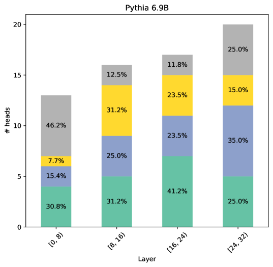
## Stacked Bar Chart: Pythia 6.9B
### Overview
The image is a stacked bar chart titled "Pythia 6.9B". It visualizes the distribution of "# heads" across different "Layer" intervals. Each bar represents a layer interval, and the bar is segmented into colored sections, each representing a percentage of the total "# heads" for that layer.
### Components/Axes
* **Title:** Pythia 6.9B
* **Y-axis:** "# heads", with a scale from 0 to 20.
* **X-axis:** "Layer", with four categories: \[0, 8), \[8, 16), \[16, 24), and \[24, 32).
* **Bar Segments (from bottom to top):**
* Teal: Represents the lowest segment of each bar.
* Purple: Represents the second segment from the bottom.
* Yellow: Represents the third segment from the bottom.
* Gray: Represents the top segment of each bar.
### Detailed Analysis
Here's a breakdown of the percentage values for each layer interval:
* **Layer \[0, 8):**
* Teal: 30.8%
* Purple: 15.4%
* Yellow: 7.7%
* Gray: 46.2%
* **Layer \[8, 16):**
* Teal: 31.2%
* Purple: 25.0%
* Yellow: 31.2%
* Gray: 12.5%
* **Layer \[16, 24):**
* Teal: 41.2%
* Purple: 23.5%
* Yellow: 23.5%
* Gray: 11.8%
* **Layer \[24, 32):**
* Teal: 25.0%
* Purple: 35.0%
* Yellow: 15.0%
* Gray: 25.0%
### Key Observations
* The teal segment (bottom) is largest in the \[16, 24) layer, representing 41.2%.
* The gray segment (top) is largest in the \[0, 8) layer, representing 46.2%.
* The distribution of percentages across segments varies significantly between layers.
### Interpretation
The chart illustrates how the "# heads" are distributed across different layers in the Pythia 6.9B model. The varying percentages suggest that different layers may have different characteristics or roles within the model. For example, the \[0, 8) layer has a high percentage in the gray segment, while the \[16, 24) layer has a high percentage in the teal segment. This could indicate that certain types of heads are more prevalent in specific layers.