## Combined Chart: Conductance Histograms and PCM Count vs. Epoch
### Overview
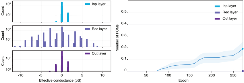
The image presents two charts side-by-side. The left side shows three histograms representing the distribution of effective conductance for the Input (Inp), Recurrent (Rec), and Output (Out) layers. The right side displays a line graph showing the number of Phase Change Memories (PCMs) over Epochs for the same three layers, with a shaded region indicating uncertainty.
### Components/Axes
**Left Side: Histograms**
* **Y-axis (all histograms):** "Count" - Logarithmic scale from 10^0 to 10^3.
* **X-axis (all histograms):** "Effective conductance (µS)" - Linear scale from -10 to 10.
* **Histograms (top to bottom):**
* **Inp layer:** Light blue bars.
* **Rec layer:** Purple bars.
* **Out layer:** Dark purple bars.
**Right Side: Line Graph**
* **Y-axis:** "Number of PCMs" - Linear scale from 0 to 0.5.
* **X-axis:** "Epoch" - Linear scale from 0 to 250.
* **Data Series:**
* **Inp layer:** Light blue line with a shaded region around it.
* **Rec layer:** Purple line (not visible on the graph).
* **Out layer:** Dark purple line (horizontal line at 0).
### Detailed Analysis
**Left Side: Histograms**
* **Inp layer (Light Blue):** The distribution is heavily concentrated around a positive conductance value, approximately between 1 and 3 µS, with a peak count near 10^3. There are also smaller peaks around 5 µS.
* **Rec layer (Purple):** The distribution is broader, ranging from approximately -10 µS to 10 µS. It appears to be roughly symmetrical around 0 µS, with multiple peaks between -5 µS and 5 µS. The highest count is approximately 10^3.
* **Out layer (Dark Purple):** The distribution is concentrated around 0 µS, with a peak count near 10^2. There's a smaller peak around 3 µS.
**Right Side: Line Graph**
* **Inp layer (Light Blue):** The number of PCMs starts at 0 until approximately Epoch 75. It then increases gradually until Epoch 150, where it reaches approximately 0.1. From Epoch 150 to 250, it continues to increase, reaching approximately 0.2 at Epoch 250. The shaded region indicates the uncertainty around this line.
* **Rec layer (Purple):** The line is not visible on the graph, suggesting it remains at or near 0 across all epochs.
* **Out layer (Dark Purple):** The number of PCMs remains at 0 across all epochs.
### Key Observations
* The Inp layer shows a strong preference for positive conductance values.
* The Rec layer exhibits a more balanced distribution of conductance values, centered around zero.
* The Out layer has a high concentration of conductance values near zero.
* The number of PCMs in the Inp layer increases with the number of epochs.
* The Rec and Out layers show minimal to no change in the number of PCMs over epochs.
### Interpretation
The histograms suggest that the different layers in the neural network have distinct conductance profiles. The Inp layer seems to be biased towards positive conductance, while the Rec layer has a more balanced distribution. The Out layer is concentrated around zero, possibly indicating a different role in the network's operation.
The line graph indicates that the Inp layer's PCMs are being utilized and adjusted during training (as epochs increase), while the Rec and Out layers remain relatively inactive in terms of PCM usage. This could imply that the Inp layer is crucial for learning and adapting to the input data, while the other layers might have different functions or require different training strategies. The shaded region around the Inp layer line suggests that there is some variability or uncertainty in the number of PCMs being used at each epoch.