## Line Chart: Test Loss vs. Compute (Power-Law Scaling)
### Overview
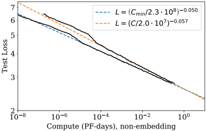
The image displays a line chart on a log-log scale, illustrating the relationship between model test loss and the amount of computational resources used for training (measured in PetaFLOP-days, excluding embedding parameters). The chart features three lines: two dashed trend lines representing theoretical power-law scaling models and one solid black line representing empirical data. The overall trend shows test loss decreasing as compute increases, following a power-law relationship.
### Components/Axes
* **Y-Axis (Vertical):**
* **Label:** "Test Loss"
* **Scale:** Logarithmic, ranging from 2 to 7. Major tick marks are at 2, 3, 4, 5, 6, and 7.
* **X-Axis (Horizontal):**
* **Label:** "Compute (PF-days), non-embedding"
* **Scale:** Logarithmic, ranging from 10⁻⁸ to 10⁰ (1). Major tick marks are at 10⁻⁸, 10⁻⁶, 10⁻⁴, 10⁻², and 10⁰.
* **Legend:**
* **Position:** Top-right corner of the chart area.
* **Content:** Two entries, each associating a dashed line style with a mathematical equation.
1. **Blue Dashed Line:** `L = (C_min / 2.3 · 10⁸)⁻⁰.⁰⁵⁰`
2. **Orange Dashed Line:** `L = (C / 2.0 · 10⁷)⁻⁰.⁰⁵⁷`
* **Note:** The equations use `L` for Loss and `C` or `C_min` for Compute. The notation `·` represents multiplication.
### Detailed Analysis
* **Empirical Data (Solid Black Line):**
* **Trend:** The line slopes consistently downward from left to right, indicating that test loss decreases as compute increases. The slope is not perfectly smooth; there are minor fluctuations, particularly a slight flattening or bump between approximately 10⁻⁴ and 10⁻² PF-days.
* **Key Data Points (Approximate):**
* At ~10⁻⁷ PF-days: Loss ≈ 6.2
* At ~10⁻⁶ PF-days: Loss ≈ 5.5
* At ~10⁻⁴ PF-days: Loss ≈ 4.2
* At ~10⁻² PF-days: Loss ≈ 3.2
* At ~10⁰ PF-days: Loss ≈ 2.5
* **Theoretical Models (Dashed Lines):**
* **Blue Dashed Line (`L ∝ C⁻⁰.⁰⁵⁰`):** This line runs slightly below the black empirical line for most of the range. It starts near a loss of 6.2 at 10⁻⁸ PF-days and ends near a loss of 2.5 at 10⁰ PF-days. Its slope is slightly shallower than the orange line.
* **Orange Dashed Line (`L ∝ C⁻⁰.⁰⁵⁷`):** This line starts higher than both other lines (loss ~7.2 at 10⁻⁸ PF-days) but crosses below the black line around 10⁻⁵ PF-days. It ends at the lowest point on the chart (loss ~2.3 at 10⁰ PF-days). Its steeper slope (exponent -0.057 vs. -0.050) means it predicts a faster reduction in loss with increased compute.
### Key Observations
1. **Power-Law Relationship:** All three lines demonstrate a clear linear relationship on this log-log plot, which is the signature of a power-law function (Loss ∝ Compute^exponent).
2. **Model Fit:** The empirical data (black line) lies between the two theoretical models for most of the compute range. The orange model (`exponent = -0.057`) appears to be a better fit for the data at very high compute levels (>10⁻² PF-days), while the blue model (`exponent = -0.050`) is closer at lower compute levels.
3. **Diminishing Returns:** The negative exponents (both around -0.05) indicate diminishing returns. A tenfold increase in compute (e.g., from 10⁻⁶ to 10⁻⁵) results in only a modest reduction in loss (multiplied by 10^(-0.05) ≈ 0.89, or an ~11% decrease).
4. **Anomaly/Feature:** The solid black line shows a subtle deviation from a perfect power law between 10⁻⁴ and 10⁻² PF-days, where the rate of loss improvement slows temporarily before resuming its downward trend.
### Interpretation
This chart is a classic representation of **scaling laws** in machine learning, specifically for neural language models. It empirically validates the hypothesis that model performance (measured by test loss) improves predictably as more computational resources are dedicated to training, following a power-law distribution.
* **What the data suggests:** The primary insight is that throwing more compute at the problem is a reliable, if inefficient, way to improve model performance. The specific exponents (-0.050 and -0.057) quantify this efficiency. The fact that the empirical data closely follows these theoretical lines suggests the underlying scaling phenomenon is robust.
* **How elements relate:** The legend's equations are not just labels; they are predictive models. The chart's purpose is to compare these models against real-world data (the black line). The close alignment validates the models' utility for forecasting the compute required to reach a target loss level.
* **Notable implications:** The principle of diminishing returns is critical for resource planning. To halve the loss, one would need to increase compute by a factor of roughly 2^(1/0.05) ≈ 1.4 million times, highlighting the immense cost of pushing the state-of-the-art. The minor deviation in the black line could indicate a transition point in training dynamics, a change in model architecture scale, or simply noise in the experimental data. This chart would be fundamental for making strategic decisions about model size and training budget in a research or industrial setting.