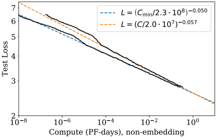
## Chart: Test Loss vs. Compute
### Overview
The image is a log-log plot showing the relationship between Test Loss and Compute (PF-days, non-embedding). Two trend lines are overlaid on the plot, representing different power-law relationships. The x-axis (Compute) ranges from 10^-8 to 10^0, and the y-axis (Test Loss) ranges from 2 to 7.
### Components/Axes
* **X-axis:** Compute (PF-days, non-embedding). Logarithmic scale from 10^-8 to 10^0.
* **Y-axis:** Test Loss. Linear scale from 2 to 7.
* **Legend (Top-Right):**
* Blue dashed line: L = (Cmin/2.3 * 10^8)^-0.050
* Orange dashed line: L = (C/2.0 * 10^7)^-0.057
* **Data Series:** A black line represents the observed test loss as a function of compute.
### Detailed Analysis
* **Black Line (Observed Test Loss):** The black line shows a decreasing trend as compute increases. The line is not smooth, showing some plateaus and steeper drops.
* At Compute = 10^-8, Test Loss is approximately 6.3.
* At Compute = 10^-6, Test Loss is approximately 5.8.
* At Compute = 10^-4, Test Loss is approximately 4.5.
* At Compute = 10^-2, Test Loss is approximately 3.3.
* At Compute = 10^0, Test Loss is approximately 2.3.
* **Blue Dashed Line (L = (Cmin/2.3 * 10^8)^-0.050):** This line represents a power-law relationship. It starts at approximately 6.2 at Compute = 10^-8 and decreases to approximately 2.2 at Compute = 10^0.
* **Orange Dashed Line (L = (C/2.0 * 10^7)^-0.057):** This line also represents a power-law relationship. It starts at approximately 6.7 at Compute = 10^-8 and decreases to approximately 2.2 at Compute = 10^0.
### Key Observations
* The observed test loss (black line) generally follows a decreasing trend as compute increases, which is expected.
* The blue and orange dashed lines provide a model for the relationship between test loss and compute.
* The black line is above the blue line for most of the range, indicating that the observed test loss is generally higher than predicted by the blue line model.
* The black line is initially below the orange line, but crosses it around Compute = 10^-2.
* The black line exhibits some plateaus, suggesting diminishing returns in test loss reduction for certain ranges of compute.
### Interpretation
The plot illustrates the relationship between computational resources (Compute) and the resulting performance of a model (Test Loss). The decreasing trend of the black line indicates that increasing compute generally leads to lower test loss, which means better model performance. The power-law relationships represented by the blue and orange dashed lines provide a way to model and predict this relationship. The differences between the observed test loss (black line) and the model predictions (blue and orange lines) suggest that the power-law models are approximations and may not perfectly capture the complex dynamics of the system. The plateaus in the black line suggest that there may be diminishing returns in terms of test loss reduction as compute increases, and that other factors may be limiting performance.