\n
## Line Chart: Effective Dimension vs. Sample Size
### Overview
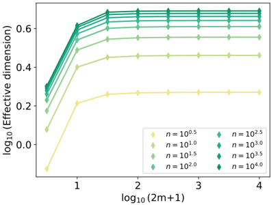
The image presents a line chart illustrating the relationship between the logarithm base 10 of the effective dimension and the logarithm base 10 of (2m+1), where 'm' likely represents the sample size. The chart displays multiple lines, each representing a different value of 'n', also expressed as a logarithm base 10. The chart aims to demonstrate how the effective dimension scales with increasing sample size for different values of 'n'.
### Components/Axes
* **X-axis Title:** log₁₀(2m+1)
* **X-axis Scale:** Ranges from approximately 0.8 to 4.0, with tick marks at 1, 2, 3, and 4.
* **Y-axis Title:** log₁₀(Effective dimension)
* **Y-axis Scale:** Ranges from approximately 0.0 to 0.75, with tick marks at 0.2, 0.4, and 0.6.
* **Legend:** Located in the bottom-right corner of the chart.
* Yellow line: n = 10⁰.⁵
* Light Green line: n = 10¹.⁰
* Medium Green line: n = 10¹.⁵
* Dark Green line: n = 10².⁰
* Dark Teal line: n = 10².⁵
* Teal line: n = 10³.⁰
* Darker Teal line: n = 10³.⁵
* Darkest Teal line: n = 10⁴.⁰
### Detailed Analysis
The chart contains eight distinct lines, each representing a different value of 'n'.
* **n = 10⁰.⁵ (Yellow Line):** This line starts at approximately 0.05 at x=0.8, rises sharply to approximately 0.23 at x=1.0, and then plateaus around 0.25 for x values greater than 1.5.
* **n = 10¹.⁰ (Light Green Line):** This line starts at approximately 0.1 at x=0.8, rises to approximately 0.35 at x=1.0, and then plateaus around 0.4 for x values greater than 1.5.
* **n = 10¹.⁵ (Medium Green Line):** This line starts at approximately 0.15 at x=0.8, rises to approximately 0.45 at x=1.0, and then plateaus around 0.5 for x values greater than 1.5.
* **n = 10².⁰ (Dark Green Line):** This line starts at approximately 0.2 at x=0.8, rises to approximately 0.55 at x=1.0, and then plateaus around 0.6 for x values greater than 1.5.
* **n = 10².⁵ (Dark Teal Line):** This line starts at approximately 0.25 at x=0.8, rises to approximately 0.6 at x=1.0, and then plateaus around 0.65 for x values greater than 1.5.
* **n = 10³.⁰ (Teal Line):** This line starts at approximately 0.3 at x=0.8, rises to approximately 0.65 at x=1.0, and then plateaus around 0.7 for x values greater than 1.5.
* **n = 10³.⁵ (Darker Teal Line):** This line starts at approximately 0.35 at x=0.8, rises to approximately 0.7 at x=1.0, and then plateaus around 0.72 for x values greater than 1.5.
* **n = 10⁴.⁰ (Darkest Teal Line):** This line starts at approximately 0.4 at x=0.8, rises to approximately 0.72 at x=1.0, and then plateaus around 0.73 for x values greater than 1.5.
All lines exhibit a steep increase in effective dimension for x values less than approximately 1.5, after which the increase slows down significantly, and the lines tend to converge towards a plateau.
### Key Observations
* The effective dimension increases with both increasing 'm' (sample size) and increasing 'n'.
* The rate of increase in effective dimension diminishes as 'm' increases, suggesting diminishing returns.
* For larger values of 'm' (x > 2), the lines representing different values of 'n' converge, indicating that the effective dimension becomes less sensitive to changes in 'n'.
* The yellow line (n = 10⁰.⁵) consistently exhibits the lowest effective dimension across all values of 'm'.
* The darkest teal line (n = 10⁴.⁰) consistently exhibits the highest effective dimension across all values of 'm'.
### Interpretation
The chart demonstrates the relationship between sample size, the parameter 'n', and the effective dimension of a system. The effective dimension represents the number of independent variables needed to describe the system. As the sample size ('m') increases, the system becomes more complex, and the effective dimension increases. However, the rate of increase diminishes, suggesting that beyond a certain point, adding more data does not significantly increase the complexity of the system.
The parameter 'n' appears to control the inherent complexity of the system. Higher values of 'n' lead to higher effective dimensions, even for small sample sizes. The convergence of the lines for larger 'm' suggests that the influence of 'n' becomes less pronounced as the sample size grows, and the effective dimension is primarily determined by the sample size itself.
This type of analysis is common in fields like machine learning and statistical modeling, where understanding the effective dimension is crucial for model selection, regularization, and generalization performance. The chart suggests that there is a trade-off between sample size and the inherent complexity of the system, and that choosing appropriate values for both is essential for building accurate and reliable models.