## Line Chart: Effective Dimension Scaling with Parameter m and n
### Overview
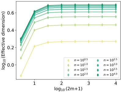
The image is a line chart plotted on a logarithmic scale, illustrating the relationship between the effective dimension (y-axis) and a parameter derived from `m` (x-axis), across multiple values of a parameter `n`. The chart demonstrates how the effective dimension increases with `m` and saturates at different levels depending on the value of `n`.
### Components/Axes
* **Chart Type:** Multi-line chart with markers.
* **X-Axis:**
* **Label:** `log10(2m+1)`
* **Scale:** Logarithmic (base 10). Major tick marks are at 1, 2, 3, and 4.
* **Range:** Approximately 0.5 to 4.0.
* **Y-Axis:**
* **Label:** `log10(Effective dimension)`
* **Scale:** Logarithmic (base 10). Major tick marks are at 0.0, 0.2, 0.4, and 0.6.
* **Range:** Approximately -0.1 to 0.7.
* **Legend:**
* **Position:** Bottom-right corner of the plot area.
* **Content:** Eight data series, each corresponding to a different value of `n`. The values are presented in scientific notation as powers of 10.
* **Series (from bottom to top in legend, corresponding to lines from lowest to highest plateau):**
1. `n = 10^0.5` (Light yellow, diamond marker)
2. `n = 10^1.0` (Light green, diamond marker)
3. `n = 10^1.5` (Medium green, diamond marker)
4. `n = 10^2.0` (Green, diamond marker)
5. `n = 10^2.5` (Teal, diamond marker)
6. `n = 10^3.0` (Darker teal, diamond marker)
7. `n = 10^3.5` (Dark green, diamond marker)
8. `n = 10^4.0` (Darkest green, diamond marker)
### Detailed Analysis
**Trend Verification:** All eight data series follow the same qualitative trend: a steep, near-linear increase in `log10(Effective dimension)` as `log10(2m+1)` increases from ~0.5 to ~1.5, followed by a clear saturation (plateau) where the effective dimension becomes largely independent of `m` for `log10(2m+1) > ~2`.
**Data Point Extraction (Approximate Values):**
| n (Value) | Color (Approx.) | At x ≈ 0.5 (log10(2m+1)) | At x ≈ 1.0 | At x ≈ 1.5 (Start of Plateau) | Plateau Level (y-value for x > 2) |
| :--- | :--- | :--- | :--- | :--- | :--- |
| **10^0.5** | Light Yellow | y ≈ -0.1 | y ≈ 0.2 | y ≈ 0.25 | **~0.25** |
| **10^1.0** | Light Green | y ≈ 0.05 | y ≈ 0.35 | y ≈ 0.45 | **~0.45** |
| **10^1.5** | Medium Green | y ≈ 0.15 | y ≈ 0.45 | y ≈ 0.55 | **~0.55** |
| **10^2.0** | Green | y ≈ 0.2 | y ≈ 0.5 | y ≈ 0.6 | **~0.60** |
| **10^2.5** | Teal | y ≈ 0.25 | y ≈ 0.55 | y ≈ 0.65 | **~0.65** |
| **10^3.0** | Darker Teal | y ≈ 0.28 | y ≈ 0.58 | y ≈ 0.68 | **~0.68** |
| **10^3.5** | Dark Green | y ≈ 0.3 | y ≈ 0.6 | y ≈ 0.7 | **~0.70** |
| **10^4.0** | Darkest Green | y ≈ 0.32 | y ≈ 0.62 | y ≈ 0.72 | **~0.72** |
**Spatial Grounding:** The legend is placed in the bottom-right quadrant, overlapping the plateau region of the lower lines. The lines are ordered consistently: for any given x-value, the line corresponding to a higher `n` is always positioned above the line for a lower `n`.
### Key Observations
1. **Saturation Effect:** The most prominent feature is the saturation of the effective dimension. For all `n`, increasing the parameter `m` (via `2m+1`) beyond a threshold (`log10(2m+1) ≈ 2`) yields negligible increase in the effective dimension.
2. **Monotonic Dependence on n:** The plateau level of the effective dimension is a strictly increasing function of `n`. Larger `n` values lead to a higher maximum effective dimension.
3. **Convergence of Initial Slopes:** In the initial growth phase (`log10(2m+1) < 1.5`), the slopes of all lines appear very similar, suggesting the rate of growth with respect to `m` is initially independent of `n`.
4. **Diminishing Returns with n:** The vertical spacing between the plateau levels decreases as `n` increases. The jump from `n=10^0.5` to `n=10^1.0` is large (~0.2 in log space), while the jump from `n=10^3.5` to `n=10^4.0` is much smaller (~0.02). This indicates a logarithmic or sub-linear relationship between the saturated effective dimension and `n`.
### Interpretation
This chart likely visualizes a concept from high-dimensional statistics, machine learning, or computational complexity, where "effective dimension" measures the useful degrees of freedom or complexity of a model or system.
* **What the data suggests:** The system's complexity (effective dimension) grows with the resource parameter `m` but eventually hits a ceiling determined by the intrinsic parameter `n`. This is characteristic of models where capacity is limited by one factor (`n`) even if another resource (`m`) is increased.
* **Relationship between elements:** `m` and `n` are two different control parameters. `m` appears to be a resource that can be scaled up (like sample size, iterations, or network width), while `n` seems to be a more fundamental constraint (like ambient dimension, true model order, or a regularization parameter). The chart shows that scaling `m` is only beneficial up to a point defined by `n`.
* **Notable Anomalies/Patterns:** The perfect ordering and consistent shape of the curves suggest this is likely a theoretical or empirical result from a well-defined mathematical model, rather than noisy experimental data. The clear saturation implies a phase transition or a fundamental limit. The diminishing returns with increasing `n` are critical for practical applications, as they show that beyond a certain point, increasing `n` provides minimal gain in effective model complexity.