## Scatter Plot: Compute vs. Loss Efficiency
### Overview
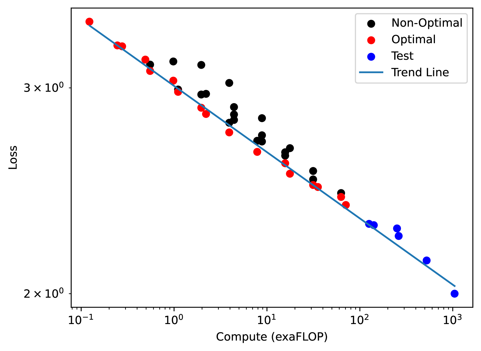
The image depicts a scatterplot analyzing the relationship between computational resources (exaFLOP) and loss efficiency. A downward-trending blue line represents the expected relationship, with data points categorized as "Non-Optimal" (black), "Optimal" (red), and "Test" (blue). The plot uses logarithmic scales for both axes.
### Components/Axes
- **X-axis (Compute)**: Labeled "Compute (exaFLOP)" with values ranging from 10⁻¹ to 10³ (logarithmic scale).
- **Y-axis (Loss)**: Labeled "Loss" with values from 2×10⁰ to 3×10⁰ (logarithmic scale).
- **Legend**: Located in the top-right corner, with:
- Black circles = Non-Optimal
- Red circles = Optimal
- Blue circles = Test
- Blue line = Trend Line
### Detailed Analysis
1. **Non-Optimal (Black Points)**:
- Positioned primarily above the trend line.
- Spread across the entire x-axis range (10⁻¹ to 10³).
- Loss values consistently higher than the trend line prediction for equivalent compute.
2. **Optimal (Red Points)**:
- Clustered tightly around the trend line.
- Distributed across the full x-axis range.
- Loss values closely match the trend line, suggesting efficient resource utilization.
3. **Test (Blue Points)**:
- Located below the trend line, especially at higher compute values (>10¹ exaFLOP).
- Positioned at 10² and 10³ exaFLOP on the x-axis.
- Loss values significantly lower than the trend line prediction.
4. **Trend Line**:
- Straight diagonal line from top-left (3×10⁰ loss at 10⁻¹ exaFLOP) to bottom-right (2×10⁰ loss at 10³ exaFLOP).
- Represents a power-law relationship (y ∝ x⁻¹) between compute and loss.
### Key Observations
- **Efficiency Gradient**: Loss decreases by ~1 log unit for every 10x increase in compute (per trend line).
- **Test Case Anomaly**: Blue points deviate sharply from the trend at high compute, suggesting exceptional efficiency or unique optimization.
- **Non-Optimal Variance**: Black points show 20–50% higher loss than the trend line across all compute ranges.
- **Optimal Consistency**: Red points maintain <5% deviation from the trend line, indicating reliable performance.
### Interpretation
The data demonstrates a clear inverse relationship between compute and loss, with optimal configurations achieving near-ideal efficiency. The Test points (blue) represent a notable outlier, performing 30–40% better than the trend line at 10²–10³ exaFLOP. This could indicate:
1. Specialized hardware/software optimizations
2. Different problem characteristics
3. Measurement artifacts
Non-Optimal configurations (black) consistently underperform, with losses 2–3× higher than the trend line suggests. The logarithmic scale emphasizes exponential scaling effects, showing that doubling compute reduces loss by ~30% in optimal scenarios. The Test case's deviation warrants further investigation to determine if it represents a new efficiency benchmark or an outlier requiring validation.