## Line Graphs: Risk Reduction Over Training Time
### Overview
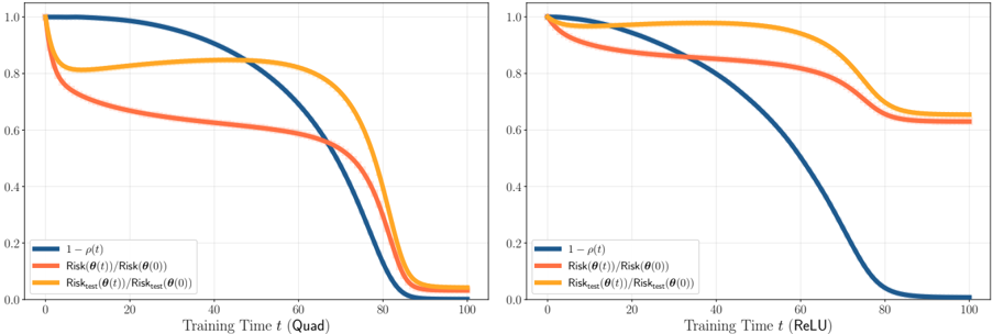
Two side-by-side line graphs compare the evolution of risk metrics during training under two activation functions: "Quad" (left) and "ReLU" (right). Each graph tracks three metrics:
1. **1 - ρ(t)** (blue line)
2. **Risk(θ(t))/Risk(θ(0))** (orange line)
3. **Risk_test(θ(t))/Risk_test(θ(0))** (red line)
### Components/Axes
- **X-axis (Left Graph)**: "Training Time t (Quad)" with values from 0 to 100.
- **X-axis (Right Graph)**: "Training Time t (ReLU)" with values from 0 to 100.
- **Y-axis (Both Graphs)**: "1 - ρ(t)" (blue line) and ratios of risk at time *t* to initial risk (orange/red lines).
- **Legends**: Positioned on the left of each graph, with color-coded labels matching the lines.
### Detailed Analysis
#### Left Graph (Quad Activation)
- **Blue Line (1 - ρ(t))**: Starts at 1.0, decreases sharply to ~0.2 by t=60, then plateaus.
- **Orange Line (Risk(θ(t))/Risk(θ(0)))**: Begins at ~0.8, drops to ~0.4 by t=40, then stabilizes.
- **Red Line (Risk_test(θ(t))/Risk_test(θ(0)))**: Starts at ~0.6, declines to ~0.3 by t=60, then plateaus.
#### Right Graph (ReLU Activation)
- **Blue Line (1 - ρ(t))**: Similar to the left graph but with a slower initial decline, reaching ~0.2 by t=80.
- **Orange Line (Risk(θ(t))/Risk(θ(0)))**: Starts at ~0.9, decreases to ~0.5 by t=60, then plateaus.
- **Red Line (Risk_test(θ(t))/Risk_test(θ(0)))**: Begins at ~0.7, drops to ~0.4 by t=60, then stabilizes.
### Key Observations
1. **Blue Line (1 - ρ(t))**: Represents the inverse of the risk function. Both graphs show a monotonic decline, but the ReLU graph has a slower initial drop.
2. **Orange Line (Training Risk Ratio)**: Both graphs show a sharp decline in training risk, but the ReLU graph starts higher and declines more gradually.
3. **Red Line (Test Risk Ratio)**: Test risk decreases similarly in both graphs, but the ReLU graph exhibits a slightly slower decline.
4. **Divergence at Early Training**: The ReLU graph shows higher initial values for all metrics compared to the Quad graph, suggesting slower early progress.
### Interpretation
- **Risk Reduction Dynamics**: The blue line (1 - ρ(t)) indicates that the model’s risk reduction accelerates early in training (Quad) but slows under ReLU. This suggests ReLU may require longer training to achieve similar risk reduction.
- **Training vs. Test Risk**: The orange and red lines (training and test risk ratios) both decline, but the test risk (red line) lags slightly behind training risk (orange line) in both cases. This implies potential overfitting, though the gap narrows over time.
- **Activation Function Impact**: The Quad activation achieves faster risk reduction initially, while ReLU shows more gradual progress. This could reflect differences in gradient dynamics or optimization landscapes between the two activation functions.
### Notable Trends
- **Plateauing Behavior**: All metrics eventually plateau, indicating diminishing returns in risk reduction after a certain training duration.
- **Consistency Across Metrics**: The blue line (1 - ρ(t)) consistently aligns with the orange and red lines, suggesting a direct relationship between the inverse risk function and the risk ratios.
### Conclusion
The graphs demonstrate that training time significantly impacts risk reduction, with activation function choice influencing the rate of convergence. Quad activation achieves faster initial progress, while ReLU may require extended training for comparable results. The test risk (red line) lags behind training risk, highlighting the need for careful regularization to avoid overfitting.