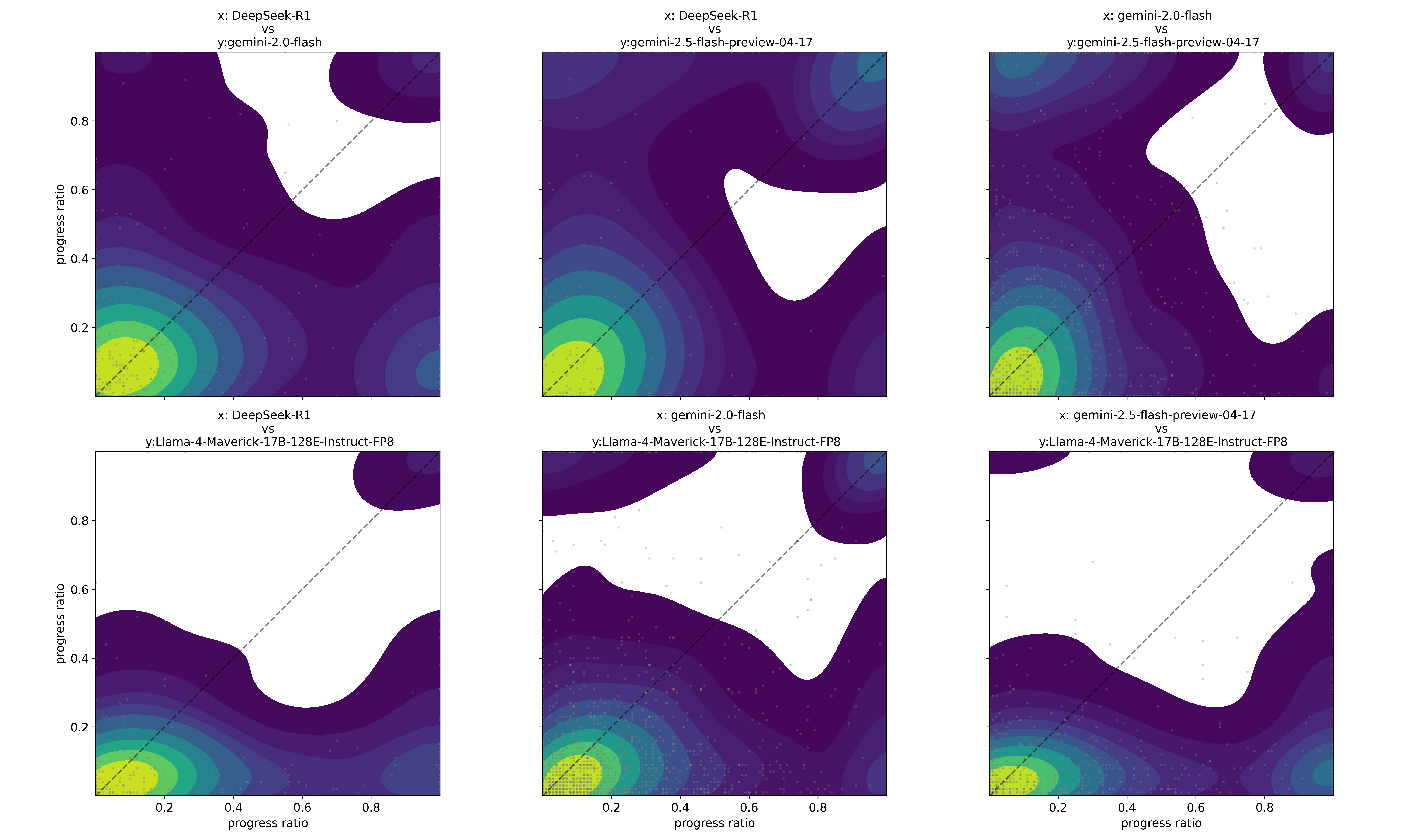
## Chart Type: Density Scatter Plots
### Overview
The image presents six density scatter plots arranged in a 2x3 grid. Each plot compares the "progress ratio" of two different language models. The x and y axes represent the progress ratio for each model, ranging from 0 to 1. The density of points is indicated by color, with yellow/green representing higher density and purple representing lower density. A dashed diagonal line is present in each plot, representing the line of equality where both models have the same progress ratio.
### Components/Axes
* **X-axis:** Progress ratio, ranging from 0 to 1, with tick marks at 0.2, 0.4, 0.6, and 0.8.
* **Y-axis:** Progress ratio, ranging from 0 to 1, with tick marks at 0.2, 0.4, 0.6, and 0.8.
* **Diagonal Line:** Dashed line representing x = y, indicating equal progress ratios.
* **Color Density:** Yellow/Green indicates high density of data points, while Purple indicates low density.
* **Titles:** Each plot has a title indicating the models being compared.
### Detailed Analysis
**Top Row:**
1. **Top-Left Plot:**
* X-axis: DeepSeek-R1
* Y-axis: gemini-2.0-flash
* High-density region: Located near the origin (0,0), indicating that both models frequently have low progress ratios.
* Trend: The density decreases as the progress ratio increases for both models.
2. **Top-Middle Plot:**
* X-axis: DeepSeek-R1
* Y-axis: gemini-2.5-flash-preview-04-17
* High-density region: Located near the origin (0,0).
* Trend: Similar to the top-left plot, density decreases as progress ratio increases.
3. **Top-Right Plot:**
* X-axis: gemini-2.0-flash
* Y-axis: gemini-2.5-flash-preview-04-17
* High-density region: Located near the origin (0,0).
* Trend: Density decreases as progress ratio increases.
**Bottom Row:**
1. **Bottom-Left Plot:**
* X-axis: DeepSeek-R1
* Y-axis: Llama-4-Maverick-17B-128E-Instruct-FP8
* High-density region: Located near the origin (0,0).
* Trend: Density decreases as progress ratio increases.
2. **Bottom-Middle Plot:**
* X-axis: gemini-2.0-flash
* Y-axis: Llama-4-Maverick-17B-128E-Instruct-FP8
* High-density region: Located near the origin (0,0).
* Trend: Density decreases as progress ratio increases.
3. **Bottom-Right Plot:**
* X-axis: gemini-2.5-flash-preview-04-17
* Y-axis: Llama-4-Maverick-17B-128E-Instruct-FP8
* High-density region: Located near the origin (0,0).
* Trend: Density decreases as progress ratio increases.
### Key Observations
* All plots show a high concentration of data points near the origin (0,0), indicating that all model pairs frequently exhibit low progress ratios.
* The density generally decreases as the progress ratio increases for all model pairs.
* The plots do not show a strong correlation along the diagonal line, suggesting that the models often have different progress ratios.
* There are some regions of higher density away from the origin, but they are less pronounced than the density near the origin.
### Interpretation
The density scatter plots suggest that the language models being compared tend to perform poorly (low progress ratio) more often than they perform well. The lack of strong correlation along the diagonal indicates that the models' performance is not consistently aligned; one model may perform better than the other in many cases. The plots do not provide information about the specific tasks or datasets used to evaluate the models, so it is difficult to draw more specific conclusions about their relative strengths and weaknesses. The plots primarily highlight the frequency of low progress ratios across different model pairings.