\n
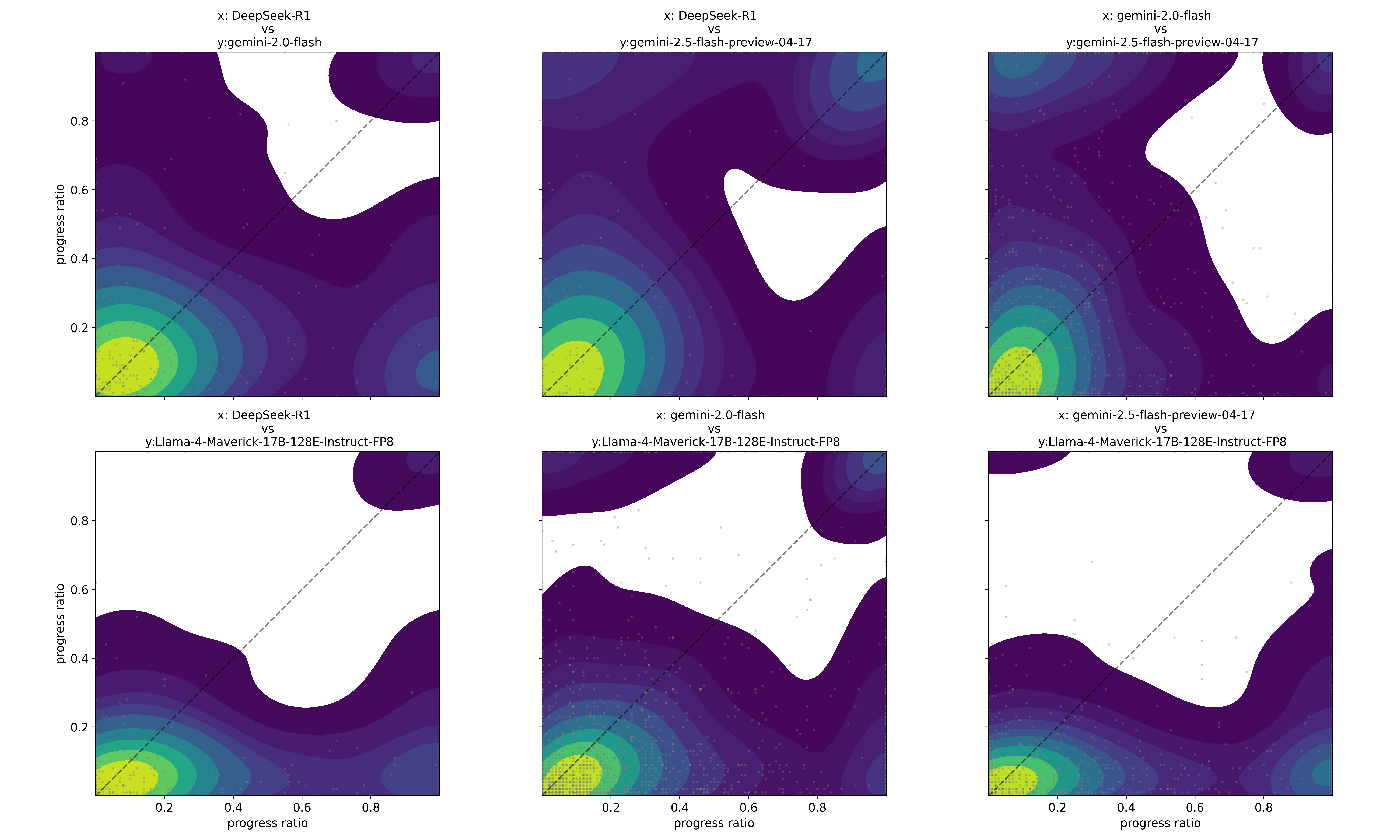
## Heatmaps: Model Comparison - Progress Ratio vs. Progress Ratio
### Overview
The image presents a 3x3 grid of heatmaps, each comparing two different models based on their "progress ratio" values. The heatmaps visualize the relationship between the progress ratio of one model (x-axis) and the progress ratio of another (y-axis). The color intensity represents the frequency or density of occurrences for specific combinations of progress ratios. Each heatmap has a dashed diagonal line.
### Components/Axes
Each heatmap shares the following components:
* **X-axis Label:** "progress ratio" (ranging from approximately 0.2 to 0.8)
* **Y-axis Label:** "progress ratio" (ranging from approximately 0.2 to 0.8)
* **Color Scale:** A gradient from dark purple (low density) to yellow/light green (high density).
* **Diagonal Line:** A dashed line running from the bottom-left to the top-right corner of each heatmap.
The specific model comparisons are as follows:
1. Top-Left: x: DeepSeek-R1 vs y: gemini-2.0-flash
2. Top-Center: x: DeepSeek-R1 vs y: gemini-2.5-flash-preview-04-17
3. Top-Right: x: gemini-2.0-flash vs y: gemini-2.5-flash-preview-04-17
4. Bottom-Left: x: DeepSeek-R1 vs y: Llama-4-Maverick-17B-128E-Instruct-FP8
5. Bottom-Center: x: gemini-2.0-flash vs y: Llama-4-Maverick-17B-128E-Instruct-FP8
6. Bottom-Right: x: gemini-2.5-flash-preview-04-17 vs y: Llama-4-Maverick-17B-128E-Instruct-FP8
### Detailed Analysis or Content Details
Each heatmap shows a concentration of data points along the diagonal line, indicating a positive correlation between the progress ratios of the two models being compared. The density of points varies across the heatmaps.
**1. DeepSeek-R1 vs gemini-2.0-flash:**
* The highest density (yellow/light green) is concentrated around the diagonal where both progress ratios are approximately 0.4.
* Density decreases as progress ratios move away from 0.4 in either direction.
**2. DeepSeek-R1 vs gemini-2.5-flash-preview-04-17:**
* Highest density is around the diagonal where both progress ratios are approximately 0.5.
* A secondary concentration appears at lower progress ratios (around 0.2-0.3).
**3. gemini-2.0-flash vs gemini-2.5-flash-preview-04-17:**
* Highest density is around the diagonal where both progress ratios are approximately 0.5.
* The density is more spread out compared to the previous two heatmaps.
**4. DeepSeek-R1 vs Llama-4-Maverick-17B-128E-Instruct-FP8:**
* Highest density is around the diagonal where both progress ratios are approximately 0.4.
* A noticeable concentration exists at lower progress ratios for DeepSeek-R1 (around 0.2) and higher progress ratios for Llama (around 0.6-0.7).
**5. gemini-2.0-flash vs Llama-4-Maverick-17B-128E-Instruct-FP8:**
* Highest density is around the diagonal where both progress ratios are approximately 0.4.
* A secondary concentration appears at lower progress ratios for gemini-2.0-flash (around 0.2) and higher progress ratios for Llama (around 0.6-0.7).
**6. gemini-2.5-flash-preview-04-17 vs Llama-4-Maverick-17B-128E-Instruct-FP8:**
* Highest density is around the diagonal where both progress ratios are approximately 0.5.
* A secondary concentration exists at lower progress ratios for gemini-2.5-flash-preview-04-17 (around 0.2-0.3) and higher progress ratios for Llama (around 0.6-0.7).
### Key Observations
* All heatmaps exhibit a strong positive correlation along the diagonal, suggesting that when one model has a higher progress ratio, the other model tends to have a higher progress ratio as well.
* The concentration of data points varies between model pairs, indicating different relationships between their progress ratios.
* The secondary concentrations observed in some heatmaps suggest that certain models may exhibit different progress patterns.
* The diagonal line serves as a reference point for perfect correlation. Deviations from the diagonal indicate discrepancies in progress ratios between the models.
### Interpretation
These heatmaps provide a visual comparison of the progress ratios of different language models. The progress ratio itself is not defined in the image, but it likely represents a metric of task completion or performance. The concentration of data points along the diagonal suggests that the models generally perform similarly – if one model makes progress, the other does too. However, the variations in density and the presence of secondary concentrations indicate that the models have different strengths and weaknesses.
The secondary concentrations suggest that certain models might excel in specific scenarios or tasks where the other model struggles. For example, the concentration at lower progress ratios for DeepSeek-R1 and higher progress ratios for Llama-4-Maverick in the fourth heatmap suggests that Llama-4-Maverick might perform better on tasks where DeepSeek-R1 is less effective, and vice versa.
The comparison between different versions of the Gemini model (2.0-flash vs. 2.5-flash-preview-04-17) shows a slight shift in the distribution, potentially indicating improvements in the newer version. The newer version appears to have a slightly higher density at higher progress ratios.
Without knowing the specific definition of "progress ratio" and the tasks the models were evaluated on, it's difficult to draw definitive conclusions. However, these heatmaps provide valuable insights into the relative performance and behavior of these language models.