## Chart: Microlensing Event OGLE-2017-BLG-1806
### Overview
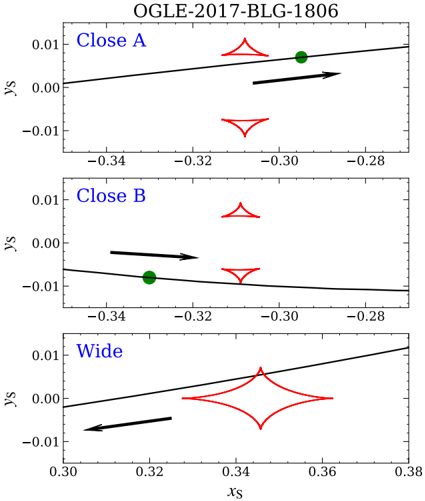
The image presents three separate charts displaying data related to a microlensing event designated OGLE-2017-BLG-1806. Each chart represents a different observational setup or filter: "Close A", "Close B", and "Wide". The charts plot the y-coordinate (Ys) against the x-coordinate (Xs), likely representing the relative positions of source, lens, and observer during the event. Each chart includes a black line representing a model fit to the data, and red symbols representing observed data points. Green dots with arrows indicate the direction of time progression.
### Components/Axes
* **Title:** OGLE-2017-BLG-1806 (top-center)
* **X-axis Label:** Xs (bottom-center of each chart)
* **Y-axis Label:** Ys (left-side of each chart)
* **Charts:** Three sub-charts labeled "Close A", "Close B", and "Wide" (top-left of each chart).
* **Data Points:** Red symbols (various shapes) representing observed data.
* **Model Fit:** Black solid lines representing the theoretical model.
* **Time Progression:** Green dots with arrows indicating the direction of time.
### Detailed Analysis or Content Details
**Close A Chart:**
* **X-axis Range:** Approximately -0.34 to -0.28
* **Y-axis Range:** Approximately -0.01 to 0.01
* **Model Fit:** The black line slopes upward with a slight positive gradient.
* **Data Points:**
* First data point (top-right): Xs ≈ -0.31, Ys ≈ 0.008
* Second data point (bottom-right): Xs ≈ -0.31, Ys ≈ -0.005
* Third data point (bottom-left): Xs ≈ -0.33, Ys ≈ -0.003
* **Time Progression:** Arrow points from left to right.
**Close B Chart:**
* **X-axis Range:** Approximately -0.34 to -0.28
* **Y-axis Range:** Approximately -0.01 to 0.01
* **Model Fit:** The black line is initially relatively flat, then curves upward.
* **Data Points:**
* First data point (top-right): Xs ≈ -0.31, Ys ≈ 0.008
* Second data point (bottom-right): Xs ≈ -0.31, Ys ≈ -0.005
* Third data point (bottom-left): Xs ≈ -0.33, Ys ≈ -0.003
* **Time Progression:** Arrow points from left to right.
**Wide Chart:**
* **X-axis Range:** Approximately 0.30 to 0.38
* **Y-axis Range:** Approximately -0.01 to 0.01
* **Model Fit:** The black line slopes upward with a positive gradient.
* **Data Points:** Multiple red symbols are present, forming a more complex pattern.
* First data point (top-right): Xs ≈ 0.34, Ys ≈ 0.006
* Second data point (center-right): Xs ≈ 0.35, Ys ≈ 0.002
* Third data point (bottom-right): Xs ≈ 0.36, Ys ≈ -0.002
* Fourth data point (bottom-left): Xs ≈ 0.32, Ys ≈ -0.004
* Fifth data point (center-left): Xs ≈ 0.31, Ys ≈ 0.001
* **Time Progression:** Arrow points from left to right.
### Key Observations
* All three charts show a general upward trend in the model fit lines.
* The "Wide" chart exhibits a more complex data pattern with more data points than the "Close A" and "Close B" charts.
* The green dots with arrows consistently indicate a progression of time from left to right in all charts.
* The data points in all charts appear to generally follow the trend of the model fit lines, but with some deviations.
### Interpretation
These charts represent the light curve of a microlensing event. Microlensing occurs when a massive object (the lens) passes between a distant source star and the observer (Earth). The gravity of the lens bends the light from the source star, causing it to appear brighter and potentially distorted.
The three charts likely represent observations taken with different filters or at different times during the event. The "Close A" and "Close B" charts might represent observations taken closer to the peak of the event, while the "Wide" chart could represent observations taken further away from the peak.
The model fit lines represent the theoretical prediction of how the light curve should look based on the properties of the lens and source star. The data points represent the actual observed brightness of the source star. The differences between the data points and the model fit lines could be due to various factors, such as noise in the data, the presence of other objects in the field of view, or inaccuracies in the model.
The upward trend in the model fit lines suggests that the lens is moving across the line of sight to the source star, causing the brightness of the source star to increase. The more complex pattern in the "Wide" chart could indicate that the event is more complex than a simple single-lens microlensing event, potentially involving multiple lenses or a binary lens system. The green arrows indicate the direction of time, allowing us to track the evolution of the microlensing event.