## Line Graphs: MSE Loss, Kendall, and Overlap Rate vs. Step
### Overview
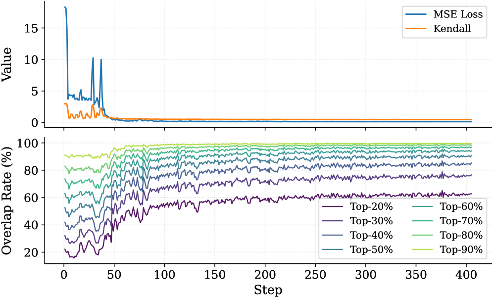
The image contains two line graphs plotted above each other. The top graph displays the MSE Loss and Kendall values against the step number. The bottom graph shows the overlap rate (%) for different top percentages (20% to 90%) against the step number.
### Components/Axes
**Top Graph:**
* **Y-axis:** "Value", ranging from 0 to 15. Axis markers are present at 0, 5, 10, and 15.
* **X-axis:** "Step", shared with the bottom graph, ranging from 0 to 400. Axis markers are present at 0, 50, 100, 150, 200, 250, 300, 350, and 400.
* **Legend (top-right):**
* Blue line: "MSE Loss"
* Orange line: "Kendall"
**Bottom Graph:**
* **Y-axis:** "Overlap Rate (%)", ranging from 20 to 100. Axis markers are present at 20, 40, 60, 80, and 100.
* **X-axis:** "Step", ranging from 0 to 400. Axis markers are present at 0, 50, 100, 150, 200, 250, 300, 350, and 400.
* **Legend (bottom-right):**
* Dark Purple line: "Top-20%"
* Purple line: "Top-30%"
* Dark Blue line: "Top-40%"
* Blue line: "Top-50%"
* Teal line: "Top-60%"
* Green line: "Top-70%"
* Light Green line: "Top-80%"
* Yellow-Green line: "Top-90%"
### Detailed Analysis
**Top Graph:**
* **MSE Loss (Blue):** The MSE Loss starts at a high value (approximately 17) and rapidly decreases within the first 50 steps. It experiences some spikes before stabilizing at a value close to 0 after approximately 100 steps.
* **Kendall (Orange):** The Kendall value starts at approximately 3, decreases rapidly within the first 50 steps, and then stabilizes at a value close to 0 after approximately 100 steps.
**Bottom Graph:**
* **Top-20% (Dark Purple):** Starts around 20%, increases to approximately 60% by step 100, and then fluctuates around 60% for the remaining steps.
* **Top-30% (Purple):** Starts around 30%, increases to approximately 70% by step 100, and then fluctuates around 70% for the remaining steps.
* **Top-40% (Dark Blue):** Starts around 40%, increases to approximately 75% by step 100, and then fluctuates around 75% for the remaining steps.
* **Top-50% (Blue):** Starts around 50%, increases to approximately 80% by step 100, and then fluctuates around 80% for the remaining steps.
* **Top-60% (Teal):** Starts around 60%, increases to approximately 85% by step 100, and then fluctuates around 85% for the remaining steps.
* **Top-70% (Green):** Starts around 70%, increases to approximately 90% by step 100, and then fluctuates around 90% for the remaining steps.
* **Top-80% (Light Green):** Starts around 75%, increases to approximately 95% by step 100, and then fluctuates around 95% for the remaining steps.
* **Top-90% (Yellow-Green):** Starts around 80%, increases to approximately 98% by step 100, and then fluctuates around 98% for the remaining steps.
### Key Observations
* Both MSE Loss and Kendall values decrease rapidly in the initial steps and stabilize around 0.
* The overlap rate for all top percentages increases rapidly in the initial steps and then fluctuates around a stable value.
* Higher top percentages generally have higher overlap rates.
* The stabilization point for both graphs appears to be around step 100.
### Interpretation
The graphs suggest that the model is learning effectively in the initial steps, as indicated by the rapid decrease in MSE Loss and Kendall values. The overlap rate also increases rapidly during this period, indicating that the model is becoming more consistent in its top predictions. After approximately 100 steps, the model's performance stabilizes, with only minor fluctuations in MSE Loss, Kendall, and overlap rates. The higher overlap rates for higher top percentages indicate that the model is more confident in its top predictions when considering a larger set of candidates. The convergence of MSE Loss and Kendall to near-zero values suggests that the model is effectively minimizing the error and improving the ranking correlation.