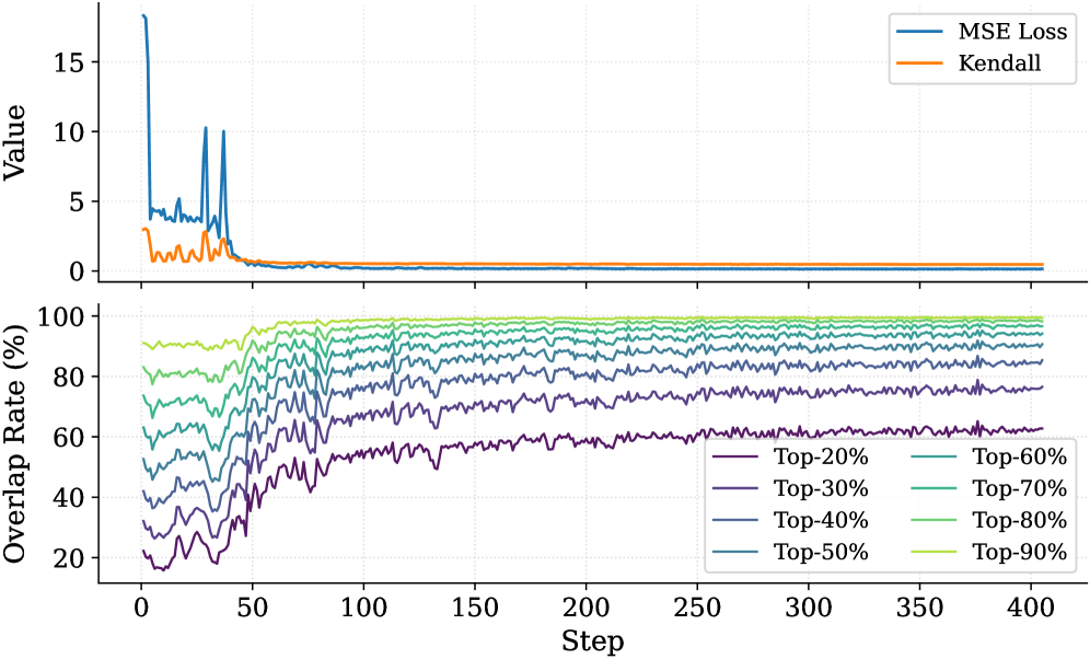
## Line Chart: Model Performance Metrics
### Overview
The image contains two line charts stacked vertically. The top chart compares two metrics (MSE Loss and Kendall) over training steps, while the bottom chart shows multiple overlapping lines representing "Overlap Rate (%)" across different percentile thresholds (Top-20% to Top-90%) over the same step range.
### Components/Axes
**Top Chart:**
- **X-axis (Step):** Ranges from 0 to 400 in increments of 50.
- **Y-axis (Value):** Ranges from 0 to 15 in increments of 5.
- **Legend:**
- Blue line: MSE Loss
- Orange line: Kendall
**Bottom Chart:**
- **X-axis (Step):** Same as top chart (0–400).
- **Y-axis (Overlap Rate %):** Ranges from 20% to 100% in increments of 20%.
- **Legend:**
- Purple: Top-20%
- Dark blue: Top-30%
- Teal: Top-40%
- Light blue: Top-50%
- Green: Top-60%
- Yellow: Top-70%
- Lime: Top-80%
- Bright yellow: Top-90%
### Detailed Analysis
**Top Chart Trends:**
1. **MSE Loss (Blue):**
- Starts with a sharp spike (~15) at Step 0, dropping to ~0.5 by Step 50.
- Remains stable at ~0.2–0.3 from Step 100 onward.
2. **Kendall (Orange):**
- Begins with a smaller spike (~3) at Step 0, declining to ~0.1 by Step 50.
- Stabilizes at ~0.05–0.1 from Step 100 onward.
**Bottom Chart Trends:**
- All lines show gradual decline over steps, with higher percentile thresholds (e.g., Top-90%) starting and ending at lower overlap rates.
- **Key Patterns:**
- Top-20% (purple) starts at ~85% and drops to ~60% by Step 400.
- Top-90% (bright yellow) starts at ~95% and decreases to ~85%.
- Lines exhibit jagged fluctuations, especially in early steps (0–100).
### Key Observations
1. **Top Chart:** Both metrics stabilize after initial volatility, suggesting convergence in model performance.
2. **Bottom Chart:**
- Higher percentile thresholds (e.g., Top-90%) maintain higher overlap rates throughout training.
- Lower thresholds (e.g., Top-20%) show steeper declines, indicating greater divergence from top-performing segments.
- Overlap rates for all thresholds plateau between Steps 200–400.
### Interpretation
The data suggests:
1. **Model Convergence:** The top chart indicates that both MSE Loss and Kendall metrics stabilize after ~100 steps, implying the model reaches a steady state.
2. **Performance Segmentation:** The bottom chart reveals that the model's predictions for higher percentile thresholds (e.g., Top-90%) remain more consistent with the "top" data segments, while lower thresholds (e.g., Top-20%) diverge significantly. This could reflect:
- **Selectivity:** The model prioritizes high-confidence predictions (Top-90%) over uncertain ones (Top-20%).
- **Training Dynamics:** Early steps may involve aggressive exploration, causing lower thresholds to overfit or underfit, while later steps refine predictions for dominant patterns.
3. **Anomalies:** The sharp initial spikes in the top chart (Step 0–50) might indicate initialization effects or data preprocessing artifacts.
**Critical Insight:** The divergence between high and low percentile overlap rates highlights potential trade-offs between model confidence and generalization. Further analysis could explore whether the Top-20% segment represents outliers or edge cases requiring specialized handling.