## Line Chart: Attention Key Query Score, a=512
### Overview
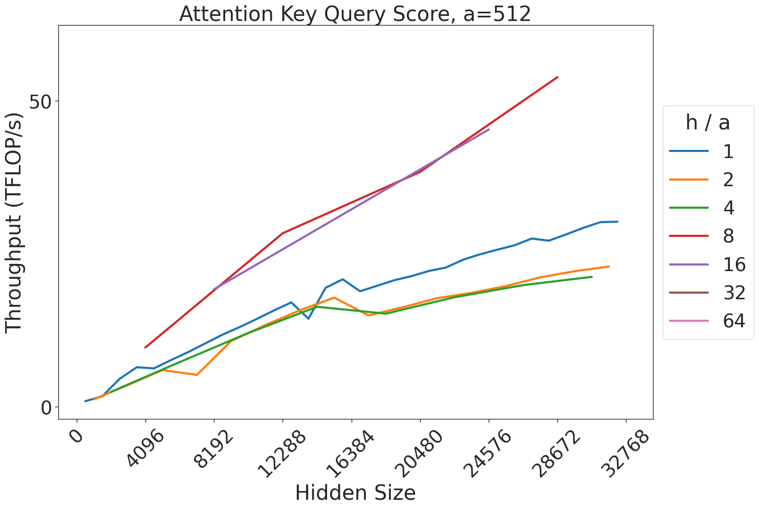
This image displays a line chart illustrating the relationship between "Hidden Size" (x-axis) and "Throughput (TFLOP/s)" (y-axis) for various "h / a" ratios. The chart is titled "Attention Key Query Score, a=512," suggesting it is a performance benchmark for a specific computational kernel (likely related to Transformer attention mechanisms) where the attention dimension ($a$) is fixed at 512.
### Components/Axes
* **Title:** "Attention Key Query Score, a=512" (Top center).
* **X-Axis:** Labeled "Hidden Size". The scale ranges from 0 to 32768. Major tick marks are provided at intervals of 4096 (0, 4096, 8192, 12288, 16384, 20480, 24576, 28672, 32768). The labels are rotated 45 degrees.
* **Y-Axis:** Labeled "Throughput (TFLOP/s)". The scale ranges from 0 to 50+.
* **Legend:** Located on the right side of the chart. It lists "h / a" (Heads / Attention dimension ratio) with the following color-coded values:
* **Blue:** 1
* **Orange:** 2
* **Green:** 4
* **Red:** 8
* **Purple:** 16
* **Brown:** 32
* **Pink:** 64
### Detailed Analysis
The chart plots five distinct data series corresponding to the "h / a" ratios 1, 2, 4, 8, and 16. Note that the legend includes values for 32 and 64, but no corresponding lines are plotted for these values.
**Data Series Trends:**
1. **Blue (h/a = 1):**
* **Trend:** Starts at (0,0) and slopes upward.
* **Behavior:** Shows significant volatility between Hidden Size 12288 and 16384, characterized by a sharp spike followed by a dip, before resuming a steady upward trajectory.
* **End Point:** At Hidden Size 32768, throughput is approximately 25 TFLOP/s.
2. **Orange (h/a = 2):**
* **Trend:** Starts at (0,0) and slopes upward.
* **Behavior:** Exhibits a dip around Hidden Size 8192, a peak around 14000, and another dip before continuing upward.
* **End Point:** At Hidden Size 32768, throughput is approximately 22 TFLOP/s.
3. **Green (h/a = 4):**
* **Trend:** Starts at (0,0) and slopes upward.
* **Behavior:** This is the smoothest line among the lower-throughput series. It generally tracks slightly below the Orange line.
* **End Point:** At Hidden Size 28672, throughput is approximately 20 TFLOP/s.
4. **Red (h/a = 8):**
* **Trend:** Starts at Hidden Size ~4096 with a throughput of ~10 TFLOP/s. It slopes steeply upward.
* **Behavior:** This series provides the highest throughput on the chart.
* **End Point:** At Hidden Size 28672, throughput is approximately 55 TFLOP/s.
5. **Purple (h/a = 16):**
* **Trend:** Starts at Hidden Size ~4096 with a throughput of ~10 TFLOP/s. It slopes steeply upward.
* **Behavior:** Tracks very closely with the Red line, though it appears to terminate slightly earlier (around Hidden Size 24576) at a throughput of ~45 TFLOP/s.
### Key Observations
* **Performance Disparity:** There is a clear performance bifurcation. The configurations with higher "h/a" ratios (8 and 16) achieve significantly higher throughput (reaching >50 TFLOP/s) compared to the lower ratios (1, 2, and 4), which struggle to exceed 25 TFLOP/s.
* **Missing Data:** The legend includes "32" and "64," but these are absent from the plot. This implies that these configurations were either not tested, failed to execute, or are not supported by the current implementation.
* **Volatility:** The lower "h/a" ratios (1 and 2) exhibit non-linear, volatile behavior in the 12k–16k Hidden Size range, suggesting potential cache thrashing, kernel switching, or memory alignment issues at these specific sizes.
### Interpretation
This chart demonstrates the efficiency of different attention head configurations relative to the hidden size of a model.
* **Optimal Configuration:** The data suggests that higher "h/a" ratios (8 and 16) are significantly more efficient for the hardware being tested. This is likely because higher ratios allow for better utilization of GPU tensor cores or memory bandwidth, whereas lower ratios (1, 2, 4) may be bottlenecked by memory access patterns or insufficient parallelism.
* **Hardware/Software Limits:** The absence of lines for 32 and 64 suggests a hard limit in the implementation or hardware constraints where these configurations become invalid or perform so poorly they were excluded.
* **Peircean Investigative Note:** The "bump" in the Blue and Orange lines around the 12k–16k mark is a classic indicator of a "cliff" or "sweet spot" in GPU kernel performance. It suggests that at these specific hidden sizes, the memory access pattern changes (perhaps due to tiling or block size limits), causing a temporary performance degradation before the kernel adapts to the larger size.