\n
## Horizontal Bar Chart: R1-Qwen | AIME25
### Overview
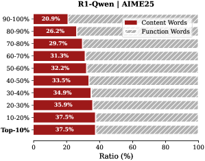
This image displays a horizontal stacked bar chart analyzing the composition of words (Content vs. Function) across different performance percentile groups for a model or system identified as "R1-Qwen" on the "AIME25" benchmark or dataset. The chart quantifies the ratio of content words to function words for each percentile tier.
### Components/Axes
* **Chart Title:** "R1-Qwen | AIME25" (Top center).
* **Y-Axis (Vertical):** Labeled with percentile ranges, ordered from highest performance at the top to lowest at the bottom. The categories are:
* 90-100%
* 80-90%
* 70-80%
* 60-70%
* 50-60%
* 40-50%
* 30-40%
* 20-30%
* 10-20%
* Top-10%
* **X-Axis (Horizontal):** Labeled "Ratio (%)" with a scale from 0 to 100, marked at intervals of 0, 20, 40, 60, 80, 100.
* **Legend:** Positioned in the top-right corner of the chart area.
* **Content Words:** Represented by a solid, dark red bar.
* **Function Words:** Represented by a gray bar with diagonal hatching (stripes).
* **Data Labels:** Each bar segment contains a white text label indicating its precise percentage value.
### Detailed Analysis
The chart presents a stacked bar for each percentile group, where the total length of each bar represents 100%. The left segment (solid red) shows the percentage of Content Words, and the right segment (hatched gray) shows the percentage of Function Words.
**Data Points by Percentile Group (Content Words % / Function Words %):**
* **90-100%:** 20.9% / 79.1%
* **80-90%:** 26.2% / 73.8%
* **70-80%:** 29.7% / 70.3%
* **60-70%:** 31.1% / 68.9%
* **50-60%:** 32.2% / 67.8%
* **40-50%:** 33.3% / 66.7%
* **30-40%:** 34.9% / 65.1%
* **20-30%:** 35.9% / 64.1%
* **10-20%:** 37.5% / 62.5%
* **Top-10%:** 37.5% / 62.5%
**Trend Verification:**
* **Content Words (Red Bars):** The visual trend shows a clear and consistent increase in the length of the red bar segment as one moves down the y-axis from the highest percentile group (90-100%) to the lowest (Top-10%). The numerical values confirm this, rising from 20.9% to 37.5%.
* **Function Words (Gray Hatched Bars):** Conversely, the length of the gray hatched segment shows a consistent decrease from top to bottom, falling from 79.1% to 62.5%. This is the inverse of the Content Words trend.
### Key Observations
1. **Strong Inverse Correlation:** There is a perfect inverse relationship between the percentage of Content Words and Function Words across all groups. As one increases, the other decreases by the same amount, maintaining a 100% total for each bar.
2. **Performance Gradient:** The composition of language use changes systematically with performance tier. Higher-performing groups (e.g., 90-100%) have a significantly lower proportion of Content Words (~21%) compared to lower-performing groups (~37.5%).
3. **Plateau at the Bottom:** The two lowest percentile groups, "10-20%" and "Top-10%", show identical word composition (37.5% Content / 62.5% Function), suggesting a potential floor or convergence in language style at the lower end of the performance spectrum.
4. **Consistent Scale:** The x-axis scale is linear and clearly marked, allowing for reliable visual estimation of values even without the data labels.
### Interpretation
This chart suggests a significant correlation between the lexical composition of outputs (or inputs) and performance on the AIME25 benchmark for the R1-Qwen system. The data indicates that **higher performance is associated with a lower density of content words** (nouns, verbs, adjectives carrying core meaning) and a **higher density of function words** (articles, prepositions, conjunctions that provide grammatical structure).
This could imply several investigative possibilities:
* **Efficiency vs. Detail:** Top-performing responses may be more concise and structurally efficient, relying on precise function words to frame arguments, while lower-performing responses might use more content words in a less focused or more verbose manner.
* **Task Nature:** The AIME25 benchmark might reward a specific rhetorical or logical style that is characterized by this functional linguistic structure.
* **Model Behavior:** The pattern could reveal an intrinsic characteristic of the R1-Qwen model's generation strategy across different confidence or quality levels.
The identical composition for the bottom two tiers is a notable anomaly. It may indicate that below a certain performance threshold, the model's output style stabilizes into a specific, less effective pattern, or it could be an artifact of how the "Top-10%" category is defined relative to the "10-20%" group. The chart effectively visualizes a clear, quantifiable linguistic marker that differentiates performance levels.