TECHNICAL ASSET FINGERPRINT
68fcefb76a0c2f353368d68d
Click to view fullscreen
Press ESC or click to close
FOUND IN PAPERS
EXPERT: gemini-2.0-flash VERSION 1
RUNTIME: nugit/gemini/gemini-2.0-flash
INTEL_VERIFIED
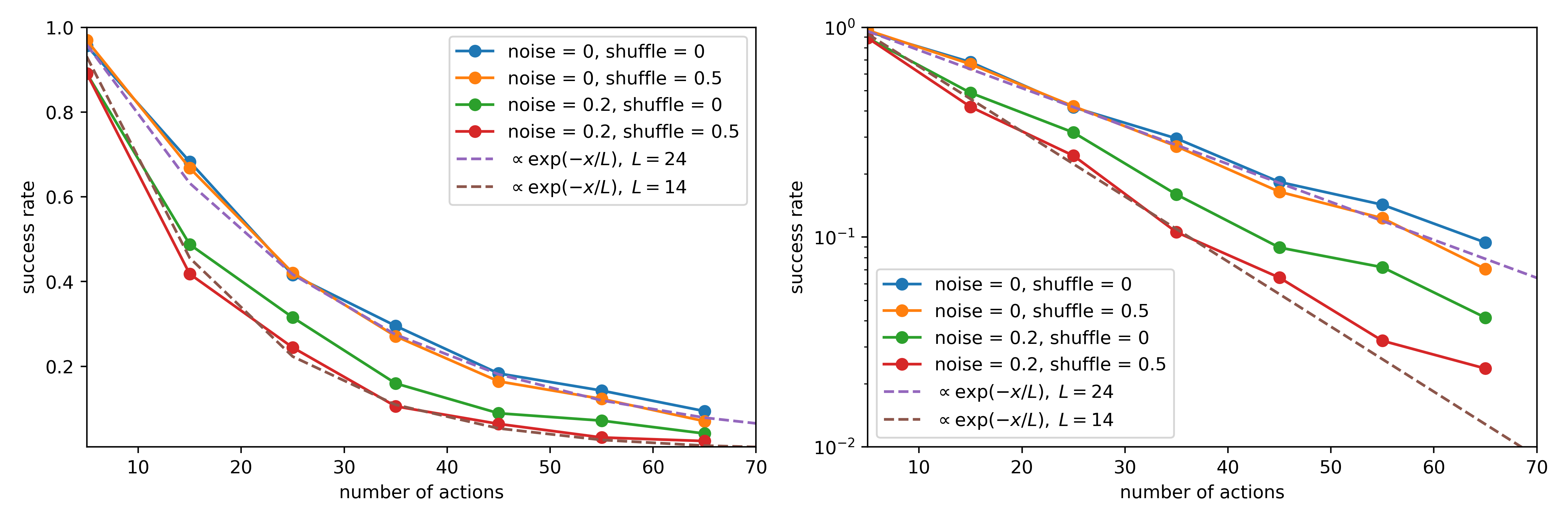
## Line Charts: Success Rate vs. Number of Actions
### Overview
The image contains two line charts comparing the success rate against the number of actions under different noise and shuffle conditions. The left chart uses a linear scale for the y-axis (success rate), while the right chart uses a logarithmic scale. Both charts share the same x-axis (number of actions). The charts show how success rate decreases as the number of actions increases, with variations based on noise levels and shuffling.
### Components/Axes
**Left Chart:**
* **Title:** Implicitly, "Success Rate vs. Number of Actions (Linear Scale)"
* **X-axis:** "number of actions", ranging from 0 to 70 in increments of 10.
* **Y-axis:** "success rate", ranging from 0.0 to 1.0 in increments of 0.2.
* **Legend:** Located in the top-right corner.
* Blue line: "noise = 0, shuffle = 0"
* Orange line: "noise = 0, shuffle = 0.5"
* Green line: "noise = 0.2, shuffle = 0"
* Red line: "noise = 0.2, shuffle = 0.5"
* Dashed purple line: "∝ exp(-x/L), L = 24"
* Dashed brown line: "∝ exp(-x/L), L = 14"
**Right Chart:**
* **Title:** Implicitly, "Success Rate vs. Number of Actions (Logarithmic Scale)"
* **X-axis:** "number of actions", ranging from 0 to 70 in increments of 10.
* **Y-axis:** "success rate", logarithmic scale ranging from 10^-2 to 10^0 (0.01 to 1.0).
* **Legend:** Located in the bottom-right corner, identical to the left chart.
* Blue line: "noise = 0, shuffle = 0"
* Orange line: "noise = 0, shuffle = 0.5"
* Green line: "noise = 0.2, shuffle = 0"
* Red line: "noise = 0.2, shuffle = 0.5"
* Dashed purple line: "∝ exp(-x/L), L = 24"
* Dashed brown line: "∝ exp(-x/L), L = 14"
### Detailed Analysis
**Left Chart (Linear Scale):**
* **noise = 0, shuffle = 0 (Blue):** Starts at approximately 0.98 and decreases to about 0.18.
* **noise = 0, shuffle = 0.5 (Orange):** Starts at approximately 0.95 and decreases to about 0.15.
* **noise = 0.2, shuffle = 0 (Green):** Starts at approximately 0.88 and decreases to about 0.08.
* **noise = 0.2, shuffle = 0.5 (Red):** Starts at approximately 0.42 and decreases to about 0.03.
* **∝ exp(-x/L), L = 24 (Purple Dashed):** Starts at approximately 0.95 and decreases to about 0.10.
* **∝ exp(-x/L), L = 14 (Brown Dashed):** Starts at approximately 0.88 and decreases to about 0.01.
**Right Chart (Logarithmic Scale):**
* **noise = 0, shuffle = 0 (Blue):** Starts at approximately 0.98 and decreases to about 0.10.
* **noise = 0, shuffle = 0.5 (Orange):** Starts at approximately 0.95 and decreases to about 0.08.
* **noise = 0.2, shuffle = 0 (Green):** Starts at approximately 0.88 and decreases to about 0.04.
* **noise = 0.2, shuffle = 0.5 (Red):** Starts at approximately 0.42 and decreases to about 0.02.
* **∝ exp(-x/L), L = 24 (Purple Dashed):** Starts at approximately 0.95 and decreases to about 0.04.
* **∝ exp(-x/L), L = 14 (Brown Dashed):** Starts at approximately 0.88 and decreases to about 0.01.
### Key Observations
* All success rates decrease as the number of actions increases.
* Higher noise levels (0.2 vs. 0) generally lead to lower success rates.
* Shuffling (0.5 vs. 0) also tends to decrease success rates, but the effect is less pronounced than the noise level.
* The exponential decay curves (∝ exp(-x/L)) provide a baseline for comparison. The curve with L=14 decays faster than the curve with L=24.
* The logarithmic scale in the right chart emphasizes the differences in success rates at lower values.
### Interpretation
The charts illustrate the impact of noise and shuffling on the success rate of a process as the number of actions increases. The data suggests that both noise and shuffling negatively affect performance, with noise having a more significant impact. The exponential decay curves provide a theoretical model for the decrease in success rate, and the empirical data appears to follow this trend. The logarithmic scale highlights the differences in performance at lower success rates, which may be important in certain applications. The charts demonstrate that controlling noise and minimizing shuffling are crucial for maintaining high success rates in systems with a large number of actions.
DECODING INTELLIGENCE...
EXPERT: gemini-2.5-flash-free VERSION 1
RUNTIME: google-free/gemini-2.5-flash
INTEL_VERIFIED
## Line Charts: Success Rate vs. Number of Actions under Varying Conditions
### Overview
The image displays two line charts side-by-side, illustrating the "success rate" as a function of "number of actions" under different conditions of "noise" and "shuffle". Both charts present the same data series but differ in their Y-axis scaling: the left chart uses a linear scale, while the right chart uses a logarithmic scale. The charts also include two dashed lines representing exponential decay fits with different characteristic lengths (L).
### Components/Axes
**Common Elements (Both Charts):**
* **X-axis Label**: "number of actions"
* **X-axis Tick Markers**: 10, 20, 30, 40, 50, 60, 70. The data points are not aligned with these major tick marks but are positioned approximately at X-values of 7, 15, 25, 35, 45, 55, and 65.
* **Legend**: Located in the top-right quadrant of each chart, listing six data series with their corresponding colors and line styles.
* **Blue solid line with circular markers**: `noise = 0, shuffle = 0`
* **Orange solid line with circular markers**: `noise = 0, shuffle = 0.5`
* **Green solid line with circular markers**: `noise = 0.2, shuffle = 0`
* **Red solid line with circular markers**: `noise = 0.2, shuffle = 0.5`
* **Purple dashed line**: `∝ exp(-x/L), L = 24` (where '∝' means "proportional to")
* **Brown dashed line**: `∝ exp(-x/L), L = 14`
**Left Chart Specifics:**
* **Y-axis Label**: "success rate"
* **Y-axis Scale**: Linear, ranging from 0.0 to 1.0.
* **Y-axis Tick Markers**: 0.2, 0.4, 0.6, 0.8, 1.0.
**Right Chart Specifics:**
* **Y-axis Label**: "success rate"
* **Y-axis Scale**: Logarithmic, ranging from 10^-2 (0.01) to 10^0 (1.0).
* **Y-axis Tick Markers**: 10^-2, 10^-1, 10^0.
### Detailed Analysis
**Left Chart (Linear Y-axis)**
All data series show a decreasing trend in "success rate" as the "number of actions" increases.
* **Blue line (noise = 0, shuffle = 0)**: This line starts at a high success rate and decreases steadily.
* Data points (approx. X, Y): (7, 0.95), (15, 0.68), (25, 0.48), (35, 0.30), (45, 0.18), (55, 0.10), (65, 0.05).
* **Orange line (noise = 0, shuffle = 0.5)**: This line closely follows the blue line but is slightly below it, indicating a slightly lower success rate for the same number of actions.
* Data points (approx. X, Y): (7, 0.95), (15, 0.65), (25, 0.42), (35, 0.28), (45, 0.16), (55, 0.08), (65, 0.04).
* **Green line (noise = 0.2, shuffle = 0)**: This line shows a more rapid decrease in success rate compared to the blue and orange lines.
* Data points (approx. X, Y): (7, 0.90), (15, 0.48), (25, 0.28), (35, 0.15), (45, 0.08), (55, 0.04), (65, 0.02).
* **Red line (noise = 0.2, shuffle = 0.5)**: This line exhibits the steepest decline in success rate among the solid lines, consistently below the green line.
* Data points (approx. X, Y): (7, 0.88), (15, 0.42), (25, 0.20), (35, 0.10), (45, 0.05), (55, 0.02), (65, 0.01).
* **Purple dashed line (∝ exp(-x/L), L = 24)**: This line represents an exponential decay model. It starts around 0.9 and decays smoothly.
* Data points (approx. X, Y): (7, 0.90), (15, 0.68), (25, 0.48), (35, 0.34), (45, 0.24), (55, 0.17), (65, 0.12).
* **Brown dashed line (∝ exp(-x/L), L = 14)**: This line represents another exponential decay model with a shorter characteristic length, indicating a faster decay. It starts around 0.9 and decays more rapidly than the purple dashed line.
* Data points (approx. X, Y): (7, 0.90), (15, 0.50), (25, 0.28), (35, 0.16), (45, 0.09), (55, 0.05), (65, 0.03).
**Right Chart (Logarithmic Y-axis)**
All data series, when plotted on a logarithmic Y-axis, appear approximately linear, which is characteristic of exponential decay.
* **Blue line (noise = 0, shuffle = 0)**: This line appears mostly straight, indicating an exponential decay.
* Data points (approx. X, Y): (7, 0.95), (15, 0.68), (25, 0.48), (35, 0.30), (45, 0.18), (55, 0.10), (65, 0.05).
* **Orange line (noise = 0, shuffle = 0.5)**: This line also appears mostly straight and parallel to the blue line, but slightly below it.
* Data points (approx. X, Y): (7, 0.95), (15, 0.65), (25, 0.42), (35, 0.28), (45, 0.16), (55, 0.08), (65, 0.04).
* **Green line (noise = 0.2, shuffle = 0)**: This line is steeper than the blue and orange lines, indicating a faster exponential decay.
* Data points (approx. X, Y): (7, 0.90), (15, 0.48), (25, 0.28), (35, 0.15), (45, 0.08), (55, 0.04), (65, 0.02).
* **Red line (noise = 0.2, shuffle = 0.5)**: This line is the steepest among the solid lines, showing the most rapid exponential decay.
* Data points (approx. X, Y): (7, 0.88), (15, 0.42), (25, 0.20), (35, 0.10), (45, 0.05), (55, 0.02), (65, 0.01).
* **Purple dashed line (∝ exp(-x/L), L = 24)**: This line is perfectly straight on the logarithmic plot, confirming its exponential nature. It has a shallower slope compared to the brown dashed line.
* Data points (approx. X, Y): (7, 0.90), (15, 0.68), (25, 0.48), (35, 0.34), (45, 0.24), (55, 0.17), (65, 0.12).
* **Brown dashed line (∝ exp(-x/L), L = 14)**: This line is also perfectly straight on the logarithmic plot, with a steeper slope than the purple dashed line, reflecting its smaller characteristic length (L=14 vs L=24).
* Data points (approx. X, Y): (7, 0.90), (15, 0.50), (25, 0.28), (35, 0.16), (45, 0.09), (55, 0.05), (65, 0.03).
### Key Observations
* **Impact of Noise**: Increasing `noise` from 0 to 0.2 (comparing blue/orange to green/red) significantly reduces the success rate and steepens the decay. For example, at `number of actions` = 35, `noise = 0, shuffle = 0` (blue) has a success rate of ~0.30, while `noise = 0.2, shuffle = 0` (green) has a success rate of ~0.15.
* **Impact of Shuffle**: Introducing `shuffle = 0.5` (comparing blue to orange, or green to red) generally leads to a slightly lower success rate, but the effect is less pronounced than that of noise.
* **Exponential Decay**: All experimental data series (solid lines) exhibit a clear exponential decay trend, as evidenced by their approximate linearity on the logarithmic Y-axis plot.
* **Model Fits**:
* The `∝ exp(-x/L), L = 24` (purple dashed) line provides a reasonable fit for the `noise = 0` conditions (blue and orange lines), particularly at higher numbers of actions.
* The `∝ exp(-x/L), L = 14` (brown dashed) line provides a good fit for the `noise = 0.2, shuffle = 0.5` condition (red line), especially at higher numbers of actions. It also closely tracks the `noise = 0.2, shuffle = 0` (green) line.
* **Initial Values**: All series start with a success rate close to 1.0 (or 10^0) for a low number of actions (approx. 7). The initial success rate is slightly lower for `noise = 0.2` conditions.
### Interpretation
The data strongly suggests that the "success rate" in the observed system decays exponentially with the "number of actions". This exponential relationship is clearly demonstrated by the linear appearance of the data on the logarithmic Y-axis chart.
The presence of "noise" (specifically `noise = 0.2`) has a detrimental effect on the success rate, causing it to decay much faster. This is reflected in the steeper slopes of the green and red lines compared to the blue and orange lines on the logarithmic plot, and their lower success rates on the linear plot. This implies that noise introduces errors or inefficiencies that accumulate with more actions, leading to a quicker failure.
The "shuffle" parameter (`shuffle = 0.5`) also negatively impacts the success rate, but to a lesser extent than noise. It slightly reduces the success rate for both `noise = 0` and `noise = 0.2` conditions, suggesting that shuffling might introduce some disorder or less optimal sequencing of actions.
The exponential decay models (`∝ exp(-x/L)`) with different characteristic lengths (L) appear to be good approximations for the observed phenomena. A larger L (e.g., L=24) corresponds to a slower decay (higher success rate for more actions), which aligns with conditions of lower noise. A smaller L (e.g., L=14) corresponds to a faster decay, which aligns with conditions of higher noise and shuffle. This indicates that the system's resilience or "memory" (how long it can maintain a high success rate) is inversely related to the level of noise and shuffle. The characteristic length L can be interpreted as a measure of how many actions, on average, the system can tolerate before its success rate drops significantly.
DECODING INTELLIGENCE...
EXPERT: gemma-3-27b-it-free VERSION 1
RUNTIME: google-free/gemma-3-27b-it
INTEL_VERIFIED
\n
## Chart: Success Rate vs. Number of Actions
### Overview
The image presents two line charts comparing the success rate of an algorithm or process under varying conditions of noise and shuffle, plotted against the number of actions taken. The right chart uses a logarithmic y-axis to better visualize the data. Both charts display the same data, but with different y-axis scales.
### Components/Axes
* **X-axis (both charts):** "number of actions", ranging from approximately 8 to 70, with markers at 10, 20, 30, 40, 50, 60, and 70.
* **Y-axis (left chart):** "success rate", ranging from 0.0 to 1.0, with markers at 0.0, 0.2, 0.4, 0.6, 0.8, and 1.0.
* **Y-axis (right chart):** "success rate", logarithmic scale from 10<sup>-2</sup> to 10<sup>0</sup> (0.01 to 1.0).
* **Legend (top-right of both charts):**
* Blue Line: "noise = 0, shuffle = 0"
* Orange Line: "noise = 0, shuffle = 0.5"
* Green Line: "noise = 0.2, shuffle = 0"
* Red Line: "noise = 0.2, shuffle = 0.5"
* Purple Dashed Line: "α exp(-x/L), L = 24"
* Gray Dashed Line: "α exp(-x/L), L = 14"
### Detailed Analysis or Content Details
**Left Chart (Linear Scale):**
* **Blue Line ("noise = 0, shuffle = 0"):** Starts at approximately 0.95 at x=8, decreases slowly to approximately 0.15 at x=70.
* **Orange Line ("noise = 0, shuffle = 0.5"):** Starts at approximately 0.9 at x=8, decreases more rapidly than the blue line, reaching approximately 0.08 at x=70.
* **Green Line ("noise = 0.2, shuffle = 0"):** Starts at approximately 0.75 at x=8, decreases steadily to approximately 0.12 at x=70.
* **Red Line ("noise = 0.2, shuffle = 0.5"):** Starts at approximately 0.7 at x=8, decreases very rapidly, reaching approximately 0.05 at x=70.
* **Purple Dashed Line ("α exp(-x/L), L = 24"):** Starts at approximately 0.9 at x=8, decreases steadily to approximately 0.1 at x=70.
* **Gray Dashed Line ("α exp(-x/L), L = 14"):** Starts at approximately 0.9 at x=8, decreases more rapidly than the purple line, reaching approximately 0.08 at x=70.
**Right Chart (Logarithmic Scale):**
The trends are identical to the left chart, but the logarithmic scale emphasizes the rate of decline. The lines appear more linear on this scale.
### Key Observations
* Increasing noise and shuffle consistently decreases the success rate.
* The combination of noise = 0.2 and shuffle = 0.5 results in the most rapid decline in success rate.
* The dashed lines represent theoretical curves with different decay rates (L=24 and L=14). The gray dashed line (L=14) decays faster.
* The success rate decreases as the number of actions increases for all conditions.
* The logarithmic scale on the right chart reveals that the decay in success rate is approximately exponential.
### Interpretation
The data suggests that the algorithm's performance is sensitive to both noise and shuffle. The success rate decreases as the number of actions increases, indicating a potential limitation in the algorithm's ability to maintain accuracy over extended sequences. The theoretical curves (dashed lines) provide a benchmark for the expected decay rate, and the experimental data generally follows this trend. The most significant performance degradation occurs when both noise and shuffle are present, highlighting the importance of addressing these factors to improve the algorithm's robustness. The logarithmic scale provides a clearer visualization of the exponential decay, suggesting that the algorithm's performance diminishes rapidly with increasing actions under noisy and shuffled conditions. The parameter 'L' in the exponential function likely represents a characteristic length or scale over which the success rate decays. A smaller 'L' value indicates a faster decay.
DECODING INTELLIGENCE...
EXPERT: healer-alpha-free VERSION 1
RUNTIME: free/openrouter/healer-alpha
INTEL_VERIFIED
## Line Chart: Success Rate vs. Number of Actions Under Varying Noise and Shuffle Conditions
### Overview
The image displays two line charts side-by-side, presenting the same dataset with different y-axis scales. Both charts plot "success rate" against "number of actions" for four experimental conditions and two theoretical exponential decay models. The left chart uses a linear y-axis, while the right chart uses a logarithmic y-axis (base 10), which linearizes exponential decay trends.
### Components/Axes
* **X-Axis (Both Plots):** Label: "number of actions". Scale: Linear, ranging from approximately 5 to 70. Major tick marks are at 10, 20, 30, 40, 50, 60, 70.
* **Y-Axis (Left Plot):** Label: "success rate". Scale: Linear, ranging from 0.0 to 1.0. Major tick marks are at 0.2, 0.4, 0.6, 0.8, 1.0.
* **Y-Axis (Right Plot):** Label: "success rate". Scale: Logarithmic (base 10), ranging from 10⁻² (0.01) to 10⁰ (1.0). Major tick marks are at 10⁻², 10⁻¹, 10⁰.
* **Legend (Identical for both plots, positioned in the top-right quadrant):**
* **Blue line with circle markers:** `noise = 0, shuffle = 0`
* **Orange line with circle markers:** `noise = 0, shuffle = 0.5`
* **Green line with circle markers:** `noise = 0.2, shuffle = 0`
* **Red line with circle markers:** `noise = 0.2, shuffle = 0.5`
* **Purple dashed line:** `∝ exp(−x/L), L = 24`
* **Brown dashed line:** `∝ exp(−x/L), L = 14`
### Detailed Analysis
**Data Series Trends & Approximate Points:**
All series show a decaying trend: success rate decreases as the number of actions increases.
1. **Blue Line (noise=0, shuffle=0):**
* **Trend:** Highest success rate across all action counts. Decays the slowest.
* **Approximate Points (Left Plot):** (5, ~0.98), (15, ~0.68), (25, ~0.42), (35, ~0.30), (45, ~0.19), (55, ~0.15), (65, ~0.10).
2. **Orange Line (noise=0, shuffle=0.5):**
* **Trend:** Very closely follows the blue line, indicating shuffle=0.5 has minimal effect when noise=0.
* **Approximate Points (Left Plot):** (5, ~0.97), (15, ~0.67), (25, ~0.42), (35, ~0.28), (45, ~0.18), (55, ~0.14), (65, ~0.09).
3. **Green Line (noise=0.2, shuffle=0):**
* **Trend:** Significantly lower success rate than the no-noise conditions (blue/orange). Decays faster.
* **Approximate Points (Left Plot):** (5, ~0.90), (15, ~0.49), (25, ~0.32), (35, ~0.17), (45, ~0.10), (55, ~0.08), (65, ~0.06).
4. **Red Line (noise=0.2, shuffle=0.5):**
* **Trend:** Lowest success rate of all conditions. The combination of noise and shuffle degrades performance the most.
* **Approximate Points (Left Plot):** (5, ~0.88), (15, ~0.42), (25, ~0.24), (35, ~0.12), (45, ~0.07), (55, ~0.05), (65, ~0.04).
5. **Purple Dashed Line (Model: L=24):**
* **Trend:** Represents an exponential decay with characteristic length L=24. It closely fits the blue and orange (no noise) data series.
* **Approximate Points (Right Plot, Log Scale):** Starts at 1.0 for x=0. At x=24, value is ~0.37 (1/e). At x=48, value is ~0.14.
6. **Brown Dashed Line (Model: L=14):**
* **Trend:** Represents a faster exponential decay with L=14. It closely fits the red (noise=0.2, shuffle=0.5) data series.
* **Approximate Points (Right Plot, Log Scale):** Starts at 1.0 for x=0. At x=14, value is ~0.37. At x=28, value is ~0.14.
### Key Observations
1. **Dominant Effect of Noise:** The primary factor reducing success rate is the introduction of noise (noise=0.2). The green and red lines are substantially below the blue and orange lines.
2. **Minor Effect of Shuffle:** When noise is zero, shuffle=0.5 (orange) has negligible impact compared to shuffle=0 (blue). When noise is present, shuffle=0.5 (red) causes a further, noticeable degradation compared to shuffle=0 (green).
3. **Exponential Decay Fit:** The success rate decays exponentially with the number of actions. The no-noise conditions are well-modeled by a decay constant L≈24, while the worst-case condition (noise+shuffle) is better modeled by L≈14.
4. **Logarithmic Scale Clarity:** The right plot (log scale) makes the exponential nature of the decay visually apparent as straight lines and allows for clearer differentiation of the data points at higher action counts where values are small.
### Interpretation
This data demonstrates the robustness of a process (likely a sequential decision-making or planning algorithm) to perturbations. The "success rate" measures the probability of completing a task correctly within a given number of actions.
* **Under ideal conditions (no noise, no shuffle),** the process is highly reliable for short sequences but degrades predictably (exponentially) as the sequence length (number of actions) increases, with a characteristic decay length of about 24 actions.
* **Introducing noise (0.2) severely impacts performance,** cutting the effective reliable sequence length roughly in half (L≈14 for the worst case). This suggests the process is sensitive to inaccurate information or stochasticity in its environment or execution.
* **Shuffling (likely reordering of actions or sub-tasks) has a minimal standalone effect** but exacerbates the negative impact of noise. This implies that the process's structure or ordering is important for maintaining robustness when operating in noisy conditions.
* The exponential decay model provides a simple, quantitative way to compare the robustness of the system under different conditions via the parameter `L`. A higher `L` indicates greater robustness to increasing task length.
**In summary, the charts quantify how noise dramatically reduces the effective operational length of a sequential process, while shuffling acts as a secondary stressor that compounds noise's effect.**
DECODING INTELLIGENCE...
EXPERT: nemotron-free VERSION 1
RUNTIME: free/nvidia/nemotron-nano-12b-v2-vl:free
INTEL_VERIFIED
## Line Chart: Success Rate vs. Number of Actions
### Overview
The image contains two line charts comparing success rates across different noise and shuffle conditions. The left chart uses a linear y-axis (success rate) and linear x-axis (number of actions), while the right chart uses a log-log scale for both axes. Exponential decay models (α exp(-x/L)) are overlaid for comparison.
### Components/Axes
- **Left Chart**:
- **Y-axis**: "success rate" (linear scale: 0.01–1.0)
- **X-axis**: "number of actions" (linear scale: 10–70)
- **Legend**:
- Blue: noise = 0, shuffle = 0
- Orange: noise = 0, shuffle = 0.5
- Green: noise = 0.2, shuffle = 0
- Red: noise = 0.2, shuffle = 0.5
- Purple dashed: α exp(-x/L), L = 24
- Brown dashed: α exp(-x/L), L = 14
- **Right Chart**:
- **Y-axis**: "success rate" (logarithmic scale: 10⁻²–10⁰)
- **X-axis**: "number of actions" (logarithmic scale: 10–70)
- **Legend**: Same as left chart.
### Detailed Analysis
#### Left Chart Trends
1. **Blue Line (noise=0, shuffle=0)**:
- Starts at ~0.95 success rate at 10 actions.
- Declines gradually to ~0.1 by 70 actions.
- Follows the purple dashed exponential fit (L=24).
2. **Orange Line (noise=0, shuffle=0.5)**:
- Starts at ~0.9 at 10 actions.
- Declines faster than blue, reaching ~0.05 by 70 actions.
- Matches the brown dashed exponential fit (L=14).
3. **Green Line (noise=0.2, shuffle=0)**:
- Starts at ~0.85 at 10 actions.
- Declines to ~0.03 by 70 actions.
- Aligns with the purple dashed line (L=24).
4. **Red Line (noise=0.2, shuffle=0.5)**:
- Starts at ~0.8 at 10 actions.
- Declines steeply to ~0.01 by 70 actions.
- Matches the brown dashed line (L=14).
#### Right Chart Trends
- All lines appear linear due to log-log scaling.
- Exponential fits (purple/brown dashed) become straight lines.
- Relative slopes confirm decay rates: L=24 (shallower slope) vs. L=14 (steeper slope).
### Key Observations
1. **Noise/Shuffle Impact**:
- Higher noise (0.2 vs. 0) reduces success rates by ~10–15% at 10 actions.
- Shuffle=0.5 accelerates decay, halving success rates compared to shuffle=0 at 70 actions.
2. **Exponential Decay**:
- Success rate decays exponentially with actions (α exp(-x/L)).
- L=24 (purple) corresponds to lower noise/shuffle, slower decay.
- L=14 (brown) corresponds to higher noise/shuffle, faster decay.
3. **Consistency**:
- Both charts show identical trends, validating log-log scaling preserves relationships.
### Interpretation
The data demonstrates that **noise and shuffle parameters independently degrade performance**, with combined effects (noise=0.2, shuffle=0.5) causing the steepest decline. The exponential models quantify this decay, where **L=24** (slower decay) aligns with ideal conditions (noise=0, shuffle=0), while **L=14** (faster decay) reflects degraded conditions. The log-log visualization emphasizes multiplicative relationships, confirming that success rate halves every ~14–24 actions depending on conditions. This suggests optimizing noise/shuffle parameters is critical for maintaining performance in action-dependent systems.
DECODING INTELLIGENCE...