\n
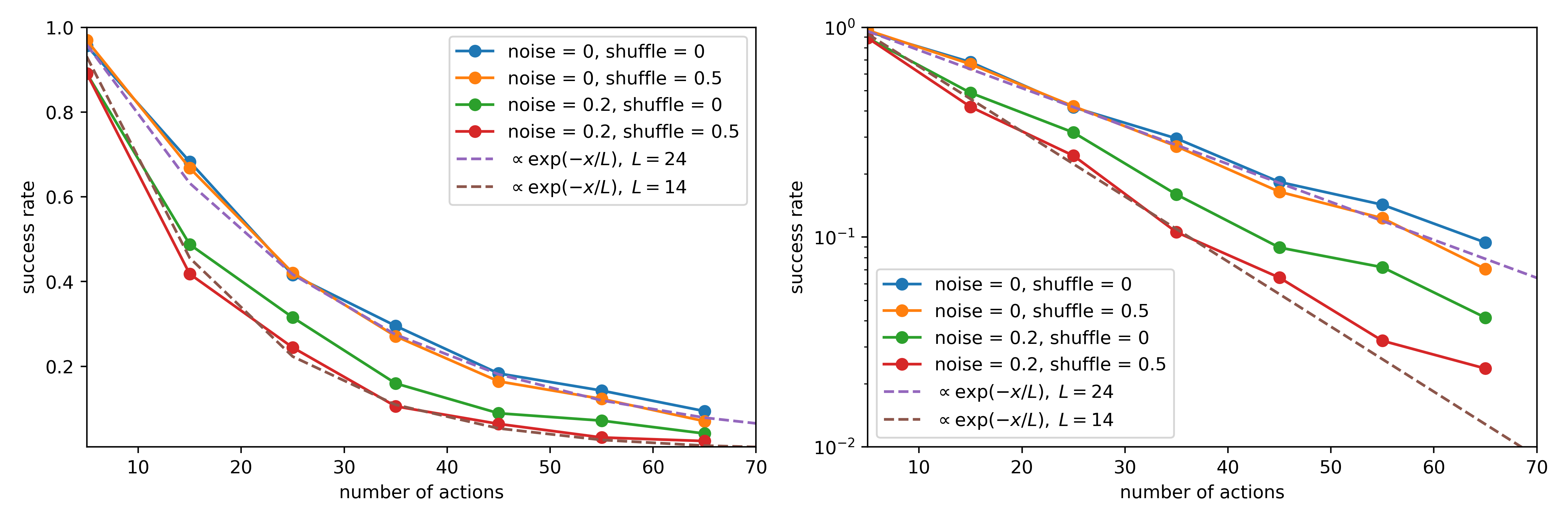
## Chart: Success Rate vs. Number of Actions
### Overview
The image presents two line charts comparing the success rate of an algorithm or process under varying conditions of noise and shuffle, plotted against the number of actions taken. The right chart uses a logarithmic y-axis to better visualize the data. Both charts display the same data, but with different y-axis scales.
### Components/Axes
* **X-axis (both charts):** "number of actions", ranging from approximately 8 to 70, with markers at 10, 20, 30, 40, 50, 60, and 70.
* **Y-axis (left chart):** "success rate", ranging from 0.0 to 1.0, with markers at 0.0, 0.2, 0.4, 0.6, 0.8, and 1.0.
* **Y-axis (right chart):** "success rate", logarithmic scale from 10<sup>-2</sup> to 10<sup>0</sup> (0.01 to 1.0).
* **Legend (top-right of both charts):**
* Blue Line: "noise = 0, shuffle = 0"
* Orange Line: "noise = 0, shuffle = 0.5"
* Green Line: "noise = 0.2, shuffle = 0"
* Red Line: "noise = 0.2, shuffle = 0.5"
* Purple Dashed Line: "α exp(-x/L), L = 24"
* Gray Dashed Line: "α exp(-x/L), L = 14"
### Detailed Analysis or Content Details
**Left Chart (Linear Scale):**
* **Blue Line ("noise = 0, shuffle = 0"):** Starts at approximately 0.95 at x=8, decreases slowly to approximately 0.15 at x=70.
* **Orange Line ("noise = 0, shuffle = 0.5"):** Starts at approximately 0.9 at x=8, decreases more rapidly than the blue line, reaching approximately 0.08 at x=70.
* **Green Line ("noise = 0.2, shuffle = 0"):** Starts at approximately 0.75 at x=8, decreases steadily to approximately 0.12 at x=70.
* **Red Line ("noise = 0.2, shuffle = 0.5"):** Starts at approximately 0.7 at x=8, decreases very rapidly, reaching approximately 0.05 at x=70.
* **Purple Dashed Line ("α exp(-x/L), L = 24"):** Starts at approximately 0.9 at x=8, decreases steadily to approximately 0.1 at x=70.
* **Gray Dashed Line ("α exp(-x/L), L = 14"):** Starts at approximately 0.9 at x=8, decreases more rapidly than the purple line, reaching approximately 0.08 at x=70.
**Right Chart (Logarithmic Scale):**
The trends are identical to the left chart, but the logarithmic scale emphasizes the rate of decline. The lines appear more linear on this scale.
### Key Observations
* Increasing noise and shuffle consistently decreases the success rate.
* The combination of noise = 0.2 and shuffle = 0.5 results in the most rapid decline in success rate.
* The dashed lines represent theoretical curves with different decay rates (L=24 and L=14). The gray dashed line (L=14) decays faster.
* The success rate decreases as the number of actions increases for all conditions.
* The logarithmic scale on the right chart reveals that the decay in success rate is approximately exponential.
### Interpretation
The data suggests that the algorithm's performance is sensitive to both noise and shuffle. The success rate decreases as the number of actions increases, indicating a potential limitation in the algorithm's ability to maintain accuracy over extended sequences. The theoretical curves (dashed lines) provide a benchmark for the expected decay rate, and the experimental data generally follows this trend. The most significant performance degradation occurs when both noise and shuffle are present, highlighting the importance of addressing these factors to improve the algorithm's robustness. The logarithmic scale provides a clearer visualization of the exponential decay, suggesting that the algorithm's performance diminishes rapidly with increasing actions under noisy and shuffled conditions. The parameter 'L' in the exponential function likely represents a characteristic length or scale over which the success rate decays. A smaller 'L' value indicates a faster decay.