## Line Chart: Accuracy vs. Thinking Compute
### Overview
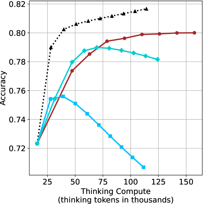
The image is a line chart plotting model accuracy against the amount of "thinking compute" allocated, measured in thousands of thinking tokens. It displays four distinct data series, each represented by a different color and marker type, showing how accuracy changes as compute increases. The chart suggests a study on the efficiency and scaling behavior of different models or methods.
### Components/Axes
* **X-Axis (Horizontal):** Labeled "Thinking Compute (thinking tokens in thousands)". The scale runs from approximately 15 to 160, with major tick marks at 25, 50, 75, 100, 125, and 150.
* **Y-Axis (Vertical):** Labeled "Accuracy". The scale runs from 0.72 to 0.82, with major tick marks at 0.72, 0.74, 0.76, 0.78, 0.80, and 0.82.
* **Data Series (Legend inferred from visual markers):**
1. **Black, Dotted Line with Upward-Pointing Triangles:** Positioned as the top-most line for most of the chart.
2. **Red (Maroon), Solid Line with Circles:** Positioned below the black line but above the cyan line for higher compute values.
3. **Cyan (Light Blue), Solid Line with Diamonds:** Initially rises, peaks, then shows a slight decline.
4. **Blue, Solid Line with Squares:** Rises to an early peak and then declines sharply.
* **Grid:** A light gray grid is present, aiding in value estimation.
### Detailed Analysis
**Data Series Trends and Approximate Points:**
1. **Black Dotted Line (Triangles):**
* **Trend:** Shows a very steep initial increase in accuracy, followed by a strong diminishing returns curve, plateauing at the highest accuracy level.
* **Key Points (Approximate):**
* At ~15k tokens: Accuracy ≈ 0.723
* At ~25k tokens: Accuracy ≈ 0.790 (sharp rise)
* At ~50k tokens: Accuracy ≈ 0.805
* At ~100k tokens: Accuracy ≈ 0.815
* At ~125k tokens: Accuracy ≈ 0.817 (appears to be the final point)
2. **Red Solid Line (Circles):**
* **Trend:** Shows a steady, nearly linear increase in accuracy across the entire range of compute, without clear signs of plateauing within the chart's bounds.
* **Key Points (Approximate):**
* At ~15k tokens: Accuracy ≈ 0.723 (similar starting point to others)
* At ~50k tokens: Accuracy ≈ 0.774
* At ~75k tokens: Accuracy ≈ 0.794
* At ~100k tokens: Accuracy ≈ 0.797
* At ~150k tokens: Accuracy ≈ 0.800
3. **Cyan Solid Line (Diamonds):**
* **Trend:** Increases to a peak, then begins a gradual decline. It suggests an optimal compute point beyond which performance slightly degrades.
* **Key Points (Approximate):**
* At ~15k tokens: Accuracy ≈ 0.723
* At ~50k tokens: Accuracy ≈ 0.788
* **Peak at ~70k tokens:** Accuracy ≈ 0.790
* At ~100k tokens: Accuracy ≈ 0.786
* At ~125k tokens: Accuracy ≈ 0.781
4. **Blue Solid Line (Squares):**
* **Trend:** Rises to an early peak and then exhibits a strong, consistent decline as compute increases, indicating severe over-computation or inefficiency.
* **Key Points (Approximate):**
* At ~15k tokens: Accuracy ≈ 0.723
* **Peak at ~35k tokens:** Accuracy ≈ 0.756
* At ~50k tokens: Accuracy ≈ 0.751
* At ~75k tokens: Accuracy ≈ 0.736
* At ~100k tokens: Accuracy ≈ 0.714
* At ~110k tokens: Accuracy ≈ 0.707 (final visible point)
### Key Observations
1. **Common Origin:** All four series appear to start at approximately the same accuracy (~0.723) at the lowest compute level (~15k tokens).
2. **Divergent Scaling:** The series diverge dramatically as compute increases, revealing fundamentally different scaling laws.
3. **Performance Hierarchy:** For compute > ~40k tokens, the black dotted line consistently achieves the highest accuracy, followed by the red line, then the cyan line, with the blue line performing worst.
4. **Optimal Compute Points:** The cyan and blue lines demonstrate clear "peaks," suggesting optimal compute budgets for those methods (~70k and ~35k tokens, respectively). The black and red lines show no such peak within the chart, implying they benefit from (or at least are not harmed by) additional compute up to ~125k and ~150k tokens.
5. **Rate of Improvement:** The black line shows the most efficient initial scaling (steepest slope). The red line shows the most sustained, stable improvement.
### Interpretation
This chart visualizes a critical concept in AI scaling: **not all methods or models benefit equally from increased computational resources.**
* The **black dotted line** likely represents a highly optimized or state-of-the-art method that efficiently converts additional "thinking" compute into accuracy gains, exhibiting classic logarithmic scaling with strong diminishing returns.
* The **red line** suggests a robust, stable method that scales predictably and linearly, making it reliable for scaling but potentially less efficient at the low-compute end.
* The **cyan line** indicates a method with a clear "sweet spot." Allocating more than ~70k thinking tokens is not just wasteful but actively harmful, possibly due to overfitting, noise introduction, or a breakdown in the reasoning process with excessive length.
* The **blue line** represents a method that is highly sensitive to over-computation. Its performance collapses with more thinking tokens, suggesting it may be prone to error propagation, distraction, or a fundamental mismatch between the method and the extended compute budget.
The overarching insight is that **"more compute" is not a universal solution.** The relationship between compute and performance is method-dependent. Choosing the right method for a given compute budget is as important as the budget itself. The chart argues for the development and use of methods like the one represented by the black line, which can effectively leverage available resources without suffering from performance degradation.