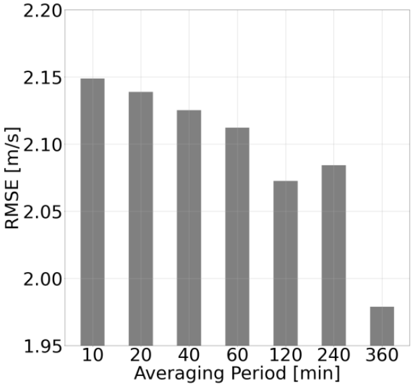
## Bar Chart: RMSE vs. Averaging Period
### Overview
The image is a bar chart showing the Root Mean Square Error (RMSE) in meters per second (m/s) as a function of the averaging period in minutes (min). The chart displays how the RMSE changes with different averaging periods. The bars are gray.
### Components/Axes
* **Y-axis:** RMSE [m/s], ranging from 1.95 to 2.20 with increments of 0.05.
* **X-axis:** Averaging Period [min], with values 10, 20, 40, 60, 120, 240, and 360.
### Detailed Analysis
The chart presents the RMSE values for different averaging periods.
* **10 min:** RMSE is approximately 2.15 m/s.
* **20 min:** RMSE is approximately 2.14 m/s.
* **40 min:** RMSE is approximately 2.12 m/s.
* **60 min:** RMSE is approximately 2.11 m/s.
* **120 min:** RMSE is approximately 2.07 m/s.
* **240 min:** RMSE is approximately 2.08 m/s.
* **360 min:** RMSE is approximately 1.98 m/s.
The trend shows a general decrease in RMSE as the averaging period increases, with a slight increase at 240 minutes before a significant drop at 360 minutes.
### Key Observations
* The highest RMSE occurs at the 10-minute averaging period.
* The lowest RMSE occurs at the 360-minute averaging period.
* There is a slight increase in RMSE from 120 minutes to 240 minutes.
### Interpretation
The chart suggests that increasing the averaging period generally reduces the RMSE, indicating a more accurate estimation of the wind speed. The anomaly at 240 minutes might be due to specific data characteristics or measurement conditions at that averaging period. The significant drop in RMSE at 360 minutes suggests that a longer averaging period provides the most stable and accurate estimate within the tested range.