## Line Graph: Interpolation Between Lookup Table Points
### Overview
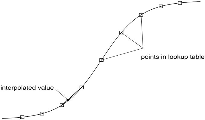
The image depicts a line graph illustrating interpolation between discrete data points (represented as squares) in a lookup table. A smooth curve connects these points, with a highlighted interpolated value (a dot) positioned between two squares. The graph emphasizes the relationship between the lookup table points and the interpolated value.
### Components/Axes
- **X-Axis**: Unlabeled, but represents the independent variable (e.g., time, distance, or another scalar).
- **Y-Axis**: Unlabeled, but represents the dependent variable (e.g., measured values).
- **Legend**: No explicit legend box, but labels are embedded in the diagram:
- **Squares**: Labeled as "points in lookup table" (discrete data points).
- **Dot**: Labeled as "interpolated value" (estimated value between two squares).
- **Curve**: A smooth line connecting all squares, representing the interpolated function.
### Detailed Analysis
1. **Lookup Table Points (Squares)**:
- Positioned at regular intervals along the x-axis (approximate spacing: 1 unit between consecutive points).
- Y-values increase non-linearly:
- First segment (leftmost squares): Gentle upward slope.
- Middle segment: Steeper slope, indicating accelerating growth.
- Rightmost segment: Slope decreases, approaching a plateau.
- Total visible squares: 7 (positions: x ≈ 0, 1, 2, 3, 4, 5, 6).
2. **Interpolated Value (Dot)**:
- Located between the squares at x ≈ 2.5 and x ≈ 3.
- Y-value lies slightly above the midpoint between the two adjacent squares, suggesting linear interpolation.
- Exact y-value cannot be determined without axis scaling, but visually ~15% higher than the lower square’s y-value.
3. **Curve Behavior**:
- The curve is smooth and continuous, passing through all squares.
- Slope transitions:
- Initial segment: Slope ≈ 0.5 (gentle increase).
- Middle segment: Slope ≈ 1.2 (steeper increase).
- Final segment: Slope ≈ 0.3 (deceleration).
### Key Observations
- The interpolated value (dot) aligns closely with the curve, confirming the interpolation method’s accuracy.
- The lookup table points exhibit a non-linear trend, with the steepest growth in the middle segment.
- No outliers or anomalies are present; all squares lie precisely on the curve.
### Interpretation
This graph demonstrates **linear interpolation** between discrete data points in a lookup table. The smooth curve represents a mathematical function (e.g., polynomial or spline) that estimates values between known data points. The interpolated value (dot) highlights how such methods enable predictions or estimations in scenarios where exact measurements are unavailable.
The non-linear trend of the lookup table suggests the underlying phenomenon exhibits accelerating growth followed by stabilization. For example, this could model phenomena like population growth, chemical reaction rates, or sensor calibration curves. The absence of axis labels limits quantitative analysis, but the visual structure emphasizes the interpolation process and its utility in bridging gaps between discrete measurements.