TECHNICAL ASSET FINGERPRINT
699a07010834f27ca2a5d7cc
Click to view fullscreen
Press ESC or click to close
FOUND IN PAPERS
EXPERT: healer-alpha-free VERSION 1
RUNTIME: free/openrouter/healer-alpha
INTEL_VERIFIED
\n
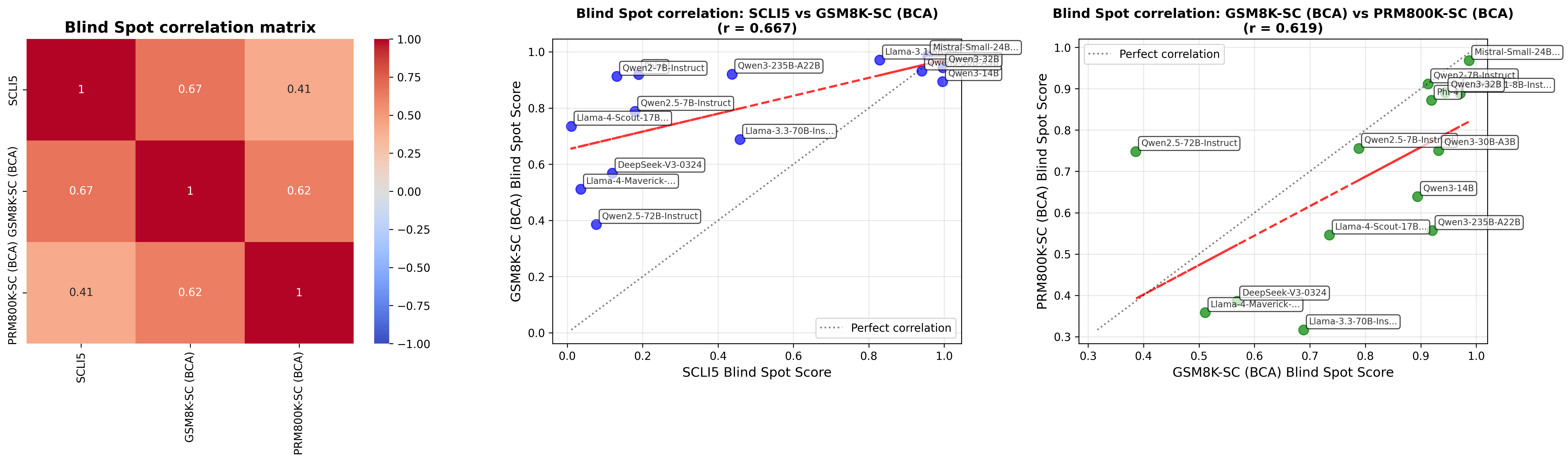
## [Chart Set]: Blind Spot Correlation Analysis
### Overview
The image displays three horizontally arranged charts analyzing the correlation of "Blind Spot Scores" across three different evaluation datasets: SCLI5, GSM8K-SC (BCA), and PRM800K-SC (BCA). The analysis includes a correlation matrix heatmap and two scatter plots with regression lines, comparing pairs of these datasets. The charts appear to evaluate the performance consistency of various Large Language Models (LLMs) across different benchmarks.
### Components/Axes
**Chart 1 (Left): Blind Spot correlation matrix**
* **Type:** Heatmap.
* **Axes:** Both the X and Y axes are labeled with the three datasets: `SCLI5`, `GSM8K-SC (BCA)`, and `PRM800K-SC (BCA)`.
* **Legend/Color Bar:** A vertical color bar on the right side indicates the correlation coefficient scale, ranging from `-1.00` (blue) to `1.00` (dark red), with `0.00` at the midpoint (light gray/white).
* **Data Labels:** Each cell in the 3x3 matrix contains the correlation coefficient value.
**Chart 2 (Middle): Blind Spot correlation: SCLI5 vs GSM8K-SC (BCA) (r = 0.667)**
* **Type:** Scatter plot with regression line.
* **X-Axis:** `SCLI5 Blind Spot Score`. Scale ranges from `0.0` to `1.0`.
* **Y-Axis:** `GSM8K-SC (BCA) Blind Spot Score`. Scale ranges from `0.0` to `1.0`.
* **Data Series:** Blue circular data points, each labeled with an LLM model name.
* **Lines:**
* A red dashed line represents the linear regression fit.
* A gray dotted line represents the line of perfect correlation (y=x).
* **Legend:** Located in the bottom-right corner, labeling the gray dotted line as "Perfect correlation".
**Chart 3 (Right): Blind Spot correlation: GSM8K-SC (BCA) vs PRM800K-SC (BCA) (r = 0.619)**
* **Type:** Scatter plot with regression line.
* **X-Axis:** `GSM8K-SC (BCA) Blind Spot Score`. Scale ranges from `0.3` to `1.0`.
* **Y-Axis:** `PRM800K-SC (BCA) Blind Spot Score`. Scale ranges from `0.3` to `1.0`.
* **Data Series:** Green circular data points, each labeled with an LLM model name.
* **Lines:**
* A red dashed line represents the linear regression fit.
* A gray dotted line represents the line of perfect correlation (y=x).
* **Legend:** Located in the top-left corner, labeling the gray dotted line as "Perfect correlation".
### Detailed Analysis
**Chart 1: Correlation Matrix Data**
The matrix shows the pairwise Pearson correlation coefficients (r) between the three datasets.
* **SCLI5 vs. GSM8K-SC (BCA):** r = 0.67
* **SCLI5 vs. PRM800K-SC (BCA):** r = 0.41
* **GSM8K-SC (BCA) vs. PRM800K-SC (BCA):** r = 0.62
* **Self-correlation (Diagonal):** All are 1.
**Chart 2: SCLI5 vs. GSM8K-SC (BCA) Scatter Plot Data**
*Trend Verification:* The blue data points show a general upward trend from left to right, indicating a positive correlation. The red regression line slopes upward. The overall correlation is noted as r = 0.667.
*Approximate Data Points (Model: [SCLI5 Score, GSM8K-SC Score]):*
* Qwen2.5-72B-Instruct: [~0.15, ~0.38]
* Llama-4-Maverick-...: [~0.05, ~0.51]
* DeepSeek-V3-0324: [~0.12, ~0.57]
* Llama-4-Scout-17B...: [~0.02, ~0.73]
* Qwen2.5-7B-Instruct: [~0.18, ~0.80]
* Qwen2-7B-Instruct: [~0.15, ~0.91]
* Llama-3.3-70B-Ins...: [~0.45, ~0.69]
* Qwen3-235B-A22B: [~0.42, ~0.92]
* Llama-3.1...: [~0.82, ~0.97]
* Qwen3-32B: [~0.95, ~0.93]
* Qwen3-14B: [~0.98, ~0.89]
* Mistral-Small-24B...: [~0.92, ~0.95]
**Chart 3: GSM8K-SC (BCA) vs. PRM800K-SC (BCA) Scatter Plot Data**
*Trend Verification:* The green data points show a general upward trend, though with more scatter than the middle chart. The red regression line slopes upward. The overall correlation is noted as r = 0.619.
*Approximate Data Points (Model: [GSM8K-SC Score, PRM800K-SC Score]):*
* Llama-3.3-70B-Ins...: [~0.68, ~0.32]
* Llama-4-Maverick-...: [~0.51, ~0.36]
* DeepSeek-V3-0324: [~0.57, ~0.39]
* Llama-4-Scout-17B...: [~0.73, ~0.55]
* Qwen3-235B-A22B: [~0.92, ~0.56]
* Qwen3-14B: [~0.89, ~0.64]
* Qwen2.5-72B-Instruct: [~0.38, ~0.75]
* Qwen2.5-7B-Instruct: [~0.78, ~0.76]
* Qwen3-30B-A3B: [~0.93, ~0.75]
* Qwen2-7B-Instruct: [~0.91, ~0.90]
* Phi-4...: [~0.93, ~0.87]
* Qwen3-32B: [~0.95, ~0.91]
* Mistral-Small-24B...: [~0.98, ~0.98]
### Key Observations
1. **Correlation Strength:** The strongest correlation (r=0.67) is between SCLI5 and GSM8K-SC (BCA). The weakest (r=0.41) is between SCLI5 and PRM800K-SC (BCA).
2. **Model Performance Clusters:** In the scatter plots, models tend to cluster. For example, in Chart 2, several high-performing models (Qwen3-32B, Mistral-Small-24B, Llama-3.1) are grouped in the top-right corner, indicating high scores on both benchmarks. Conversely, models like Qwen2.5-72B-Instruct and Llama-4-Maverick-... are in the lower-left, indicating lower scores on both.
3. **Notable Outliers:** In Chart 3, `Qwen2.5-72B-Instruct` is a significant outlier. It has a relatively low GSM8K-SC score (~0.38) but a high PRM800K-SC score (~0.75), placing it far above the regression line. This suggests its performance profile differs markedly between these two benchmarks.
4. **Regression vs. Perfect Correlation:** In both scatter plots, the red regression line is less steep than the gray perfect correlation line. This indicates that, on average, as the score on the X-axis benchmark increases, the score on the Y-axis benchmark also increases, but not at a 1:1 rate. Models with very high X-axis scores tend to have slightly lower Y-axis scores than perfect correlation would predict.
### Interpretation
This set of charts investigates how consistently LLMs perform across different "Blind Spot" evaluation benchmarks, which likely test for specific reasoning failures or knowledge gaps.
* **What the data suggests:** The moderate positive correlations (0.41 to 0.67) indicate that a model's tendency to have "blind spots" is somewhat consistent across different test suites, but far from perfectly aligned. A model that excels (or fails) in one benchmark's blind spot evaluation is only moderately likely to show a similar pattern in another.
* **Relationship between elements:** The heatmap provides a high-level summary of the relationships, which are then visualized in detail by the scatter plots. The scatter plots reveal the individual model behaviors that create the aggregate correlation numbers. The regression lines model the general trend, while the perfect correlation line serves as a reference for ideal consistency.
* **Why it matters:** This analysis is crucial for benchmarking and model evaluation. It suggests that:
1. **No single benchmark is sufficient:** Since correlations are not near 1.0, evaluating a model on only one of these datasets would give an incomplete picture of its "blind spot" profile.
2. **Benchmark design matters:** The differing correlations imply the benchmarks (SCLI5, GSM8K-SC, PRM800K-SC) are testing related but distinct capabilities or failure modes. The weaker link between SCLI5 and PRM800K-SC suggests they may have less in common methodologically or in the skills they assess.
3. **Model-specific insights:** Outliers like `Qwen2.5-72B-Instruct` in the third chart are particularly interesting. They highlight models with unique performance signatures, which could be due to specific training data, architecture, or optimization that makes them proficient in one type of reasoning (tested by PRM800K-SC) while leaving them vulnerable in another (tested by GSM8K-SC).
DECODING INTELLIGENCE...