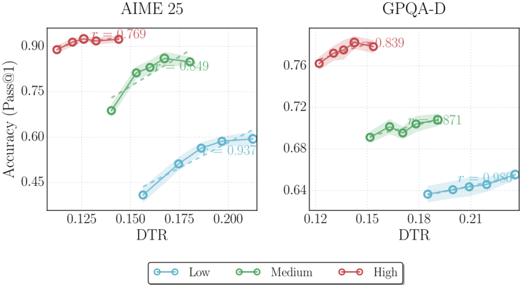
## Line Chart: Accuracy vs. DTR for AIME 25 and GPQA-D
### Overview
The image presents two line charts comparing the accuracy (Pass@1) against DTR (Decoding Temperature Ratio) for two datasets: AIME 25 and GPQA-D. Each chart displays three data series representing "Low", "Medium", and "High" levels, indicated by blue, green, and red lines, respectively. The charts also include shaded regions around each line, representing uncertainty or variance.
### Components/Axes
**AIME 25 Chart (Left)**
* **Title:** AIME 25
* **X-axis:** DTR (Decoding Temperature Ratio)
* Scale: 0.125, 0.150, 0.175, 0.200
* **Y-axis:** Accuracy (Pass@1)
* Scale: 0.45, 0.60, 0.75, 0.90
* **Data Series:**
* Low (Blue): Starts around (0.16, 0.45) and increases to approximately (0.20, 0.60). r = 0.937
* Medium (Green): Starts around (0.15, 0.73) and increases to approximately (0.18, 0.85). r = 0.849
* High (Red): Remains relatively constant around 0.90 for DTR values between 0.125 and 0.15. r = 0.769
**GPQA-D Chart (Right)**
* **Title:** GPQA-D
* **X-axis:** DTR (Decoding Temperature Ratio)
* Scale: 0.12, 0.15, 0.18, 0.21
* **Y-axis:** Accuracy (Pass@1)
* Scale: 0.64, 0.68, 0.72, 0.76
* **Data Series:**
* Low (Blue): Starts around (0.19, 0.64) and increases slightly. r = 0.986
* Medium (Green): Remains relatively constant around 0.70 for DTR values between 0.15 and 0.18. r = 0.871
* High (Red): Remains relatively constant around 0.77 for DTR values between 0.12 and 0.15. r = 0.839
**Legend (Bottom)**
* Low: Blue line with circle markers
* Medium: Green line with circle markers
* High: Red line with circle markers
### Detailed Analysis
**AIME 25 Chart**
* **Low (Blue):** The accuracy increases steadily with DTR.
* (0.16, 0.45)
* (0.18, 0.53)
* (0.20, 0.60)
* **Medium (Green):** The accuracy increases from DTR 0.15 to 0.18 and then plateaus.
* (0.15, 0.73)
* (0.165, 0.80)
* (0.18, 0.85)
* **High (Red):** The accuracy remains high and relatively constant across the DTR range.
* (0.125, 0.90)
* (0.1375, 0.905)
* (0.15, 0.90)
**GPQA-D Chart**
* **Low (Blue):** The accuracy increases slightly with DTR.
* (0.19, 0.64)
* (0.20, 0.645)
* (0.21, 0.65)
* **Medium (Green):** The accuracy remains relatively constant across the DTR range.
* (0.15, 0.69)
* (0.165, 0.70)
* (0.18, 0.70)
* **High (Red):** The accuracy remains relatively constant across the DTR range.
* (0.12, 0.76)
* (0.135, 0.77)
* (0.15, 0.77)
### Key Observations
* For AIME 25, the "High" level consistently achieves the highest accuracy, while "Low" has the lowest.
* For GPQA-D, the "High" level consistently achieves the highest accuracy, while "Low" has the lowest.
* The AIME 25 chart shows a more pronounced increase in accuracy with DTR for the "Low" and "Medium" levels compared to the GPQA-D chart.
* The 'r' values are correlation coefficients, indicating the strength and direction of a linear relationship between DTR and Accuracy.
### Interpretation
The charts illustrate the relationship between Decoding Temperature Ratio (DTR) and accuracy for different levels (Low, Medium, High) on two datasets, AIME 25 and GPQA-D. The data suggests that, in general, higher levels tend to achieve higher accuracy. The impact of DTR on accuracy varies between the datasets and levels. For AIME 25, increasing DTR has a more significant positive impact on the "Low" and "Medium" levels compared to GPQA-D. The relatively high 'r' values suggest a strong positive correlation between DTR and Accuracy, especially for the "Low" series in both charts. The shaded regions indicate the variability or uncertainty associated with each data series, providing a sense of the robustness of the observed trends.