## Scatter Plot Comparison: AIME 25 vs. GPQA-D
### Overview
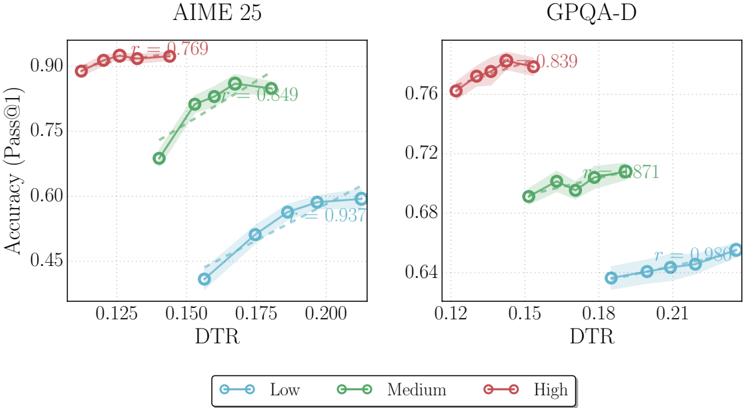
The image displays two side-by-side scatter plots comparing model performance (Accuracy, Pass@1) against a metric called "DTR" for two different datasets or benchmarks: "AIME 25" (left) and "GPQA-D" (right). Each plot contains three data series, color-coded by a categorical variable labeled "Low," "Medium," and "High" in a shared legend at the bottom. Each data series includes a trend line and a displayed correlation coefficient (r).
### Components/Axes
* **Titles:**
* Left Plot: "AIME 25"
* Right Plot: "GPQA-D"
* **Y-Axis (Both Plots):** Labeled "Accuracy (Pass@1)". The scale is linear.
* AIME 25 Range: Approximately 0.40 to 0.95.
* GPQA-D Range: Approximately 0.62 to 0.78.
* **X-Axis (Both Plots):** Labeled "DTR". The scale is linear.
* AIME 25 Range: Approximately 0.11 to 0.22.
* GPQA-D Range: Approximately 0.12 to 0.24.
* **Legend:** Positioned at the bottom center, below both plots.
* **Low:** Blue line with circle markers.
* **Medium:** Green line with circle markers.
* **High:** Red line with circle markers.
* **Data Series Annotations:** Each colored series has a correlation coefficient (`r`) displayed near its trend line, colored to match the series.
### Detailed Analysis
**AIME 25 Plot (Left):**
* **High (Red):** Clustered in the top-left region (low DTR, high accuracy). The trend line shows a slight downward slope. Data points are approximately at DTR: 0.115, 0.125, 0.135, 0.145 with corresponding Accuracy: ~0.88, ~0.90, ~0.91, ~0.91. Correlation coefficient: `r = -0.769`.
* **Medium (Green):** Positioned in the center of the plot. The trend line shows a clear upward slope. Data points are approximately at DTR: 0.145, 0.160, 0.170, 0.180, 0.190 with corresponding Accuracy: ~0.68, ~0.80, ~0.83, ~0.85, ~0.84. Correlation coefficient: `r = 0.849`.
* **Low (Blue):** Clustered in the bottom-right region (high DTR, low accuracy). The trend line shows a strong upward slope. Data points are approximately at DTR: 0.155, 0.170, 0.180, 0.190, 0.200, 0.210 with corresponding Accuracy: ~0.40, ~0.48, ~0.55, ~0.58, ~0.59, ~0.59. Correlation coefficient: `r = 0.937`.
**GPQA-D Plot (Right):**
* **High (Red):** Clustered in the top-left region. The trend line shows a slight upward slope. Data points are approximately at DTR: 0.125, 0.135, 0.145, 0.155 with corresponding Accuracy: ~0.76, ~0.77, ~0.77, ~0.77. Correlation coefficient: `r = 0.839`.
* **Medium (Green):** Positioned in the center. The trend line shows a moderate upward slope. Data points are approximately at DTR: 0.155, 0.165, 0.175, 0.185, 0.195 with corresponding Accuracy: ~0.69, ~0.70, ~0.70, ~0.71, ~0.71. Correlation coefficient: `r = 0.871`.
* **Low (Blue):** Clustered in the bottom-right region. The trend line shows a moderate upward slope. Data points are approximately at DTR: 0.185, 0.195, 0.205, 0.215, 0.225 with corresponding Accuracy: ~0.64, ~0.64, ~0.65, ~0.65, ~0.66. Correlation coefficient: `r = 0.982`.
### Key Observations
1. **Stratification by Category:** In both plots, the "High" category consistently achieves the highest accuracy, "Medium" is in the middle, and "Low" has the lowest accuracy. This creates three distinct horizontal bands.
2. **DTR Relationship:** There is a clear inverse relationship between the category and DTR value. "High" accuracy models operate at lower DTR values, while "Low" accuracy models operate at higher DTR values.
3. **Trend Direction Variance:** The correlation between DTR and Accuracy within a category differs between the two benchmarks.
* For **AIME 25**, the "High" category shows a *negative* correlation (`r = -0.769`), while "Medium" and "Low" show strong *positive* correlations.
* For **GPQA-D**, all three categories ("High," "Medium," "Low") show *positive* correlations.
4. **Performance Gap:** The vertical spread (accuracy difference) between the "High" and "Low" categories is much larger in the AIME 25 plot (~0.50 difference) compared to the GPQA-D plot (~0.13 difference).
### Interpretation
The data suggests that the "DTR" metric is strongly predictive of model performance tier (High/Medium/Low) across both benchmarks, with lower DTR associated with higher performance. However, the *nature* of the relationship between fine-grained DTR changes and accuracy within a tier is benchmark-dependent.
* **AIME 25** appears to be a benchmark where achieving top-tier ("High") performance requires operating at a very specific, low DTR range; pushing DTR slightly higher within that tier correlates with a slight accuracy drop. Conversely, for lower-performing models ("Medium," "Low"), increasing DTR is strongly associated with better accuracy, suggesting they benefit from whatever DTR represents.
* **GPQA-D** shows a more uniform pattern where, across all performance tiers, a higher DTR is associated with marginally better accuracy. This indicates that the factor measured by DTR might have a more consistent, positive effect on this benchmark.
The stark difference in the accuracy gap between tiers suggests AIME 25 is a more discriminative benchmark, separating high and low performers more dramatically than GPQA-D. The inverse correlation for the top tier in AIME 25 is a notable anomaly, indicating a potential ceiling effect or a trade-off specific to that benchmark's highest difficulty level.