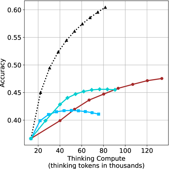
## Multi-Series Line Chart: Accuracy vs. Thinking Compute
### Overview
The image is a line chart plotting model accuracy against computational effort, measured in thinking tokens. It displays four distinct data series, each represented by a different color and marker style, showing how accuracy scales with increased "thinking compute." The chart demonstrates a clear positive correlation between compute and accuracy for all series, but with significantly different scaling efficiencies.
### Components/Axes
* **X-Axis (Horizontal):**
* **Label:** "Thinking Compute (thinking tokens in thousands)"
* **Scale:** Linear scale ranging from approximately 10 to 130 (in thousands of tokens).
* **Major Tick Marks:** 20, 40, 60, 80, 100, 120.
* **Y-Axis (Vertical):**
* **Label:** "Accuracy"
* **Scale:** Linear scale ranging from 0.40 to 0.60.
* **Major Tick Marks:** 0.40, 0.45, 0.50, 0.55, 0.60.
* **Data Series (Legend inferred from visual markers):**
1. **Black, Dotted Line with Upward-Pointing Triangles (▲):** The top-performing series.
2. **Cyan (Light Blue), Solid Line with Diamonds (◆):** The second-highest series.
3. **Blue, Solid Line with Squares (■):** The series that plateaus earliest.
4. **Red (Maroon), Solid Line with Circles (●):** The series with the most linear, steady growth.
* **Grid:** A light gray grid is present, with vertical lines at each major x-axis tick and horizontal lines at each major y-axis tick.
### Detailed Analysis
**1. Black Dotted Line (▲):**
* **Trend:** Exhibits the steepest, near-logarithmic growth. It starts at the lowest accuracy point but rapidly surpasses all others.
* **Key Data Points (Approximate):**
* ~10k tokens: Accuracy ≈ 0.37
* ~20k tokens: Accuracy ≈ 0.45
* ~40k tokens: Accuracy ≈ 0.525
* ~60k tokens: Accuracy ≈ 0.575
* ~80k tokens: Accuracy ≈ 0.60 (highest point on the chart)
**2. Cyan Line (◆):**
* **Trend:** Shows strong initial growth that begins to decelerate and plateau after ~60k tokens.
* **Key Data Points (Approximate):**
* ~10k tokens: Accuracy ≈ 0.37
* ~30k tokens: Accuracy ≈ 0.41
* ~50k tokens: Accuracy ≈ 0.445
* ~70k tokens: Accuracy ≈ 0.455
* ~90k tokens: Accuracy ≈ 0.455 (plateau)
**3. Blue Line (■):**
* **Trend:** Rises quickly at very low compute but hits a performance ceiling earliest, showing a clear plateau and even a slight decline.
* **Key Data Points (Approximate):**
* ~10k tokens: Accuracy ≈ 0.37
* ~20k tokens: Accuracy ≈ 0.40
* ~40k tokens: Accuracy ≈ 0.415
* ~60k tokens: Accuracy ≈ 0.415 (plateau)
* ~80k tokens: Accuracy ≈ 0.41 (slight decline)
**4. Red Line (●):**
* **Trend:** Demonstrates a remarkably steady, almost linear increase in accuracy across the entire compute range shown. It starts as the lowest-performing series but eventually overtakes the plateauing blue and cyan series.
* **Key Data Points (Approximate):**
* ~10k tokens: Accuracy ≈ 0.37
* ~40k tokens: Accuracy ≈ 0.40
* ~70k tokens: Accuracy ≈ 0.44
* ~100k tokens: Accuracy ≈ 0.46
* ~130k tokens: Accuracy ≈ 0.475 (highest point for this series)
### Key Observations
1. **Performance Hierarchy:** At high compute (>80k tokens), the order of performance from highest to lowest accuracy is: Black (▲) > Red (●) > Cyan (◆) > Blue (■).
2. **Scaling Efficiency:** The Black (▲) series demonstrates vastly superior scaling efficiency. To reach 0.50 accuracy, it requires only ~30k tokens, while the Red (●) series does not reach 0.50 even at 130k tokens.
3. **Plateau Effects:** The Blue (■) and Cyan (◆) series exhibit clear diminishing returns, with the Blue series plateauing below 0.42 accuracy. The Red (●) series shows no signs of plateauing within the charted range.
4. **Convergence at Low Compute:** All four series originate from approximately the same point (~0.37 accuracy at ~10k tokens), indicating similar baseline performance with minimal thinking compute.
### Interpretation
This chart illustrates a fundamental trade-off in AI model design between **peak performance** and **compute efficiency**.
* The **Black (▲) series** likely represents a highly optimized, state-of-the-art reasoning or "chain-of-thought" method. Its steep curve suggests that allocating more thinking tokens yields dramatic accuracy gains, making it the best choice when high accuracy is critical and compute is available.
* The **Red (●) series** represents a method with consistent, reliable scaling. While less efficient than the black series, its linear growth is predictable and may be preferable in scenarios where compute budgets are fixed and incremental improvements are valued over peak performance.
* The **Cyan (◆) and Blue (■) series** represent methods that are effective at low compute but hit inherent limitations. The Blue series, in particular, may be a simpler or more constrained model that cannot leverage additional thinking tokens to improve beyond a certain point. These could be suitable for low-latency or resource-constrained applications where minimal compute is the primary concern.
The data suggests that the choice of "thinking" architecture or prompting strategy (represented by the different lines) is more impactful on final accuracy than simply increasing compute for a given method, especially at higher token counts. The stark difference between the black and red lines highlights that not all methods for utilizing thinking compute are created equal.