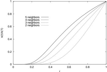
## Line Chart: s(r)/s(1) vs. r for Different Numbers of Neighbors
### Overview
The image is a line chart showing the relationship between `s(r)/s(1)` (y-axis) and `r` (x-axis) for different numbers of neighbors (2, 3, 4, and 5). The chart illustrates how the value of `s(r)/s(1)` changes as `r` increases, with separate lines representing different neighbor counts. All lines start at (0,0) and end at (1,1).
### Components/Axes
* **X-axis:**
* Label: `r`
* Scale: 0 to 1, with tick marks at 0, 0.2, 0.4, 0.6, 0.8, and 1.
* **Y-axis:**
* Label: `s(r)/s(1)`
* Scale: 0 to 1, with tick marks at 0, 0.2, 0.4, 0.6, 0.8, and 1.
* **Legend:** Located in the top-left quadrant of the chart.
* `5 neighbors`: Solid black line
* `4 neighbors`: Dashed black line
* `3 neighbors`: Dotted black line
* `2 neighbors`: Solid gray line
### Detailed Analysis
* **5 neighbors (Solid Black Line):**
* Trend: The line slopes upward, starting from (0,0) and ending at (1,1). The slope is initially shallow, then increases more rapidly between r=0.2 and r=0.8, and then flattens out again as it approaches r=1.
* Approximate Data Points:
* r = 0.2, s(r)/s(1) ≈ 0.02
* r = 0.4, s(r)/s(1) ≈ 0.15
* r = 0.6, s(r)/s(1) ≈ 0.38
* r = 0.8, s(r)/s(1) ≈ 0.68
* r = 1.0, s(r)/s(1) = 1.0
* **4 neighbors (Dashed Black Line):**
* Trend: The line slopes upward, starting from (0,0) and ending at (1,1). The slope is initially shallow, then increases more rapidly between r=0.3 and r=0.8.
* Approximate Data Points:
* r = 0.2, s(r)/s(1) ≈ 0.01
* r = 0.4, s(r)/s(1) ≈ 0.10
* r = 0.6, s(r)/s(1) ≈ 0.30
* r = 0.8, s(r)/s(1) ≈ 0.60
* r = 1.0, s(r)/s(1) = 1.0
* **3 neighbors (Dotted Black Line):**
* Trend: The line slopes upward, starting from (0,0) and ending at (1,1). The slope is initially shallow, then increases more rapidly between r=0.4 and r=0.9.
* Approximate Data Points:
* r = 0.2, s(r)/s(1) ≈ 0.00
* r = 0.4, s(r)/s(1) ≈ 0.05
* r = 0.6, s(r)/s(1) ≈ 0.20
* r = 0.8, s(r)/s(1) ≈ 0.50
* r = 1.0, s(r)/s(1) = 1.0
* **2 neighbors (Solid Gray Line):**
* Trend: The line slopes upward, starting from (0,0) and ending at (1,1). The slope is initially very shallow, then increases rapidly between r=0.5 and r=1.0.
* Approximate Data Points:
* r = 0.2, s(r)/s(1) ≈ 0.00
* r = 0.4, s(r)/s(1) ≈ 0.01
* r = 0.6, s(r)/s(1) ≈ 0.10
* r = 0.8, s(r)/s(1) ≈ 0.35
* r = 1.0, s(r)/s(1) = 1.0
### Key Observations
* All lines start at the origin (0,0) and end at (1,1).
* As the number of neighbors increases, the curve shifts upwards, indicating a higher value of `s(r)/s(1)` for a given value of `r`.
* The curve for 2 neighbors is significantly lower than the other curves, especially for smaller values of `r`.
* The curves become steeper as the number of neighbors decreases.
### Interpretation
The chart illustrates the relationship between `s(r)/s(1)` and `r` for different numbers of neighbors. The data suggests that as the number of neighbors increases, the value of `s(r)/s(1)` tends to be higher for a given value of `r`. This implies that the function `s(r)` is influenced by the number of neighbors considered. The steeper curves for lower neighbor counts indicate a more rapid change in `s(r)/s(1)` as `r` increases. The chart could be used to analyze the impact of neighborhood size on some underlying phenomenon represented by the function `s(r)`.