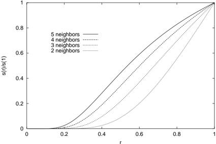
## Line Chart: Normalized Similarity Function s(r)/s(1) vs. Distance r
### Overview
The image is a 2D line chart plotting a normalized function, `s(r)/s(1)`, against a variable `r`. The chart displays four distinct curves, each corresponding to a different number of "neighbors" (2, 3, 4, and 5). All curves originate near the origin (0,0) and converge at the point (1,1), exhibiting a monotonic, S-shaped (sigmoidal) increase. The chart is presented in grayscale with different line styles to differentiate the data series.
### Components/Axes
* **Chart Type:** 2D Line Chart.
* **X-Axis:**
* **Label:** `r`
* **Scale:** Linear, ranging from 0 to 1.
* **Major Ticks:** 0, 0.2, 0.4, 0.6, 0.8, 1.0.
* **Y-Axis:**
* **Label:** `s(r)/s(1)`
* **Scale:** Linear, ranging from 0 to 1.
* **Major Ticks:** 0, 0.2, 0.4, 0.6, 0.8, 1.0.
* **Legend:**
* **Position:** Top-left corner of the plot area.
* **Entries (from top to bottom):**
1. `5 neighbors` - Represented by a solid line.
2. `4 neighbors` - Represented by a dashed line.
3. `3 neighbors` - Represented by a dotted line.
4. `2 neighbors` - Represented by a dash-dot line.
### Detailed Analysis
The chart compares the behavior of the function `s(r)/s(1)` for different neighbor counts as `r` increases from 0 to 1.
* **General Trend:** All four curves are monotonically increasing. They start with a shallow slope near `r=0`, steepen in the middle range of `r`, and then flatten as they approach the convergence point at (1,1).
* **Series-Specific Behavior (from highest to lowest curve at a given `r`):**
1. **5 neighbors (Solid Line):** This curve is the highest for all `r` values between 0 and 1. It begins its noticeable ascent earliest (around `r=0.1`) and maintains the steepest slope through the middle range.
2. **4 neighbors (Dashed Line):** This curve lies just below the "5 neighbors" line. Its trajectory is very similar but slightly delayed and less steep.
3. **3 neighbors (Dotted Line):** This curve is positioned below the "4 neighbors" line. It shows a more pronounced delay in its ascent compared to the higher neighbor counts.
4. **2 neighbors (Dash-Dot Line):** This is the lowest curve. It remains close to zero for the longest duration (until approximately `r=0.3`) and has the most gradual slope, resulting in the latest approach to the value of 1.
* **Convergence:** All lines meet precisely at the coordinate (1, 1), indicating that `s(r)/s(1) = 1` when `r = 1`, regardless of the neighbor count.
### Key Observations
1. **Monotonic Ordering:** There is a strict, consistent ordering of the curves. For any given `r` between 0 and 1, the value of `s(r)/s(1)` increases with the number of neighbors: `5 neighbors > 4 neighbors > 3 neighbors > 2 neighbors`.
2. **Sigmoidal Shape:** The curves are not linear; they exhibit an S-shape, suggesting a phase of slow initial growth, rapid transition, and then saturation.
3. **Convergence Point:** The forced convergence at (1,1) is a defining feature, implying `s(1)` is the normalization factor for the function `s(r)`.
4. **Line Style Clarity:** The use of distinct line styles (solid, dashed, dotted, dash-dot) effectively differentiates the series in a monochrome format.
### Interpretation
This chart likely illustrates a concept from machine learning, statistics, or spatial analysis, specifically related to **k-Nearest Neighbors (k-NN)** or a similar distance-based similarity metric.
* **What `r` and `s(r)` represent:** `r` is almost certainly a **normalized distance** (e.g., distance divided by the maximum distance in the dataset or to the k-th neighbor). `s(r)` is a **similarity or affinity function** that decreases with distance. The plot shows `s(r)` normalized by its value at `r=1` (`s(1)`), which is the similarity at the maximum considered distance.
* **The Role of "Neighbors":** The parameter (2, 3, 4, 5 neighbors) is `k`. The chart demonstrates how the **effective similarity profile** changes with `k`.
* **Core Insight:** The data suggests that **increasing `k` (the number of neighbors) makes the similarity function `s(r)` more "aggressive" or "confident."** For the same normalized distance `r`, a query point is considered more similar to its neighborhood when that neighborhood is larger (higher `k`). This is because with more neighbors, the distance to the farthest one (`r=1`) is relatively larger, so intermediate distances represent a smaller fraction of the total neighborhood spread, warranting a higher similarity score.
* **Practical Implication:** In a k-NN classifier or regressor, using a higher `k` would mean that points need to be relatively closer (smaller `r`) to be considered highly similar, but the similarity score for points at a medium distance would be higher compared to a lower `k` setting. This affects decision boundaries and smoothing. The chart provides a visual, quantitative comparison of this effect for small values of `k`.