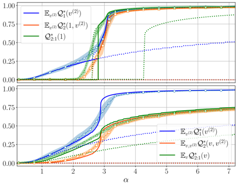
## Chart: Cumulative Distribution Functions
### Overview
The image presents two charts stacked vertically, both depicting cumulative distribution functions (CDFs) plotted against a variable denoted as "α" (alpha). Each chart displays three curves, representing different expectations (E) of quantities Q. The charts are shaded to indicate confidence intervals around the curves.
### Components/Axes
* **X-axis:** Labeled "α", ranging from approximately 0.8 to 7.0. The axis is divided into increments of 1.
* **Y-axis:** Both charts share the same Y-axis, ranging from 0.0 to 1.0, representing the cumulative probability. The axis is divided into increments of 0.25.
* **Legend (Top-Left of each chart):**
* Blue Solid Line: E<sub>μ(2)</sub> Q<sub>1</sub><sup>(v(2)</sup>
* Orange Solid Line: E<sub>μ(2)</sub> Q<sub>2</sub><sup>(1, v(2)</sup>
* Green Solid Line: Q<sub>2:1</sub><sup>(1)</sup>
* **Shading:** Each line has a shaded region around it, representing a confidence interval. The shading is lighter in color than the corresponding line.
* **Vertical Gridlines:** There are vertical gridlines at α = 2, α = 3, α = 4, α = 5, and α = 6.
* **Data Points:** Each line is composed of connected data points, indicated by small circles.
### Detailed Analysis or Content Details
**Chart 1 (Top):**
* **E<sub>μ(2)</sub> Q<sub>1</sub><sup>(v(2)</sup> (Blue):** This line starts at approximately 0.1 at α = 0.8, increases gradually until α = 2.5, then rises sharply to reach approximately 0.95 at α = 3.5, and plateaus around 1.0.
* **E<sub>μ(2)</sub> Q<sub>2</sub><sup>(1, v(2)</sup> (Orange):** This line begins at approximately 0.05 at α = 0.8, increases slowly until α = 2, then rises rapidly to reach approximately 0.9 at α = 3.2, and plateaus around 1.0.
* **Q<sub>2:1</sub><sup>(1)</sup> (Green):** This line starts at approximately 0.1 at α = 0.8, increases gradually until α = 3.5, then rises sharply to reach approximately 0.95 at α = 4.5, and plateaus around 1.0.
**Chart 2 (Bottom):**
* **E<sub>μ(2)</sub> Q<sub>1</sub><sup>(v(2)</sup> (Blue):** This line starts at approximately 0.05 at α = 0.8, increases gradually until α = 2.5, then rises sharply to reach approximately 0.95 at α = 3.5, and plateaus around 1.0.
* **E<sub>μ(2)</sub> Q<sub>2</sub><sup>(1, v(2)</sup> (Orange):** This line begins at approximately 0.02 at α = 0.8, increases slowly until α = 2, then rises rapidly to reach approximately 0.85 at α = 3.2, and plateaus around 0.95.
* **Q<sub>2:1</sub><sup>(1)</sup> (Green):** This line starts at approximately 0.05 at α = 0.8, increases gradually until α = 3.5, then rises sharply to reach approximately 0.9 at α = 4.5, and plateaus around 0.95.
### Key Observations
* All three curves in both charts demonstrate a sigmoid (S-shaped) pattern, characteristic of cumulative distribution functions.
* The curves shift to the right in the bottom chart compared to the top chart, indicating a different distribution for the variables.
* The confidence intervals (shaded regions) provide a measure of the uncertainty around each curve.
* The vertical gridlines highlight specific values of α for comparison across the different curves.
### Interpretation
The charts illustrate the cumulative distribution of three different quantities (Q<sub>1</sub>, Q<sub>2</sub>, and Q<sub>2:1</sub>) under different expectations (E<sub>μ(2)</sub> and E<sub>μ</sub>). The variable α likely represents a parameter influencing the distribution of these quantities.
The shift in the curves between the two charts suggests that the distribution of these quantities changes depending on the context or conditions represented by the two charts. The fact that all curves eventually plateau at 1.0 indicates that there is a maximum value for these quantities, and the CDF shows the probability of observing a value less than or equal to a given α.
The differences in the steepness of the curves suggest that some quantities are more sensitive to changes in α than others. For example, the rapid increase in the CDF for E<sub>μ(2)</sub> Q<sub>2</sub><sup>(1, v(2)</sup> indicates that this quantity quickly reaches a high probability value as α increases. The confidence intervals provide a measure of the variability in these distributions, and wider intervals suggest greater uncertainty. The vertical gridlines allow for a direct comparison of the CDF values for each quantity at specific values of α.