TECHNICAL ASSET FINGERPRINT
6a30c44f1071ceea020d032c
Click to view fullscreen
Press ESC or click to close
FOUND IN PAPERS
EXPERT: healer-alpha-free VERSION 1
RUNTIME: free/openrouter/healer-alpha
INTEL_VERIFIED
\n
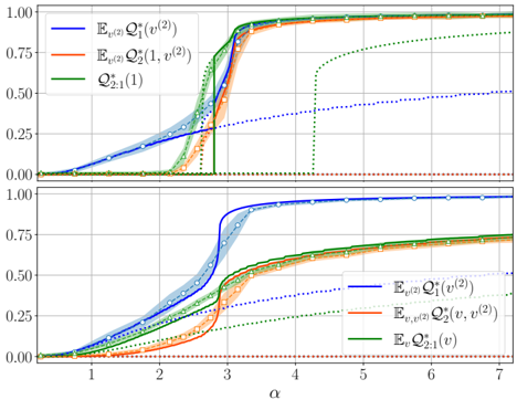
## Line Chart with Confidence Intervals: Performance Metrics vs. Parameter α
### Overview
The image displays a two-panel vertical line chart comparing the behavior of three distinct mathematical functions or metrics as a function of a parameter labeled "α". Each panel (top and bottom) plots the same three series but under different conditions or definitions, as indicated by subtle variations in the legend notation. The chart includes shaded regions around each line, representing confidence intervals, standard deviation, or some measure of variability.
### Components/Axes
* **X-Axis (Both Panels):**
* **Label:** `α` (Greek letter alpha).
* **Scale:** Linear scale from approximately 0 to 7.
* **Major Tick Marks:** At integer values 1, 2, 3, 4, 5, 6, 7.
* **Y-Axis (Both Panels):**
* **Scale:** Linear scale from 0.00 to 1.00.
* **Major Tick Marks:** At 0.00, 0.25, 0.50, 0.75, 1.00.
* **Legends:**
* **Location:** Top-left corner within each subplot.
* **Content (Top Panel):**
1. **Blue Line:** `E_{v^(2)} Q_1^*(v^(2))`
2. **Orange Line:** `E_{v^(2)} Q_2^*(1, v^(2))`
3. **Green Line:** `Q_{2,1}^*(1)`
* **Content (Bottom Panel):**
1. **Blue Line:** `E_{v^(2)} Q_1^*(v^(2))`
2. **Orange Line:** `E_{v^(2)} Q_2^*(v, v^(2))`
3. **Green Line:** `Q_{2,1}^*(v)`
* **Note:** The mathematical notation is transcribed directly. The primary difference between the top and bottom panels is in the second and third legend entries, where the arguments of the functions change (e.g., `Q_2^*(1, v^(2))` vs. `Q_2^*(v, v^(2))` and `Q_{2,1}^*(1)` vs. `Q_{2,1}^*(v)`).
### Detailed Analysis
**Top Panel:**
* **Blue Line (`E_{v^(2)} Q_1^*(v^(2))`):**
* **Trend:** Starts near 0 at α=0. Increases gradually and linearly until α≈2.5. Undergoes a sharp, sigmoidal increase between α≈2.5 and α≈3.5, reaching a plateau near 1.00 by α≈4. The shaded blue region is narrow, indicating low variance.
* **Orange Line (`E_{v^(2)} Q_2^*(1, v^(2))`):**
* **Trend:** Follows a very similar path to the blue line, with a slightly delayed and less steep initial rise. It also plateaus near 1.00. The shaded orange region is slightly wider than the blue one.
* **Green Line (`Q_{2,1}^*(1)`):**
* **Trend (Solid):** Remains near 0 until α≈2.5, then exhibits an extremely sharp, almost vertical jump to near 1.00, slightly preceding the blue and orange lines. It plateaus at 1.00.
* **Trend (Dotted):** A separate green dotted line starts at 0, rises gradually after α≈3, and appears to approach a value of approximately 0.50 by α=7. This suggests a different variant or component of the green metric.
* **Key Data Points (Approximate):**
* At α=2: Blue ≈ 0.20, Orange ≈ 0.15, Green (solid) ≈ 0.00.
* At α=3: Blue ≈ 0.75, Orange ≈ 0.65, Green (solid) ≈ 0.90.
* At α=4: All solid lines are at or very near 1.00.
**Bottom Panel:**
* **Blue Line (`E_{v^(2)} Q_1^*(v^(2))`):**
* **Trend:** Identical to the blue line in the top panel. Sharp sigmoidal rise between α≈2.5-3.5, plateau at 1.00.
* **Orange Line (`E_{v^(2)} Q_2^*(v, v^(2))`):**
* **Trend:** Rises much more gradually than its counterpart in the top panel. It begins increasing from 0 around α=1, but the slope is gentle. It does not reach 1.00 within the plotted range; at α=7, it is approximately 0.75. The shaded region is relatively wide.
* **Green Line (`Q_{2,1}^*(v)`):**
* **Trend (Solid):** Follows a path very similar to the orange line in this panel, rising gradually from α≈1 and reaching approximately 0.75 by α=7. It is nearly coincident with the orange line.
* **Trend (Dotted):** A green dotted line, similar to the top panel, rises gradually from 0 after α≈3 and reaches approximately 0.50 by α=7.
* **Key Data Points (Approximate):**
* At α=3: Blue ≈ 0.75, Orange ≈ 0.20, Green (solid) ≈ 0.15.
* At α=5: Blue ≈ 1.00, Orange ≈ 0.60, Green (solid) ≈ 0.60.
* At α=7: Blue ≈ 1.00, Orange ≈ 0.75, Green (solid) ≈ 0.75.
### Key Observations
1. **Phase Transition:** The blue line (`Q_1^*`) in both panels exhibits a clear phase transition or threshold behavior around α ≈ 2.5-3.5, rapidly moving from a low-value state to a high-value (saturated) state.
2. **Condition Dependence:** The behavior of the orange (`Q_2^*`) and green (`Q_{2,1}^*`) metrics is highly dependent on the condition specified in their arguments (the difference between `1` and `v`).
* Under the "1" condition (top panel), they behave similarly to the blue line, undergoing a sharp transition.
* Under the "v" condition (bottom panel), their transition is suppressed, resulting in a much slower, gradual increase that does not saturate within the observed α range.
3. **Dotted Green Line:** A secondary green dotted series appears in both panels, showing a slow, linear-like increase to ~0.5, independent of the sharp transitions seen in the solid lines.
4. **Convergence:** In the top panel, all solid lines converge to 1.00 for α > 4. In the bottom panel, only the blue line converges to 1.00; the orange and green solid lines appear to converge with each other at a lower value (~0.75).
### Interpretation
This chart likely illustrates the results of a theoretical or computational study in fields like statistical physics, information theory, or machine learning, where `α` is a control parameter (e.g., signal-to-noise ratio, system size, or learning rate). The functions `Q` appear to be order parameters or performance metrics.
* **Core Finding:** The system or model undergoes a sharp performance improvement (a "phase transition") for the metric `Q_1^*` at a critical value of `α_c ≈ 3`. This is a robust result, unchanged between the two panels.
* **Contextual Sensitivity:** The metrics `Q_2^*` and `Q_{2,1}^*` are sensitive to the context defined by their arguments. When evaluated at a fixed point (`1`), they mirror the sharp transition of `Q_1^*`. When evaluated in a more variable context (`v`), their improvement is gradual and incomplete, suggesting that this aspect of system performance is harder to optimize or saturate.
* **Underlying Mechanism:** The dotted green line may represent a baseline, a different solution branch, or a theoretical bound that is approached slowly. The fact that the solid green and orange lines in the bottom panel track each other closely suggests they are measuring related phenomena under the "v" condition.
* **Implication:** The data demonstrates that while one aspect of the system (`Q_1^*`) can achieve perfect performance (value of 1) beyond a critical threshold, other aspects (`Q_2^*`, `Q_{2,1}^*`) may be fundamentally limited or require different conditions to reach the same level, highlighting a trade-off or a hierarchy of difficulty in the problem being modeled.
DECODING INTELLIGENCE...