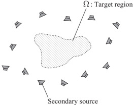
## Diagram: Spatial Distribution of Secondary Sources and Target Region
### Overview
The diagram illustrates a spatial arrangement of 12 secondary sources surrounding a central target region (Ω). The target region is depicted as an irregularly shaped area with a dotted outline, while the secondary sources are represented as uniformly sized, cone-shaped icons positioned at equidistant intervals around the perimeter. Arrows indicate directional flow or influence from the secondary sources toward the target region.
### Components/Axes
- **Labels**:
- **Ω**: Target region (central shaded area with dotted boundary).
- **Secondary source**: Cone-shaped icons (12 instances).
- **Legend**: Not explicitly present; labels are directly annotated on the diagram.
- **Spatial Grounding**:
- **Target region (Ω)**: Centered in the diagram, occupying ~60% of the vertical space and ~50% of the horizontal space.
- **Secondary sources**: Arranged in a circular pattern around Ω, with 12 evenly spaced instances. Each source is positioned at a radial distance of ~1.5× the radius of Ω.
- **Arrows**: Originate from the base of each secondary source and point toward the target region.
### Detailed Analysis
- **Secondary sources**:
- 12 identical cone-shaped icons, uniformly gray in color.
- Positioned at 30° intervals (360°/12) around the target region.
- No numerical identifiers or categorical labels assigned to individual sources.
- **Target region (Ω)**:
- Irregular polygonal shape with a dotted boundary.
- Shaded with diagonal hatching (45° orientation).
- No internal labels or subdivisions.
- **Arrows**:
- Thin, straight lines connecting secondary sources to Ω.
- Uniform thickness and style across all 12 connections.
### Key Observations
1. **Symmetry**: Secondary sources are evenly distributed around Ω, suggesting a designed or optimized layout.
2. **Directionality**: Arrows imply a unidirectional relationship (e.g., data flow, resource allocation, or influence).
3. **No numerical data**: The diagram lacks quantitative values, scales, or categorical legends beyond the two labels (Ω and secondary source).
### Interpretation
The diagram likely represents a system where secondary sources (e.g., sensors, transmitters, or processing units) contribute to or interact with a central target region (e.g., a processing hub, data sink, or area of interest). The absence of numerical data suggests the focus is on spatial relationships rather than quantitative metrics. The directional arrows imply a dependency or flow from the periphery (secondary sources) to the core (target region), which could model scenarios such as:
- **Resource distribution**: Secondary sources supplying inputs to a central system.
- **Network topology**: Peripheral nodes communicating with a central node.
- **Environmental monitoring**: Sensors surrounding a region of interest (e.g., a pollution hotspot).
The irregular shape of Ω may indicate a non-uniform area of interest, while the uniform placement of secondary sources suggests a deliberate design to ensure coverage or redundancy. The lack of a legend or scale limits quantitative interpretation but emphasizes the conceptual relationship between components.