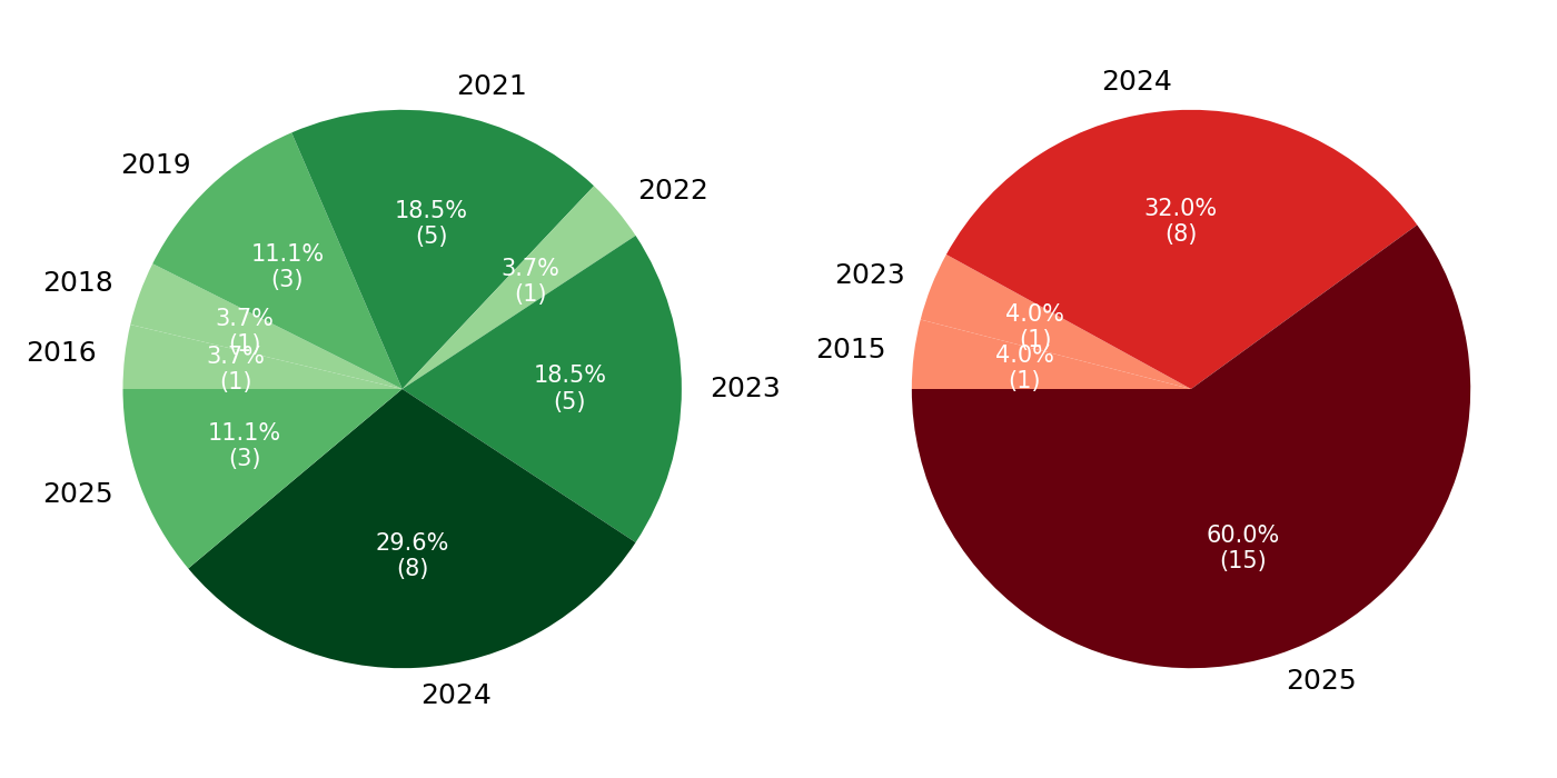
## Pie Charts: Yearly Distribution Comparison (Green vs. Red Series)
### Overview
The image consists of two side-by-side pie charts displaying categorical data based on years. The left chart utilizes a monochromatic green color palette, while the right chart utilizes a monochromatic red color palette. Both charts display the year as an external label adjacent to its respective slice, with the corresponding percentage and absolute numerical value (enclosed in parentheses) embedded directly within the slice. There is no overarching title, axis, or separate legend provided; the context of the data is not explicitly stated. The language used is entirely English (numerals).
### Components/Axes
* **Left Chart (Green Series):** Located on the left half of the image. It contains 8 distinct slices representing various years between 2016 and 2025. Labels are placed radially outside the pie.
* **Right Chart (Red Series):** Located on the right half of the image. It contains 4 distinct slices representing years 2015, 2023, 2024, and 2025. Labels are placed radially outside the pie.
* **Data Format:** Inside each slice, text is formatted with the percentage on top (rounded to one decimal place) and the absolute count below it in parentheses, e.g., `18.5% \n (5)`.
### Detailed Analysis
#### Left Chart (Green Series)
*Visual Trend:* The chart is highly fragmented, with the visual weight concentrated at the bottom (the darkest and largest slice). The data is spread across 8 different years.
*Total Calculated N-value:* 27
Starting from the top (12 o'clock position) and moving clockwise:
| Position | Year Label | Slice Color | Percentage | Absolute Value |
| :--- | :--- | :--- | :--- | :--- |
| Top | 2021 | Medium-dark green | 18.5% | (5) |
| Top-Right | 2022 | Light green | 3.7% | (1) |
| Right | 2023 | Medium-dark green | 18.5% | (5) |
| Bottom | 2024 | Very dark green | 29.6% | (8) |
| Bottom-Left | 2025 | Medium green | 11.1% | (3) |
| Left (lower) | 2016 | Light green | 3.7% | (1) |
| Left (upper) | 2018 | Light green | 3.7% | (1) |
| Top-Left | 2019 | Medium green | 11.1% | (3) |
#### Right Chart (Red Series)
*Visual Trend:* This chart is heavily consolidated, with the vast majority of the visual weight occupying the bottom and right portions (the darkest and largest slice), followed by a significant slice at the top. It only contains 4 years.
*Total Calculated N-value:* 25
Starting from the top (12 o'clock position) and moving clockwise:
| Position | Year Label | Slice Color | Percentage | Absolute Value |
| :--- | :--- | :--- | :--- | :--- |
| Top | 2024 | Bright red | 32.0% | (8) |
| Bottom/Right | 2025 | Very dark red (Maroon) | 60.0% | (15) |
| Left (lower) | 2015 | Light red (Salmon) | 4.0% | (1) |
| Left (upper) | 2023 | Light red (Salmon) | 4.0% | (1) |
### Key Observations
* **Dominant Categories:** In the Green chart, 2024 is the largest category (29.6%, n=8). In the Red chart, 2025 is overwhelmingly the largest category (60.0%, n=15).
* **Overlapping Data:** The years 2023, 2024, and 2025 appear in both charts.
* 2024 has the exact same absolute value (n=8) in both charts, though it represents a different percentage of the whole (29.6% vs 32.0%).
* **Color Mapping Logic:** There appears to be a correlation between the darkness of the slice and the absolute value it represents. In both charts, the highest values (2024 in green, 2025 in red) are assigned the darkest shades. The lowest values (n=1) are assigned the lightest shades.
* **Distribution Skew:** The Green chart shows a wider, more historical distribution of data (spanning 2016-2025 with multiple mid-tier values). The Red chart is heavily skewed toward recent/future years, with 92% of its data concentrated in 2024 and 2025.
### Interpretation
Without a title or legend defining what the "Green" and "Red" series represent, a definitive conclusion cannot be drawn about the subject matter. However, applying Peircean semiotics (reading the signs and structure), we can infer the following:
1. **Comparative Cohorts:** The side-by-side placement implies a comparison between two distinct cohorts, outcomes, or categories (e.g., "Successful vs. Failed projects," "Category A vs. Category B," or "Pre-treatment vs. Post-treatment").
2. **Temporal Shift:** If these charts represent a progression or two sides of a binary outcome, there is a distinct temporal shift. The "Green" condition was more prevalent or evenly distributed in the late 2010s and early 2020s. The "Red" condition is highly concentrated in the years 2024 and 2025.
3. **Data Volume:** The total sample sizes are remarkably similar (Green N=27, Red N=25). This suggests they might be mutually exclusive outcomes of a single dataset of roughly 52 items. If so, whatever the "Red" outcome represents, it has seen a massive spike in occurrence in the year 2025 compared to historical norms.