\n
## Pie Charts: Projected Distribution of Something Over Time
### Overview
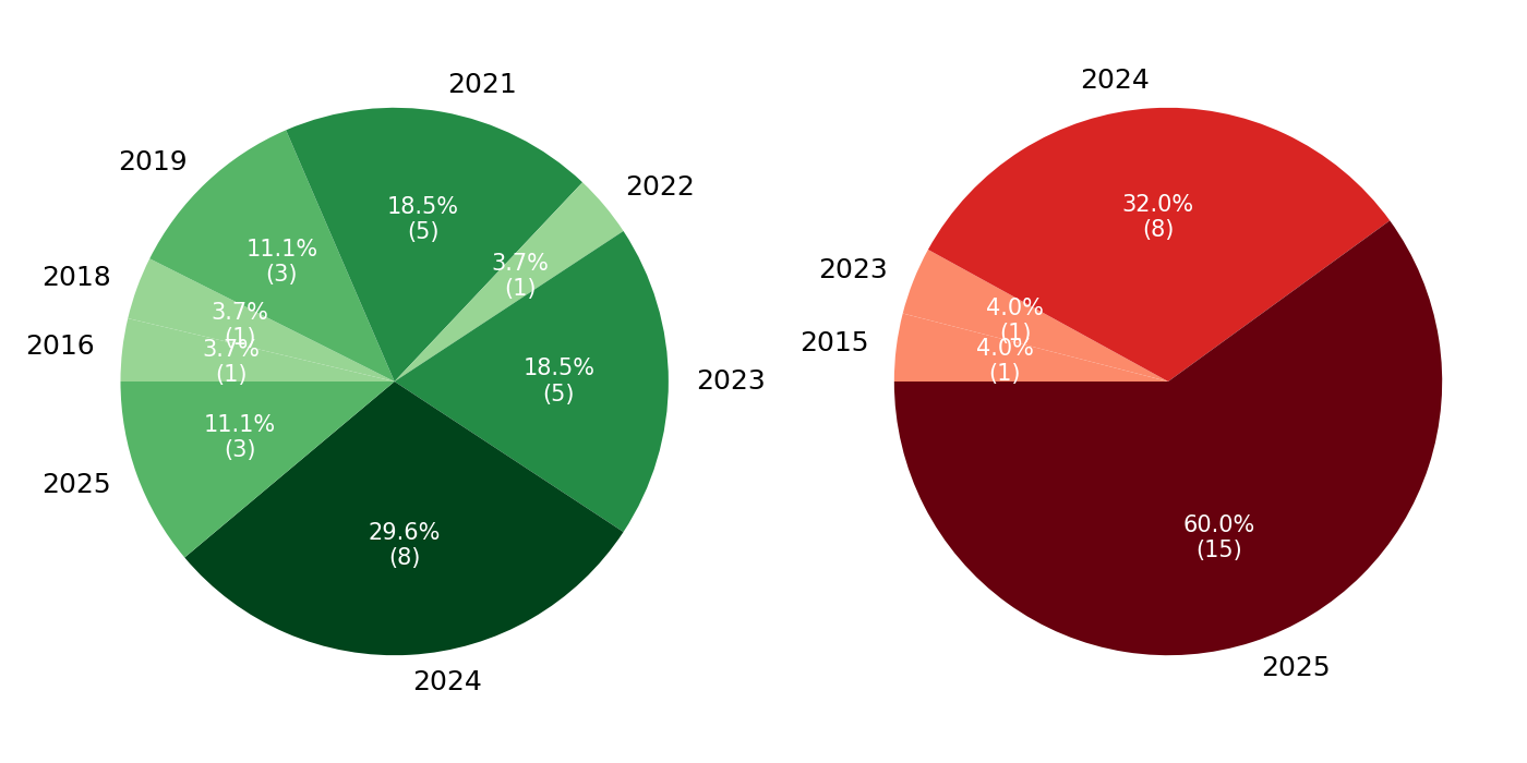
The image contains two pie charts, positioned side-by-side. Both charts represent a distribution of some quantity across different years. The left chart focuses on years 2016-2025, while the right chart focuses on years 2015-2025. Each slice of the pie charts is labeled with the year and a percentage value, along with a numerical value in parentheses.
### Components/Axes
The charts do not have traditional axes. The data is represented by the size of each slice in the pie. The labels are positioned directly adjacent to each slice. There are no legends. The years represented are: 2016, 2018, 2019, 2021, 2022, 2023, 2024, and 2025.
### Detailed Analysis or Content Details
**Left Pie Chart (2016-2025)**
* **2016:** 3.7% (1) - Light Yellow
* **2018:** 11.1% (3) - Light Green
* **2019:** 11.1% (3) - Yellow
* **2021:** 18.5% (5) - Green
* **2022:** 3.7% (1) - Light Green
* **2023:** 18.5% (5) - Green
* **2024:** 29.6% (8) - Dark Green
* **2025:** 11.1% (3) - Light Green
**Right Pie Chart (2015-2025)**
* **2015:** 4.0% (1) - Light Red
* **2023:** 4.0% (1) - Light Red
* **2024:** 32.0% (8) - Red
* **2025:** 60.0% (15) - Dark Red
### Key Observations
* In the left chart, 2024 has the largest percentage (29.6%), followed by 2021 and 2023 (both 18.5%).
* In the right chart, 2025 dominates with 60.0%, significantly larger than 2024 (32.0%).
* The values in parentheses appear to be absolute counts corresponding to the percentages.
* The color scheme is consistent within each chart, with darker shades representing larger percentages.
### Interpretation
The charts likely represent a projection or distribution of some resource or activity over time. The left chart shows a relatively even distribution across several years, with 2024 being the most prominent. The right chart, however, indicates a strong shift towards 2025, suggesting a significant concentration of the resource or activity in that year. The difference between the two charts could represent different scenarios or projections. The numerical values in parentheses suggest that the percentages are based on a total count of 100. The data suggests a growing trend towards 2025, with a substantial increase in the proportion allocated to that year. The left chart shows a more distributed allocation, while the right chart shows a more concentrated one. This could indicate a change in strategy or priorities.