## Truth Table, Weight Matrix, and Probability Distribution Charts
### Overview
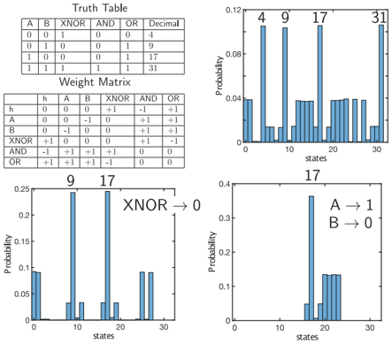
The image presents a truth table, a weight matrix, and three probability distribution charts. The truth table defines the logical operations XNOR, AND, and OR for two binary inputs A and B. The weight matrix shows the relationships between the inputs, outputs, and a hidden variable 'h'. The probability distribution charts display the probability of different states, with annotations indicating specific conditions or outputs.
### Components/Axes
**1. Truth Table:**
* **Columns:** A, B, XNOR, AND, OR, Decimal
* **Rows:** Four rows representing all possible combinations of A and B (00, 01, 10, 11).
* **Decimal Values:** 4, 9, 17, 31 corresponding to the binary combinations.
**2. Weight Matrix:**
* **Rows/Columns:** h, A, B, XNOR, AND, OR
* **Values:** +1, -1, and 0 representing the strength and direction of the relationship between the variables.
**3. Probability Distribution Charts:**
* **X-axis:** States (ranging from 0 to 30, with tick marks every 10 units)
* **Y-axis:** Probability (ranging from 0 to 0.12 in the top chart, 0 to 0.25 in the bottom-left chart, and 0 to 0.4 in the bottom-right chart)
* **Bars:** Blue bars representing the probability of each state.
* **Annotations:** Numerical values (4, 9, 17, 31) above specific bars in the top chart, and text annotations in the bottom charts ("XNOR -> 0", "A -> 1", "B -> 0").
### Detailed Analysis
**1. Truth Table:**
| A | B | XNOR | AND | OR | Decimal |
| --- | --- | ---- | --- | --- | ------- |
| 0 | 0 | 1 | 0 | 0 | 4 |
| 0 | 1 | 0 | 0 | 1 | 9 |
| 1 | 0 | 0 | 0 | 1 | 17 |
| 1 | 1 | 1 | 1 | 1 | 31 |
**2. Weight Matrix:**
| | h | A | B | XNOR | AND | OR |
| :---- | :- | :- | :- | :--- | :-: | :-: |
| h | 0 | 0 | 0 | +1 | -1 | +1 |
| A | 0 | 0 | -1 | 0 | +1 | +1 |
| B | 0 | -1 | 0 | 0 | +1 | +1 |
| XNOR | +1 | 0 | 0 | 0 | +1 | -1 |
| AND | -1 | +1 | +1 | +1 | 0 | 0 |
| OR | +1 | +1 | +1 | -1 | 0 | 0 |
**3. Probability Distribution Charts:**
* **Top Chart:**
* The probability is high at states 4, 9, 17, and 31, with approximate probabilities of 0.11.
* The probability is low for most other states, with probabilities around 0.04.
* **Bottom-Left Chart:**
* The probability is high at states 0, 9, and 17, with approximate probabilities of 0.09, 0.23, and 0.23 respectively.
* The probability is low for most other states, with probabilities around 0.03.
* Annotation: "XNOR -> 0"
* **Bottom-Right Chart:**
* The probability is high at state 17, with an approximate probability of 0.37.
* The probability is low for most other states, with probabilities around 0.12.
* Annotation: "A -> 1", "B -> 0"
### Key Observations
* The truth table defines the logical operations and their corresponding decimal values.
* The weight matrix shows the relationships between the variables, with positive values indicating positive correlations and negative values indicating negative correlations.
* The probability distribution charts show the probability of different states under specific conditions.
* The annotations on the charts provide additional information about the conditions or outputs being represented.
### Interpretation
The data suggests that the probability distribution charts are showing the probability of different states based on the truth table and weight matrix. The top chart shows the probability of states corresponding to the decimal values of the truth table rows. The bottom charts show the probability of states under specific conditions, such as when XNOR is 0, A is 1, and B is 0. The relationships between the variables in the weight matrix may be influencing the probability distributions. The high probabilities at specific states indicate that those states are more likely to occur under the given conditions.