\n
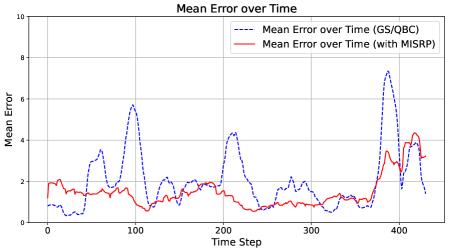
## Line Chart: Mean Error over Time
### Overview
This image presents a line chart comparing the mean error over time for two different methods: GS/QBC and a method utilizing MISRP. The chart displays the mean error on the y-axis against the time step on the x-axis.
### Components/Axes
* **Title:** "Mean Error over Time" (centered at the top)
* **X-axis Label:** "Time Step" (bottom-center)
* Scale: 0 to 450, with tick marks at intervals of approximately 50.
* **Y-axis Label:** "Mean Error" (left-center)
* Scale: 0 to 10, with tick marks at intervals of 2.
* **Legend:** Located in the top-right corner.
* "Mean Error over Time (GS/QBC)" - represented by a dashed blue line.
* "Mean Error over Time (with MISRP)" - represented by a solid red line.
* **Gridlines:** Horizontal and vertical gridlines are present to aid in reading values.
### Detailed Analysis
**Data Series 1: Mean Error over Time (GS/QBC) - Dashed Blue Line**
The blue line exhibits significant fluctuations over time.
* At Time Step 0, the mean error is approximately 1.2.
* The line increases to a peak of approximately 6.0 at Time Step 80.
* It then decreases to a low of approximately 1.0 at Time Step 150.
* Another peak is observed around Time Step 220, reaching approximately 4.5.
* The line remains relatively stable between Time Steps 250 and 350, fluctuating between 2.0 and 3.0.
* A final, large peak occurs around Time Step 400, reaching approximately 7.5, before decreasing to approximately 3.5 at Time Step 450.
**Data Series 2: Mean Error over Time (with MISRP) - Solid Red Line**
The red line also fluctuates, but generally remains lower than the blue line.
* At Time Step 0, the mean error is approximately 2.0.
* The line dips to a low of approximately 1.2 at Time Step 50.
* It increases to a peak of approximately 3.0 at Time Step 100.
* The line remains relatively stable between Time Steps 150 and 300, fluctuating between 1.5 and 2.5.
* Around Time Step 350, the line begins to increase, reaching a peak of approximately 4.2 at Time Step 400.
* It then decreases to approximately 3.0 at Time Step 450.
### Key Observations
* The GS/QBC method (blue line) consistently exhibits higher mean errors than the method with MISRP (red line) across most of the time steps.
* Both methods experience peaks in mean error at approximately Time Steps 80, 220, and 400, suggesting potential common issues or events causing increased error.
* The MISRP method appears to dampen the fluctuations in mean error, resulting in a more stable performance.
* The largest difference between the two methods occurs around Time Step 400, where the GS/QBC method's error is significantly higher.
### Interpretation
The data suggests that incorporating MISRP into the method leads to a reduction in mean error and improved stability compared to the GS/QBC method. The consistent lower error values and dampened fluctuations indicate that MISRP effectively mitigates some of the factors contributing to errors in the process. The recurring peaks in both lines suggest that there are specific time steps or events that consistently introduce errors, regardless of the method used. Further investigation into the nature of these events could lead to further improvements in both methods. The large error spike at Time Step 400 for the GS/QBC method warrants particular attention, as it represents a significant performance degradation. This could be due to a specific condition or input encountered at that time step.