## Line Chart: Mean Error over Time
### Overview
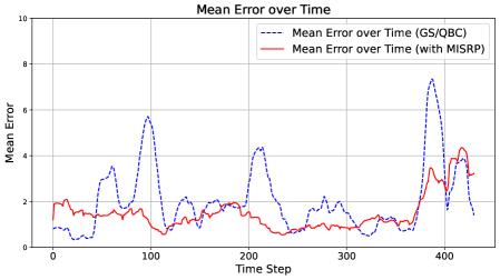
This is a line chart comparing the mean error over time for two different methods or algorithms: "GS/QBC" and "with MISRP". The chart plots the mean error (y-axis) against time steps (x-axis), showing how the error evolves for each method across approximately 430 time steps.
### Components/Axes
* **Chart Title:** "Mean Error over Time"
* **Y-Axis:**
* **Label:** "Mean Error"
* **Scale:** Linear scale from 0 to 10.
* **Major Tick Marks:** 0, 2, 4, 6, 8, 10.
* **X-Axis:**
* **Label:** "Time Step"
* **Scale:** Linear scale from 0 to approximately 430.
* **Major Tick Marks:** 0, 100, 200, 300, 400.
* **Legend:**
* **Position:** Top-right corner of the chart area.
* **Entry 1:** "Mean Error over Time (GS/QBC)" - Represented by a **blue dashed line**.
* **Entry 2:** "Mean Error over Time (with MISRP)" - Represented by a **red solid line**.
### Detailed Analysis
**Data Series 1: Mean Error over Time (GS/QBC) - Blue Dashed Line**
* **Trend Verification:** This line exhibits high volatility with several pronounced peaks and troughs. It shows a pattern of spiking to high error values and then dropping back down.
* **Key Data Points (Approximate):**
* Starts near 0.5 at Time Step 0.
* First major peak: ~3.8 at Time Step ~60.
* Second major peak: ~5.8 at Time Step ~100.
* Third major peak: ~4.4 at Time Step ~210.
* Fourth and highest peak: ~7.5 at Time Step ~390.
* Ends near 1.5 at Time Step ~430.
* Troughs frequently drop to values between 0.5 and 2.0.
**Data Series 2: Mean Error over Time (with MISRP) - Red Solid Line**
* **Trend Verification:** This line is significantly more stable and generally maintains a lower error value compared to the blue line. It shows a gentle, undulating pattern without extreme spikes.
* **Key Data Points (Approximate):**
* Starts near 2.0 at Time Step 0.
* Fluctuates mostly between 0.5 and 2.5 for the first 350 time steps.
* Shows a gradual increase starting around Time Step 350.
* Reaches its highest point of ~4.2 at Time Step ~420.
* Ends near 3.0 at Time Step ~430.
### Key Observations
1. **Volatility Contrast:** The GS/QBC method (blue) is highly unstable, with error values swinging dramatically. The MISRP method (red) is much more consistent.
2. **Error Magnitude:** For the vast majority of the timeline, the MISRP method maintains a lower mean error than the peaks of the GS/QBC method. The blue line's peaks (up to ~7.5) are far above the red line's maximum (~4.2).
3. **Converging Trend:** Towards the end of the observed period (after Time Step 350), the error for the MISRP method begins to rise, while the GS/QBC method experiences its largest spike. By the final data points, the two lines are closer in value than at many earlier peaks.
4. **Synchronized Dip:** Both methods show a notable dip in error around Time Step 120-130.
### Interpretation
The chart demonstrates a clear performance comparison between two approaches. The "with MISRP" method appears to be a more robust and reliable technique, as it successfully suppresses the large error spikes seen in the baseline "GS/QBC" method. The high volatility of the GS/QBC line suggests it may be sensitive to specific conditions or data points encountered at certain time steps, leading to periodic failures (high error). The MISRP enhancement likely introduces a stabilizing mechanism.
The rising trend for both methods in the final segment could indicate a change in the underlying data or task difficulty at later time steps. The fact that MISRP's error also increases here, but without the extreme spike seen in GS/QBC, suggests it degrades more gracefully under challenging conditions. This visualization strongly argues for the effectiveness of the MISRP component in reducing and stabilizing mean error over time.