## Charts: Type I Error vs. Alpha & Power vs. Number of Tests
### Overview
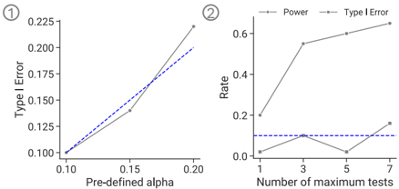
The image contains two separate charts. Chart 1 depicts the relationship between Type I Error and Pre-defined Alpha. Chart 2 shows the relationship between Rate (Type I Error and Power) and the Number of maximum tests. Both charts appear to be line graphs.
### Components/Axes
**Chart 1:**
* **X-axis:** "Pre-defined alpha" ranging from approximately 0.10 to 0.20, with markers at 0.10, 0.15, and 0.20.
* **Y-axis:** "Type I Error" ranging from approximately 0.00 to 0.225, with markers at 0.00, 0.05, 0.10, 0.15, 0.20, and 0.225.
* **Data Series:** Two lines are present.
* Solid dark blue line.
* Dashed light blue line.
**Chart 2:**
* **X-axis:** "Number of maximum tests" ranging from 1 to 7, with markers at 1, 3, 5, and 7.
* **Y-axis:** "Rate" ranging from approximately 0.00 to 0.65, with markers at 0.00, 0.10, 0.20, 0.30, 0.40, 0.50, and 0.60.
* **Legend:** Located in the top-right corner.
* "Power" - represented by a dashed grey line.
* "Type I Error" - represented by a solid dark grey line.
### Detailed Analysis or Content Details
**Chart 1:**
* The solid dark blue line starts at approximately (0.10, 0.10) and increases to approximately (0.15, 0.13) and then to approximately (0.20, 0.21). This line shows a generally upward trend.
* The dashed light blue line starts at approximately (0.10, 0.10) and increases to approximately (0.15, 0.16) and then to approximately (0.20, 0.18). This line also shows a generally upward trend, but is consistently below the solid line.
**Chart 2:**
* The "Power" line (dashed grey) starts at approximately (1, 0.05) and increases sharply to approximately (3, 0.55), then decreases slightly to approximately (5, 0.50) and continues to increase to approximately (7, 0.63). This line shows a generally upward trend with a slight dip.
* The "Type I Error" line (solid dark grey) starts at approximately (1, 0.10) and remains relatively flat at approximately (3, 0.12), then decreases to approximately (5, 0.08) and increases slightly to approximately (7, 0.15). This line shows a relatively flat trend with minor fluctuations.
* A horizontal dashed line is present at approximately y = 0.12.
### Key Observations
* In Chart 1, as the pre-defined alpha increases, the Type I Error also increases for both data series.
* In Chart 2, Power generally increases with the number of maximum tests, while Type I Error remains relatively stable, with a slight increase at the highest number of tests.
* The horizontal line in Chart 2 may represent a significance threshold.
### Interpretation
Chart 1 demonstrates the direct relationship between the chosen alpha level (significance level) and the probability of making a Type I error (false positive). A higher alpha leads to a higher chance of incorrectly rejecting a true null hypothesis.
Chart 2 illustrates the trade-off between statistical power and Type I error when conducting multiple tests. As the number of tests increases, the power to detect a true effect increases, but so does the risk of committing a Type I error. The horizontal line suggests a threshold for acceptable Type I error rate. The dip in the Power line around test number 5 could indicate a point where increasing the number of tests doesn't significantly improve power, or even slightly reduces it.
These charts are likely used in the context of statistical hypothesis testing, particularly when dealing with multiple comparisons. They highlight the importance of carefully considering the alpha level and the number of tests performed to balance the risks of Type I and Type II errors (false negatives).