\n
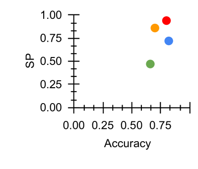
## Scatter Plot: Accuracy vs. SP
### Overview
The image presents a scatter plot visualizing the relationship between "Accuracy" and "SP". Five data points are plotted, each represented by a different colored circle. The plot aims to show how the SP value changes with varying levels of Accuracy.
### Components/Axes
* **X-axis:** Labeled "Accuracy", ranging from 0.00 to 0.75, with tick marks at 0.00, 0.25, 0.50, and 0.75.
* **Y-axis:** Labeled "SP", ranging from 0.00 to 1.00, with tick marks at 0.00, 0.25, 0.50, 0.75, and 1.00.
* **Data Points:** Five distinct colored circles representing individual data observations. No legend is provided, so colors are used to differentiate points.
### Detailed Analysis
The data points are as follows (approximate values based on visual estimation):
* **Red Point:** Located at approximately (0.75, 0.95).
* **Orange Point:** Located at approximately (0.70, 0.80).
* **Blue Point:** Located at approximately (0.65, 0.70).
* **Green Point:** Located at approximately (0.60, 0.50).
* **Purple Point:** Located at approximately (0.50, 0.60).
There is a general positive trend, where higher Accuracy values tend to correspond with higher SP values. However, the relationship isn't strictly linear.
### Key Observations
* The data points are relatively sparse, making it difficult to establish a strong correlation.
* The red point appears to be an outlier, exhibiting the highest SP value for the highest Accuracy.
* The green point is the lowest in SP, and is also relatively low in Accuracy.
### Interpretation
The scatter plot suggests a positive correlation between Accuracy and SP. As Accuracy increases, SP tends to increase as well. However, the relationship is not perfect, as evidenced by the spread of the data points. The plot could be representing the performance of a model or system, where Accuracy represents the correctness of its predictions and SP represents some other performance metric (e.g., Specificity, Precision, or a score related to a specific parameter). The outlier (red point) might indicate a particularly well-performing instance or a case where the model excels. The limited number of data points prevents a definitive conclusion about the strength and nature of the relationship. Further data would be needed to confirm the observed trend and identify any potential confounding factors.