## Scatter Plot: Accuracy vs. SP
### Overview
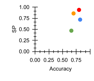
The image is a scatter plot with four colored data points plotted on a two-dimensional graph. The x-axis represents "Accuracy" (ranging from 0.00 to 0.75), and the y-axis represents "SP" (ranging from 0.00 to 1.00). The plot includes a legend on the right side, associating four colors (red, orange, blue, green) with distinct data points. The data points are spatially distributed across the plot, with varying positions along the axes.
### Components/Axes
- **X-axis (Accuracy)**: Labeled "Accuracy," with tick marks at 0.00, 0.25, 0.50, and 0.75. The axis spans from 0.00 to 0.75.
- **Y-axis (SP)**: Labeled "SP," with tick marks at 0.00, 0.25, 0.50, 0.75, and 1.00. The axis spans from 0.00 to 1.00.
- **Legend**: Located on the right side of the plot. It associates four colors with labels (not explicitly stated in the image). The colors are:
- **Red**: Top-right data point.
- **Orange**: Slightly left and below the red point.
- **Blue**: Further left and below the orange point.
- **Green**: Bottom-left data point.
### Detailed Analysis
- **Red Data Point**: Positioned at approximately (0.85, 0.95). This point lies **outside the x-axis range** (0.00–0.75) but within the y-axis range (0.00–1.00). Its high SP value (0.95) suggests a strong performance, but the Accuracy value exceeds the axis limit, indicating a potential data inconsistency or axis mislabeling.
- **Orange Data Point**: Positioned at approximately (0.80, 0.85). This point is within the x-axis range (0.00–0.75) and y-axis range (0.00–1.00). It shows a moderate Accuracy (0.80) and SP (0.85).
- **Blue Data Point**: Positioned at approximately (0.70, 0.70). This point is within both axes' ranges. It has a lower Accuracy (0.70) and SP (0.70) compared to the orange and red points.
- **Green Data Point**: Positioned at approximately (0.60, 0.50). This point is within both axes' ranges. It has the lowest Accuracy (0.60) and SP (0.50) among all points.
### Key Observations
1. **Positive Correlation**: The data points generally show a positive trend, where higher Accuracy corresponds to higher SP values. However, the red point's position (0.85, 0.95) deviates from this trend, as its Accuracy exceeds the axis limit.
2. **Outlier**: The red data point is an outlier in terms of Accuracy, as it lies beyond the x-axis range. This may indicate a measurement error or a special case.
3. **Lowest Performance**: The green data point has the lowest Accuracy (0.60) and SP (0.50), suggesting it represents the least effective performance.
4. **Legend Placement**: The legend is positioned on the right, which is standard for scatter plots. However, the labels for the colors are not explicitly stated in the image.
### Interpretation
The scatter plot suggests a general relationship between Accuracy and SP, with higher Accuracy typically associated with higher SP values. However, the red data point's position (0.85, 0.95) raises questions about data consistency, as its Accuracy value exceeds the axis limit. This could indicate a mislabeling of the axis, an error in data collection, or an intentional outlier for analysis. The green data point represents the lowest performance, while the orange and blue points fall in the middle range. The legend's placement is standard, but the absence of explicit labels for the colors limits the ability to interpret the data's context (e.g., what each color represents). The plot highlights the importance of verifying axis ranges and data point positions to ensure accuracy in analysis.