\n
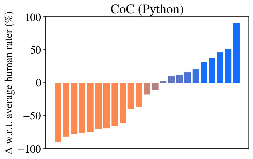
## Bar Chart: CoC (Python) - Delta w.r.t. Average Human Rater
### Overview
This is a bar chart displaying the delta (Δ) with respect to the average human rater, expressed as a percentage, for CoC (presumably "Consistency of Code" or similar) in Python. The chart shows a clear transition from negative values to positive values as the bars progress from left to right.
### Components/Axes
* **Title:** CoC (Python) - positioned at the top-center of the chart.
* **Y-axis Label:** Δ w.r.t. average human rater (%) - positioned on the left side of the chart. The scale ranges from approximately -100% to 100%.
* **X-axis:** The x-axis is not explicitly labeled, but represents the progression of some metric or category. There are approximately 20 bars.
* **Color Coding:** Two distinct colors are used:
* Orange: Represents negative delta values.
* Blue: Represents positive delta values.
* **Legend:** There is no explicit legend, but the color coding serves as an implicit legend.
### Detailed Analysis
The chart consists of a series of vertical bars. The bars transition in color from orange to blue, indicating a change from negative to positive delta values.
* **Orange Bars (Negative Delta):** The first approximately 12 bars are orange. The values start around -80% and gradually increase towards 0%.
* Bar 1: Approximately -80%
* Bar 2: Approximately -70%
* Bar 3: Approximately -60%
* Bar 4: Approximately -50%
* Bar 5: Approximately -40%
* Bar 6: Approximately -30%
* Bar 7: Approximately -20%
* Bar 8: Approximately -10%
* Bar 9: Approximately 0%
* Bar 10: Approximately 0%
* Bar 11: Approximately 0%
* Bar 12: Approximately 0%
* **Blue Bars (Positive Delta):** The remaining approximately 8 bars are blue. The values start around 0% and increase rapidly to approximately 90%.
* Bar 13: Approximately 10%
* Bar 14: Approximately 20%
* Bar 15: Approximately 30%
* Bar 16: Approximately 40%
* Bar 17: Approximately 50%
* Bar 18: Approximately 60%
* Bar 19: Approximately 80%
* Bar 20: Approximately 90%
### Key Observations
* The chart demonstrates a clear shift in performance from being significantly below the average human rater (negative delta) to exceeding it (positive delta).
* The transition from negative to positive values is not linear; the increase in positive delta is more pronounced in the later bars.
* The initial negative values are relatively consistent before beginning to rise.
### Interpretation
The data suggests that the CoC (Python) system initially performs worse than an average human rater, as indicated by the negative delta values. However, as the metric progresses (represented by the x-axis), the system's performance improves, eventually surpassing human-level performance. This could indicate a learning curve, optimization process, or a change in the complexity of the code being evaluated. The rapid increase in positive delta suggests that the system reaches a point of significant improvement. The x-axis likely represents some form of iteration, complexity, or a specific aspect of the code being analyzed. Without knowing what the x-axis represents, it's difficult to provide a more specific interpretation. The chart highlights the potential for automated code consistency checks to eventually outperform human reviewers, but also shows that initial performance may be suboptimal.